Technology
- Premier League Soccer: Stream Brentford vs. Man United Live From Anywhere
- Premier League Soccer: Stream West Ham vs. Tottenham Live From Anywhere
- Premier League Soccer: Stream Chelsea vs. Liverpool Live From Anywhere
- Today's NYT Connections Hints, Answers and Help for May 4, #693
- Today's NYT Strands Hints, Answers and Help for May 4, #427

Custom Search
News
- The Vatican installs chimney to signal the selection of the next pope
- Sovereignty beats out favorite Journalism to win the Kentucky Derby
- Florida lawmakers try to balance condo safety with cost
- Actress and 'Laugh-In' comedian Ruth Buzzi dies at 88
- A telescope's powerful new tool may offer a better way to predict solar storms
Reviews
Reviews
- I tested the Lenovo ThinkPad E14 Gen 6 and this budget laptop is a good entry-point that offers only a taste of what the line-up offers
- I spent a week with the Thrustmaster SimTask FarmStick X playing Farming Simulator 25, and despite its Hall effect stick and great customization, it made me realize that I'd be a terrible farmer
- I reviewed the Epson QL7000 projector, and 10,000 lumens brightness makes the difference between day and night
- I tested House of Marley’s solar-powered Bluetooth speaker and left the beach party disappointed
- I thought the Canon EOS R100 was a poor camera, but then my family used it for six months and now I’d recommend it to beginners in a heartbeat
New forum topics
I tested this robovac with a pop-up puck, and it could be a game-changer for cleaning under the sofa
Roborock Saros 10: two-minute review
Launched in January 2025, the Roborock Saros 10 is a premium robot vacuum with some seriously cutting-edge features. Primary among these is a navigation puck that retracts down into the bot when it senses it's entering a low-height space. That, combined with a suspension system that can bounce it over tall thresholds, means this bot can reach places other robovacs can't.
On test, I found that both these features worked reliably well. And while the pop-down puck will only really come into play in homes with furniture that's a quite-specific distance off the floor, if you do fall into this category then this robotic will prove a game-changer. No more shifting the sofa once every six months to find a horrifying amount of dust sitting below it!
I was also impressed with the Saros 10's cleaning powers. Suction is strong enough to pull large volumes of dog hair off carpeted floors without fuss, and the anti-tangle roller does exactly what it's designed to do. Mopping is good, too, with the lowest mopping modes creating only the lightest mop; perfect for floors that are sensitive to too much moisture. On balance, I still think spinning mop pads (such as those that feature on the Saron 10's sister model, the Roborock Saros 10R) do a better job of scrubbing, but I did like how the additional mini side mop on the Saros 10 got right up to the edges of rooms.
I should also give special mention to the impressive hands-off dock, which not only empties dust and charges the bot (in double-quick time), but also dispenses detergent, washes the mop pads with hot water, and dries them with warm air. All this while looking far more stylish than basically any other dock I've seen in all my time reviewing robovacs.
At list price, the Saros 10 is far from cheap, but it's roughly in line with other brands' top-of-the-range models offering similarly advanced features. If you just want decent cleaning and are happy to take care of some of the maintenance tasks yourself, there are cheaper options to be found. However, if you're after an advanced model that makes use of the very latest tech and requires minimal intervention from you, this might be the best robot vacuum for you. Read on for my full Roborock Saros 10 review.
(Image credit: Future) Roborock Saros 10 review: price & availability- List price: $1,599.99 / £1,499.99 / AU$2,999
- Launched: January 2025
- Available: Worldwide
The Roborock Saros 10 was one of three new Roborock robot vacuums announced at CES in January 2025, alongside sister model Saros 10R and the Saros Z70, which has a mechanical arm.
At list price direct from Roborock, the Saros 10 costs $1,599.99 in the US, £1,499.99 in the UK, and AU$2,999 in Australia. At time of writing, it isn't available via any third-party retailers, but it may come to Amazon at some point.
That price puts it firmly into the premium bracket for robovacs. In fact, it's one of the most expensive models we've tested so far, although its price is roughly in line with many other brands' top-of-the-range models. Build quality, performance and featureset help justify that price somewhat, and I'm not going to score it down too much on price because I'm glad this kind of innovation exists in the robovac world – plus, it's a truly excellent robot vacuum. Having said that, I'd still hold out for a discount (or for the price to come down over time) before buying one.
This is a super-advanced robot vacuum, and you don't need to spend this much to get an appliance that will keep your floors clean. For most people's needs, there are models at even half the price that will do the job – especially if you're willing to sacrifice the mop washing / drying / self-cleaning dock functions, all of which will bump up the price significantly.
Note, however, that there are a couple of ongoing costs to factor in, too. The first is replacement dust bags, although with a 2.5-liter capacity, each bag should last a decent amount of time. The second is floor cleaner: Roborock recommends you use only its own branded detergent, and I'm disappointed to report it's very expensive.
- Value for money score: 4 out of 5
- Pop-up navigation puck and bouncy chassis for traversing thresholds
- Bulky but smart mirrored self-empty dock, with mop cleaning
- Side mop and brush, and split main roller for directing hair
The bot itself looks similar to your standard disc-shaped robovac, but the main difference here is that rather than having a fixed navigation puck, it has one that can pop up and down. It will generally be up (this allows for better navigation); however, it will retract when the bot is docked and if it senses it's entering a low-height space.
On the front there's also a camera and additional navigation elements. The camera can also be used as a security cam, or to check in on your pets while you're out.
(Image credit: Future)Flip it over and you'll find two chunky wheels and a smaller front wheel, all of which can raise and lower independently to get the bot over tall thresholds. It's designed to be able to traverse thresholds up to a total of 1.6 inches / 4cm in height, including double-step thresholds, using the same AdaptiLift technology included with the Roborock Qrevo Curv. The bot learns the best process for each threshold in the mapped area.
The roller is rather unusual. It combines rubber fins and bristles, and is split in the middle to allow hair to escape into the bin, rather than becoming tangled and requiring you to then manually cut it off.
There's a spinning side brush that tucks itself away when it isn't in use. Again, the design is a little unusual: it has two arms, which sit near each other and extend at a slanting angle, to resist hair from becoming tangled.
There's a D-shaped mop pad and anti-tangle roller design (Image credit: Future)For mopping, the Saros 10 has a fixed, D-shaped mop pad. This has two vibrating zones that are designed to help dislodge dirt, and can also press down on the floor. (It's still not my preferred style – I find dual-spinning discs do a more thorough scrubbing job, which is the reason for docking a half-mark in this section).
There's also a tiny extra side mop designed to get closer to the edges of rooms. Cleverly, if you opt for a mode where the mop isn't needed, it can drop the mop off in the dock, so there's no danger of damp carpets.
The onboard dustbin is hidden beneath a magnetic top panel (Image credit: Future)The panel on the top of the robovac is magnetic, and can be removed to reveal the onboard dustbin. You shouldn't need to access this often – only if the self-empty process fails because something has jammed the mechanism. Presumably there's also a water tank in there, but I couldn't find it.
Dock designThe Saros 10 dock is one of those does-it-all units that not only charges the bot and empties its small onboard dustbin, but does a whole load more besides. It can refill its onboard water tank, disperse detergent, clean the bot's mop pads (at up to 176ºF / 80ºC), dry them (at 140ºF) over the course of a few hours, and also clean itself (at up to 176ºF).
It's designed to be able to recognize what's on the mop and adjust the temperature to suit; so it knows to use hotter water for grease and coffee stains than items such as mashed potato.
Image 1 of 3The dustbag sits between a press-to-open front hatch (Image credit: Future)Image 2 of 3Clean and dirty water tanks are beneath another door on top (Image credit: Future)Image 3 of 3The dock has mop cleaning and self-cleaning capabilities (Image credit: Future)As such, the Saros 10 is fairly bulky. However, it's one of the best-looking docks I've seen, with a smart, mirrored front that simply reflects the rest of your room back at you. So if it looks messy, that's on you.
The dustbag is hidden behind a front flap that opens when you press it, and two large water tanks (one for clean, one for dirty from cleaning the mop) are housed in the top, again behind a door.
There's a removable ramp up into the dock, and inside you can see the brushes for cleaning the mop pad.
- Design score: 4.5 out of 5
- Excellent vacuuming on higher settings; can handle pet hair
- Mopping also very good on higher settings – edge mop is useful
- Navigation great but object avoidance unreliable
Setup was painless. I unpackaged the bot, left it to charge on its dock, and then was prompted to complete a quick mapping run. Here, the bot made its way briefly into each room, looked around a bit, then left. It then provided me with a suggestion of what it thought the rooms were, and their floor types.
By default, the navigation puck is up while the bot is cleaning (Image credit: Future)I was testing this bot in a town house with multiple levels, so I repeated the process for each floor, carrying the bot up to each level to do so (advanced though this robovac is, it still can't climb stairs).
The initial plans were generally very accurate. After they'd been created, I went back in and corrected room types, removed unnecessary areas (it included the stairs when mapping higher levels, although its cliff sensors reliably prevented it from trying to go down them), and added no-go areas.
VacuumingOn the vacuuming front, there are five power levels to choose from: Quiet, Balanced, Turbo, Max and Max+ (there's a battery life warning with this mode). You can also opt to clean the space once or twice. I did find this bot a little noisy in vacuum-only mode, but it certainly wasn't any louder than a manual vacuum.
To try out vacuuming, I first set off the Saros 10 to clean each floor of the house, using a mix of different power levels, in vacuum-only mode. After cleaning, and before the bot returned to the dock, I inspected the onboard bin to see what it had gathered collected.
The Saros 10 did a great job of pulling pet hair from the carpeted rooms (Image credit: Future)I found Turbo mode was enough to extract plenty of dog hair from carpeted floors, and even more if I amped it up to a higher power mode. I was also impressed that the bot had no trouble auto-emptying, even when full with hair. I could hear the tell-tale "whoomph" sound as the wodge of dog hair made its way from the onboard bin to the dock dustbag.
I was also generally impressed by the roller design – there was next-to-none of my long hair wrapped around it at the end of a vacuuming session. That isn't the case with some of the robovacs I test.
Image 1 of 4Oats and tea on carpet before the suction test... (Image credit: Future)Image 2 of 4... and after one pass with the Saros 10 (Image credit: Future)Image 3 of 4... after two passes with the Saros 10 (Image credit: Future)Image 4 of 4... and after three passes, bumped up to Max+ mode (Image credit: Future)To test how the Roborock Saros 10 handles different kinds of debris, I ran TechRadar's standard suction tests. I sprinkled a teabag of dry tea on the carpet, alongside a handful of oats. I then ran the vacuum over them. On first pass in Turbo mode, the results were a little disappointing – the bot failed to pick much up, and what it did, it spat back out on a different area of carpet.
I ran another spot clean in Max+ mode and was far more impressed. This time, the bot picked up most of the debris, both large and small. To be clear, this is a tricky test. I went back over the tea spillage area with my Dyson Gen5detect vacuum and even that struggled to get the very last specs of tea from the carpet.
It's worth pointing out here that, in general, robot vacuums are designed for maintenance cleans – for deep cleaning, you'll still want to keep one of the best manual vacuums to hand. Among robot vacuums I've tested, the Saros 10's suction performance in general was very good.
Image 1 of 2Oats and tea on a tiled floor, ready for the suction test (Image credit: Future)Image 2 of 2The results after one pass with the Saros 10 (Image credit: Future)I ran the same test with tea and oats on a hard, tiled floor. This time, the bot picked up almost everything first time in Turbo mode, albeit with a fair bit of flicking around of debris. The only remaining bits were in the grouting cracks, and I managed to get those by remote-controlling the bot over the relevant area afterwards.
Image 1 of 2Oats and tea sprinkled along the edge of a room (Image credit: Future)Image 2 of 2The Saros 10 did a decent, but not perfect job of clearing it (Image credit: Future)To assess this bot's edge-cleaning powers, I sprinkled team and oats along the edge of the tiled kitchen. It did a pretty good job of clearing it, although it did ping everything around a bit, and there were a few remnants left that it was quicker to tackle with a manual vacuum that try and get the bot to handle.
MoppingThere are four mopping levels to choose from – Mild, Standard, Intense and Extreme. These increase not just the amount of water used, but also the enthusiasm of the scrubbing. Standard mode is really very light; I found the floor had almost completely dried by the time the bot had finished cleaning the room.
That's great news if you have floors that are sensitive to too much moisture – wooden floors, for example. However, if that's not the case and you want a more thorough mop, you'll want to deploy one of the higher mopping modes.
The Standard mopping mode is quite light (Image credit: Future)You can choose for the bot to mop only, vacuum first and then mop, or do both at once. I tend to avoid combination mopping and vacuuming since it will often lead to messy rollers and side brushes, due to the combination of water and dry debris. In mop-only mode, the Saros 10 really is extremely quiet.
On test, I found it could take a while for the mop pads to fully saturate, and especially in Standard or Mild modes. Initially, I could see damp streaks on the floor where the bot had cleaned incompletely. However, the tiny extra side mop does a good job of getting right up to the edges of rooms.
Image 1 of 2Smeared ketchup waiting to be cleaned (Image credit: Future)Image 2 of 2After a couple of passes, there was still a little left (Image credit: Future)For my mopping test, I smeared a tiny bit of ketchup on a tiled floor and left it to dry. After one pass in Standard mode, the Saros 10 had hardly cleaned up any of it. Amping it up to higher mop levels yielded better results.
On balance, while this bot does a good job of mopping, I still prefer the spinning dual disc-shaped mop style when it comes to pure scrubbing power.
Navigation and obstacle avoidanceThe pop-up puck is an interesting one, because in reality it's a very specific situation in which it's actually useful – you need furniture that's taller than 3.3inches / 8.2cm but shorter than 4.5inches / 11.4cm (the height where the puck wouldn't need to retract) off the ground. If you have that, though, it's super useful.
There's only one piece of furniture in my testing house that falls into the correct bracket, and the puck worked exactly as stated here. It also didn't impede navigation at all, although said piece of furniture is quite small, so it probably didn't present the biggest challenge.
I also ran TechRadar's standard obstacle avoidance tests, placing a sock, a charge cable, and a shoe on the floor, spread apart. I also added a box of tissues, for good measure. Results were mixed here.
The bot tried to eat the sock. It successfully identified and avoided the shoe, and at first also the tissue box, although it then went back and pushed it around a bit.
Image 1 of 2As expected, the Saros 10 didn't spot this cable (Image credit: Future)Image 2 of 2It did avoid my shoe, but pushed around the tissue box for a while (Image credit: Future)The Saros 10 also chewed the cable. That isn't a massive surprise, because I've yet to come across a robot vacuum that can successfully spot cables. However, it's something Roborock specifically states the Saros 10 can do, so it's disappointing in this regard.
In general use, however, I found this robovac pretty good at obstacle avoidance. There are various bins, speaker bases and ornaments on the floor that it successfully avoided – but as mentioned, it isn't quite the "exceptional" obstacle recognition and avoidance promised by Roborock.
Advanced features include the ability to use the robot to hunt out, photograph, and even video-call your pet. I did not try these features, because I suspect the dog would find such an intrusion wildly unsettling rather than reassuring.
Any photography and video features are turned off by default. To enable, you have to manually press some buttons on the robot vacuum, and you also have to be the primary account holder.
Battery lifeI can't fault the Saros 10's battery. While it's less of an issue with robot vacuums than a cordless stick vacuum – because the bot will automatically return to the dock to charge whenever it runs out of juice, before resuming its cleaning task – it's still helpful for a robot to offer decent runtimes. That's especially true if you're going to use it in a house with multiple floors, where it can't always get back to its charge dock without help.
The Saros 10 managed an impressive amount of cleaning on a single charge. I was concerned that the Max+ mode – which comes with a "battery draining mode" warning – would run the battery down super quickly, but on test it trundled through three complete room cleans in vacuum-only Max+ mode (from a not-full battery in the first place) before running out of juice. Impressive.
(Image credit: Future)Roborock also promises fast charging; it claims the dock will take the robovac from flat battery to full in 150 minutes. On test, I found this accurate. I went from 14% battery (at which point the bot told me it needed to return to dock to recharge) to 100% in under two and a half hours. If it goes flat mid-task, the bot will also figure out how much more power it needs to complete the task, and only charge to that point, for maximum efficiency.
Dock performanceBased on a couple of weeks of testing, the dock seems to be performing as stated. I've experienced no issues with the bin failing to empty completely, and the washing function seems to be working as claimed based on how clean the mop pads look and how dirty the water in the waste water tank is.
I'll update this section when I've been using the bot a little longer, and have a more complete view of the dock performance over time.
- Performance score: 4 out of 5
- Lots of settings for precise control
- ... but will also figure things out automatically, if you prefer
- Generally very usable, with a few usability quirks
The Roborock app is well designed and nice and usable, although it can take a little time to learn your options and explore all the settings at first – in part because there are so many of them. There are also a few areas I found unhelpful. For example, to swap between different floorplans in a multi-storey home, you need to go via the "edit map" menu, which feels unintuitive.
Otherwise, mapping is straightforward, and you have the option to set no-go zones and invisible walls, as well as removing sections that are added in error. You can also add furniture, and create cleaning preferences for different rooms and floors.
Strangely, you can't manually select the floor type for each room. You can create "carpet areas", but this is fiddly – no areas can overlap, making things tricky if the plan includes carpet rooms and hard floor rooms. The app will automatically identify floor type, but the areas that have been designated as carpet isn't always clear. I'd prefer to be able to set this as a backup – no one wants a mopped carpet.
Click to open large version (Image credit: Roborock / Future)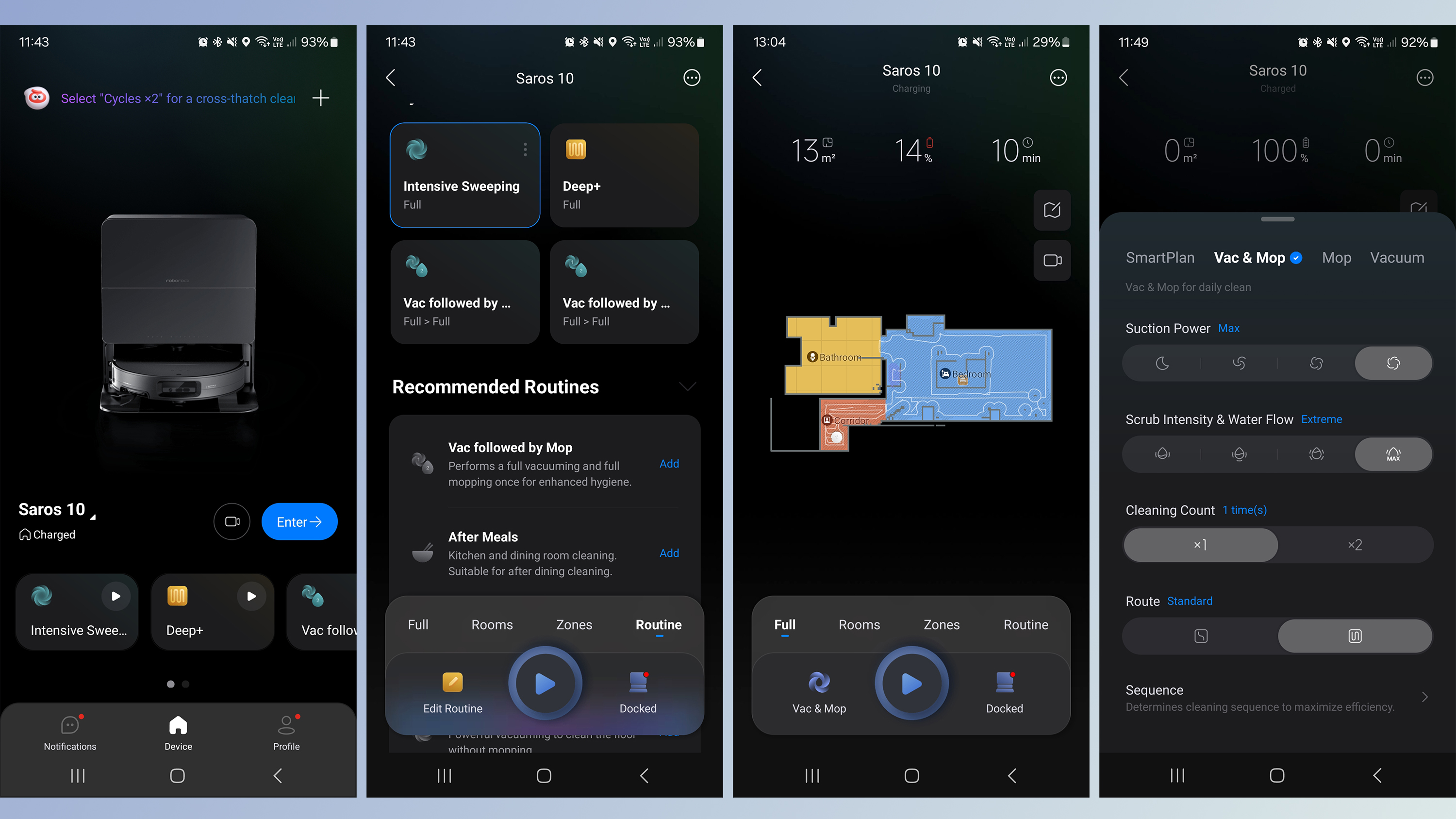
A relatively new addition to the setup is SmartPlan 2.0, which uses AI to customize the cleaning route, suction power and mop settings based on the bot's knowledge of its environment and previous use. Roborock says it can even reduce suction power during designated "quiet hours".
In short, you can have as much or as little control as you want here. If you don't want to get involved, you can basically leave the bot to figure out everything on its own, and it will do a very good job. Alternatively, you can really dig into the different features and set up everything exactly as you want it.
- App score: 4.5 out of 5
You have low-sitting furniture
The retractible puck is a game-changer if you have furniture that's between around 3.3in / 8.2cm and 4.5in / 11.4cm off the ground. It means this bot will be able to successfully clean this space, no shifting of furniture required.
You have tall room thresholds
The Saros 10 can clear thresholds up to 1.6in / 4cm tall, and it will learn the best way to get over each one and replicate it each time, too.
You want a hands-off option
The dock takes care of pretty much all maintenance tasks, from cleaning and drying the mop pads to dispensing detergent. It looks good, too.
You have delicate hard floors
The lighter mop modes are very gentle and use only a little water, making them perfect for hard floors that are sensitive to too much moisture.
You'd prefer no pop-up puck
It worked very well on test, but if you don't like the sound of the retractible puck then Roborock has a couple of models that use a newer navigation approach and don't require a puck at all: the Saros 10R and the Qrevo Slim.
You're on a budget
The Saros 10 doesn't come cheap, and there are plenty of lower-priced options on the market that will work perfectly well for many people's needs – especially if you're not fussed about advanced features such as the retractible puck and in-dock mop pad cleaning.
You want the very best mopping
I found the mopping very good here, but not as rigorous as the dual spinning disc-style mops. We were also very impressed with the roller mop found on the Eureka J20 robot vacuum, which continually siphons off dirty water and replaces it with clean water.
Eufy X10 Pro Omni
At time of writing, this bot sits at the top of our best robot vacuum ranking as the model we recommend to most people. It's significantly cheaper than the Saros 10 but not as cutting-edge. There's no pop-up puck here; threshold clearance is much lower; it can't dispense detergent; plus the dock is significantly less stylish. However, it still cleans extremely well, and the mop is great (it uses the dual spinning pads).
Read our full Eufy X10 Pro Omni reviewView Deal
Roborock Saros 10R
The 10R is the sister model to the 10, and it's extremely similar, except it uses a different navigation method. Rather than the retractible puck, it uses a new form of LiDAR that doesn't need a puck at all. We found it worked extremely well when we tested it. It also swaps the D-shaped mop pad for two spinning discs.
Read our Roborock Saros 10R reviewView Deal
How I tested the Roborock Saros 10I used the Roborock Saros 10 regularly for two weeks in a four-storey town house that has a mixture of carpeted and tiled floors, and houses a very hairy cocker spaniel. I used it to map and clean each of the levels, exploring the different settings and modes. For a more objective performance review, I ran TechRadar's standard suction tests (using dry tea and oats on hard and carpeted floors), mopping tests (using ketchup and juice on a hard floor), and obstacle avoidance tests (using socks, a cable and a shoe). I compared my experience of the Saros 10 against other robot vacuums I've tested, in terms of both ease of use and cleaning performance.
Read more about how we test robot vacuum cleaners.
- First reviewed March 2025
Categories: Reviews
I reviewed the Samsung QN900F: good enough to sway 8K cynics, and it’s not even Samsung’s most expensive 8K TV
Samsung QN900F: Two-minute review
With native 8K content still pretty elusive (though no longer flat out unfindable), buying an 8K TV might not sound like it makes much sense. The new Samsung QN900F, though, builds spectacularly on the successes of 2024’s mind-alteringly brilliant Samsung QN900D 8K range to keep the 8K TV flag flying high.
For starters, at £4,899/$4,299 for the 75-inch version of the Samsung QN900F we’re focusing on here, it’s relatively affordable by Samsung's premium 8K TV standards. It also uses the remarkably effective glare-free screen found in the Samsung S95D OLED, one of the best TVs of 2024; carries no less than 256 neural networks to apply AI enhancements to smart features, picture quality and audio quality; and supports a comprehensive array of gaming features, including support for frame rates up to 165Hz.
The QN900F’s latest (gen 9) Tizen smart system supports a typically huge range of streaming services, as well as offering AI-enhanced systems for finding content tailored to the viewing habits of different members of your household. Its powerful, cinematic multi-channel sound system ups the big screen’s immersive potential substantially, too.
The star of the show, though, is undoubtedly its eye-popping pictures, which combine phenomenal brightness and ultra-vibrant colour with, crucially, a new level of upscaling for converting non-8K sources to the screen’s native 8K resolution. It’s this, in particular, that builds on 2024’s QN900D efforts in making our previous cynicism about 8K TVs a thing of the past.
Samsung QN900F review: Prices and release date The QN900F's 8K resolution and clean upscaling make pictures look detailed and lifelike (Image credit: Future)- Release date: March 2025
- 65-inch: £3,599 / $3,299 / around AU$5,240
- 75-inch: £4,899 / $4,299 / around AU$6,825
- 85-inch: £6,899 / $5,499 / around AU$8,730
The QN900F is at the vanguard of an expansive swathe of TVs Samsung is bringing to market in March 2025. All three screen sizes of the QN900F should be available in the UK and US this month, with launch pricing for each model shown above.
Samsung QN900F review: Specs Samsung QN900F review: Benchmark results Samsung QN900F review: Features The QN900F has four HDMI 2.1 ports with 4K 165Hz support (Image credit: Future)- 8K FALD VA panel with mini-LED
- HDR10, HLG and HDR10+ HDR support
- Gaming support up to 4K 165Hz with VRR
While sales of 8K TVs might not have set the world on fire so far (in fact, Samsung is currently the only brand consistently sticking with them), the QN900F’s 7680x4320 native resolution is undoubtedly its main feature. After all, while true 8K sources are still scarce, Samsung’s upscaling processors can turn any video that comes the TV’s way into 8K, so if that processing is good enough, there’s still scope for the TV’s 8K resolution to count.
Fitting an 8K pixel count into the screen massively reduces the pixel pitch of any resulting images, of course, potentially making for a denser, smoother, more realistic image, especially when you get to screen sizes of 75 inches and up.
The 75QN900F fits its 8K resolution into a VA-type panel, which usually bodes well for contrast, and it lights all those tiny pixels using a mini-LED backlight system driven by 52x28 (1,446) local dimming zones. That’s a very high zone count for what is essentially Samsung’s entry-level 8K TV for 2025, raising hopes of an extreme contrast performance with minimal backlight clouding and haloing interference.
At the other end of the contrast scale, measurements taken using the Calman Ultimate image testing and calibration software and Portrait Displays’ G1 signal generator and C6 HDR5000 colorimeter reveals peak brightness levels as high as 2,350 nits on a 10% HDR test window. That much brightness will surely test the local dimming system, but Samsung has risen to similar challenges before with aplomb.
Potentially further boosting the 75QN900F’s contrast is its glare-free screen filter – something its predecessor lacked. This does an almost uncanny job of suppressing and rejecting reflections from your room.
Colours are delivered by a Quantum Dot system capable of covering a measured 89.28% of the DCI-P3 colour spectrum used in most HDR mastering, and all aspects of the pictures are controlled by Samsung’s latest NQ8 AI Gen 2 processor.
This processor should have a particularly strong impact on upscaling sub-8K content to the TV’s native 8K resolution, but also feeds into features such as a Real Depth Enhancer Pro system for creating a more three dimensional effect, auto HDR remastering for converting SDR to HDR, and an AI Motion Enhancer system. The processor also plays a part in delivering what Samsung claims should be much wider effective viewing angles than you would normally get with LED technology.
The AI features extend to an AI Mode option you can call in for any of the TV’s presets, which analyses the incoming content and ambient room conditions in a bid to constantly optimise the picture and sound quality. The more puritanical AV fans out there won’t like the sound of this at all, of course - but it is all strictly optional. I’ll be looking at how well it works in the next section.
- Features Score: 5/5
- High brightness and contrast
- Vibrant colours
- Excellent backlight control
The QN900F improves so much over its 2024 equivalent model that it’s hard to believe it isn’t actually Samsung’s flagship TV for 2025. The step-up QN990F series is really going to have to go some to be better than this.
The first thing that hits you like a lightning bolt is how bright the QN900F’s pictures are. This is especially true in the rather OTT Dynamic mode, but also hits home hard in the extremely watchable Standard preset. Even the Filmmaker Mode, though, which is designed to track the UHD Alliance’s preference for accuracy to industry mastering standards and minimal processing, retains a satisfyingly punchy look, with strong HDR highlighting to go with its generally more balanced and nuanced approach.
The extreme brightness is especially effective with aggressively mastered HDR footage, but the screen also adapts itself pretty much perfectly to milder HDR fare. Nothing looks forced or strained. Even SDR footage converted to HDR by the HDR Remaster option enjoys an uptick in light and colour range without looking weird or unbalanced.
At least as important as the QN900F’s impressive brightness, though, is the fact that it’s delivered without the backlight system exhibiting either heavy backlight blooming or any general greyness in dark scenes or dark picture areas. In fact, black levels are nothing short of outstanding for LCD technology, hitting essentially OLED-level black depths during fades to black, and maintaining a surprisingly inky and consistent (as in, cloud- and halo-free) look even with shots that combine lots of very bright and dark elements.
Samsung has managed to accomplish the QN900F’s exceptional LED contrast, too, without pursuing its old habit of dimming down stand-out brightness elements to stop light blooms appearing around them. The level of backlight control achieved by the NQ8 AI Gen 2 processing is so sophisticated and granular that such overt local dimming activity just isn’t needed any more.
Suppressing backlight blooming and greyness as well as the QN900F does hasn’t come completely string-free; there’s some minor crushing of shadow details in the Standard and Movie modes. But this is seldom serious enough to be distracting, and in any case it can be improved by just nudging up the TV’s Shadow Detail setting one or two points.
The QN900F’s high brightness contributes to a gorgeously rich, satisfying colour performance, too. This is most vividly obvious in the Standard preset - so much so that I’d say most QN900F buyers will find this mode irresistible for most day-to-day viewing conditions. Especially as Samsung has clearly worked hard with its latest Standard preset to try and make it deliver much more immersive and consistent pictures than the mode typically has in the past.
If you switch to a more mild, accurate preset such as Movie or Filmmaker Mode, you won’t get to ogle the most vivid extremes of the QN900F’s colour capabilities, but the wider colour range still plays its part in unlocking both more subtlety and more expressive shading than last year’s equivalent Filmmaker Mode offered.
In other words, no matter what picture preset you like the best, the much more thoughtful colour and light management of the new panel and attendant processing engine means it will look equally fantastic in its own specific way.
The QN900F's thick, chamfered frame lends itself well to displaying art from the Samsung Art Store (Image credit: Future)While it’s telling that I’ve focused so far on picture attributes that don’t directly relate to its native 8K resolution, this doesn’t mean that resolution doesn’t still matter. It is now possible to find and play native 8K videos on Youtube, and while the quality of these can be variable to say the least (you have to watch out for videos that say they’re 8K in their titles when they actually aren’t, too), the good ones reveal to a wider audience at last what some of us lucky TV reviewer types have known for years: that true 8K looks absolutely spectacular.
That’s partly because 8K looks incredibly sharp and detailed, as you might expect. But more because something about the extra density of the image somehow breaks down the usual sense that you’re watching a picture on a TV, leaving you feeling more as if you’re literally looking at reality. And that’s especially true when an 8K clip features some decent HDR encoding.
Crucially, though, the QN900F not only looks better than 4K TVs with native 8K content. Samsung’s latest 8K upscaling efforts are the best they’ve ever been, managing to make 4K sources look sharper, more textured and more dense than they would in their native resolution, while simultaneously making the upscaled results look more natural and refined than they have been on previous Samsung 8K TVs.
This is chiefly because, I think, the upscaling system has got even cleverer about detecting the difference between noise and actual picture information in a sub-8K source as it goes about figuring out how the millions (and millions) of pixels it needs to add to the picture should look.
Even fairly grubby, compressed HD sources make the journey up to 8K on the QN900F without becoming artificial looking, or suffering with exaggerated source artefacts. SD is a stretch, unsurprisingly - though even here the results only look a bit soft rather than becoming flat out ugly or messy.
Playing around with Samsung’s AI Mode yields some interesting results. Initially I found its picture optimization features a little over the top, causing some distracting processing side effects. Most notably slightly peaky skin tones, slightly forced bright highlights, and some processed-looking motion. Tweaking one or two picture settings to help ‘train’ the AI Mode, though, can help it quickly deliver much smarter results. Ultimately, I wouldn’t say I felt particularly compelled to use the AI Mode picture setting, not least because the TV does such a fantastic job even without the extra AI help. But it’s certainly good enough to at least be worth trying out.
There are a couple of other niggles to report. Default motion settings with 24fps films in the otherwise stunningly watchable Standard mode are a bit of a blunt instrument, generating a few distracting side effects. You can address this problem yourself, though, by choosing a custom setting for the Picture Clarity set of options, and turning noise reduction off while setting the power of the motion and judder reduction elements to somewhere below five each.
The second issue is that while colour saturations and contrast hold up well when viewing the TV from down its sides, the otherwise miraculously well-controlled backlight blooming suddenly starts to become noticeable.
Most of the initial niggles with the QN900F prove ultimately fixable within its menus, though, and anything left is so puny against the picture’s overwhelming strengths that it’s barely worth mentioning, honestly.
- Picture quality score: 5/5
- 4.2.2 channel speaker array
- 70W of total audio power
- Excellent detail placement and soundstaging
Samsung has backed up the QN900F’s stellar pictures with an excellent audio system. Particularly impressive is the scale of the soundstage it produces. Sounds are cast beyond the TV’s physical boundaries to left, right and even, to a more limited degree, upwards, getting a decent multi-channel effect from Dolby Atmos soundtracks that’s taken to another level, too, by Samsung’s Object Tracking Sound system.
This system manages to place sound effects and vocals so that they actually seem to be coming from the correct part of the image – or the correct place just beyond the image’s edges, where appropriate. The OTS system manages to track the motion of multiple noisy objects in an action scene frame, too, so that soundtracks always appear busy and precise – and, as a result, more engaging and clear.
The QN900F’s speakers deliver a decent amount of dynamic range too. Trebles at one end of the spectrum sound crisp and clean but also well-rounded rather than harsh or over-exposed, while bass reaches reasonably low while projecting powerfully enough to stop action scenes from sounding thin or one-dimensional.
Some of the film world’s most extreme and sustained bass rumbles push the QN900F’s speakers right to their limit, so that low frequencies started to sound a little ‘stuck’ inside the TV. But the speakers always just stop short of succumbing to really distracting amounts of bass-induced crackling or distortion.
The sound is powerful enough overall, too, to be able to shift up a few gears as action or horror sequences build towards a climax, without falling away when the going gets really tough. Dialogue is always clear and well contextualised, meanwhile – especially as Samsung’s AI-driven dialogue enhancement system is always ready to lend a vocal-boosting hand if a particular source or ambient noise in your room is making dialogue hard to pick up.
The AI Mode, if you choose it, does a pretty effective job of expanding the scale of the soundstage. This can cost the sound a little bass heft at high volumes, but you can improve this considerably by tweaking the low frequency elements of the TV’s graphic equaliser.
If I had to find a fault, the sound overall doesn’t have quite as much forward impact as you get with the very best sounding rival TVs, but overall the QN900F’s sound is a healthy improvement over many of Samsung’s other recent TVs.
It’s worth adding that the QN900F supports Samsung’s Q-Symphony feature, where its speakers can join forces with those in a Samsung soundbar to deliver a larger, more detailed soundstage.
- Sound quality score: 4.5/5
- Chamfered screen frame
- Glare-free screen can look like a painting
- Multi-position feet
The QN900F’s design is quite a change from previous equivalent models, switching from the usual barely-there screen bezel approach to an unusually wide, dark grey chamfered frame that looks more like something you’d find holding a painting rather than a cutting-edge TV screen. Which, actually, is exactly the impression Samsung wants the QN900F to give, as its at the heart of a campaign to expand the sort of design thinking that’s served Samsung so well with its The Serif and, especially, The Frame lifestyle TVs.
Personally, I’m torn over the QN900F’s new look. When you’re watching TV on it, the frame’s width feels a touch too much, and the dark finish lacks the glamour of the gleaming, ultra-slim frames of previous equivalent 8K models. If you’re using the TV’s Ambient Mode abilities, though, where you can play a still photo, gentle video or digitised artwork on the screen as a screensaver, the painting-style frame looks great. Especially with the new matte glare-free screen completing the painting-like impression.
The QN900F ships with a pair of rather spindly looking feet. These feet can, though, be attached in multiple ways: either set quite wide apart or close together, depending on how wide the furniture you’re putting the TV on is, and at two different height levels to potentially provide more space under the screen for a soundbar to sit.
You can also wall mount the QN900F, of course, and the reasonably slender, tiered rear panel lends itself well to this. I can’t help but wonder, though, whether the performance of the bank of eight mid-range speakers built into the TV’s rear might be compromised if the drivers are pressed up against your wall.
One last design point to mention is Samsung’s Art Store. Originally designed for Samsung’s lifestyle TVs, this service allows people who subscribe to it to choose from a library of thousands of digital and digitised artworks to use as screen savers in the TV’s Ambient Mode.
- Design score: 4/5
- Tizen 9.0 smart system
- Extensive voice control support
- Dedicated Gaming Hub menu
The QN900F uses Samsung’s own Tizen platform to deliver its smart interface and services, which is mostly very good news. What was once a rather over-complicated interface with some questionable content prioritisation decisions has gradually morphed into a sophisticated and helpful interface, bolstered by the introduction of handy new shortcut options, one of the most intuitive and in-depth voice recognition systems in the TV world (including a far-field mic), and some really impressive AI-driven talents when it comes to both recommending content based on the viewing habits of different members of your household, and advanced content searching.
New AI-driven features added to Tizen for its latest generation include an AI To Search feature that identifies which actors are in what you’re watching and does in-depth searches across all its available sources to find other films or TV shows those actors are in; a Live Translate feature that translates foreign language dramas with real-time subtitles; and a new Generative Wallpaper feature that can conjure up screensaver images to suit your described mood.
The Tizen menu system now features an attractive and usefully organised home menu that becomes more useful over time as the QN900F learns your viewing habits. The home screen also provides a link to a dedicated Gaming Hub page, which I’ll go into more in the next section, while the app support includes pretty much every streaming service anyone could ever want. The only significant absentees in the UK are Freeview Play and Freely – but you can access the individual catch up services for all of the main UK’s key terrestrial broadcasters. The QN900F also features an ATSC 3.0 tuner for receiving Next-Gen digital TV broadcasts in the US.
- Smart TV & menus score: 4.5/5
- Gaming Hub menu
- Game Bar menu with multiple gaming aids
- 4K 165Hz gaming support
The QN900F is a beast of a gaming display that ticks all the feature boxes you could want from the best gaming TVs. All four of its HDMI ports can support high frame rate 4K gaming feeds. Those high frame rates can stretch to 165Hz this year (up from 144Hz in 2024) for anyone with a PC powerful enough to take advantage of that, and variable refresh rates are supported right up to this eye-catching new frame rate peak. The VRR support is available in the AMD FreeSync Premium format as well as the basic HDMI format, too.
Gaming HDR is supported in the HDR10+ and HGiG approaches as well as basic HDR10, and low lag gaming modes are available for all those HDR options. This lag reduces to a fantastically low (especially considering the QN900F has to upscale graphics to the screen’s 8K resolution) 10ms with 60Hz sources with the TV’s Game mode in play. There are also options, though, to increase this lag slightly in return for mild motion smoothing processing with low frame rate titles that aren’t particularly dependent on fast reaction times.
There are also sophisticated options for magnifying and even repositioning a game’s mini map, brightening dark picture areas without affecting bright areas to make enemies lurking in the shadows easier to see, and calling up an onscreen target reticle to give you an aiming edge over your rivals.
Finding game sources is a doddle, too, as the Tizen interface provides a clearly labelled dedicating Gaming Hub, which brings together all your HDMI inputs that have gaming sources attached alongside every gaming streaming service Samsung TVs now have access to.
The QN900F’s OTS audio system proves very useful for gaming thanks to the accuracy with which it places sound effects around the TV’s frame, and finally, best of all, graphics look fantastic on the QN900F’s screen.
The TV’s brightness and colour punch are beautifully to the fore, backed up by more inky black levels and a breathtaking level of sharpness and detail that constantly reminds you this is an 8K TV. The high and variable frame rate support delivers all these pixels of gaming beauty with outstanding fluidity and responsiveness, too.
There’s a touch more backlight blooming in Game mode than you get with video content, perhaps. But I only really noticed this in menus, where there can be bright text appearing against a dark backdrop; it seldom bothered me during game play.
I know pro-grade gamers will always want to play fast-response games, at least, on a small monitor. But the vast majority of more casual gamers will struggle to go back to a small screen if they get to experience the gaming joys of the QN900F.
- Gaming score: 5/5
- More expensive than 4K equivalent
- Upscaling of 4K and lower-res content adds value
- Substantially cheaper than flagship QN990F series
The QN900F series isn’t cheap compared with even Samsung’s most premium 4K TVs. So you certainly can’t say that 8K doesn’t still attract a substantial premium, especially now that Samsung has ditched its previous, more affordable QN800 and QN700 8K ranges.
There is at least a small amount of native 8K content available on YouTube now with which to unlock the full 8K capabilities of 8K TVs, though, and Samsung’s upscaling is now so good that even 4K footage consistently benefits from being translated into 8K.
It’s also worth saying that the QN900F is substantially more affordable than Samsung’s flagship 8K TV for 2025, the QN990F series. Those models - which ship with external wireless connectivity, support ground-breakingly high frame rates and carry even more powerful sound systems - go for £4,999 / $5,499 for the 65-inch, £6,499 / $6,499 for the 75-inch, and £9,499 / $8,499 for the 85-inch.
- Value score: 4/5
You want a truly next-gen picture quality experience
The QN900F backs up its core 8K resolution with all the colour range and subtlety, sharpness and contrast it needs to fully unlock that resolution’s potential.
You’re a gamer
The QN900F’s response time, eye-catching picture attributes, impressive game-friendly connectivity and support for ultra-high frame rates make it a fantastic gaming display.
You want a TV that turns into a painting when you’re not watching it
The QN900F’s anti-glare matt frame, wide chamfered screen frame and extensive collection of digital artworks really can turn it into a work of art when you put it into its Ambient mode.
You can’t afford it
Samsung and other brands sell some excellent 4K TVs for substantially less than the QN900F costs. So while the QN900F justifies its price, it’s probably not worth getting yourself into debt for!
You want Dolby Vision
Samsung has never supported Dolby Vision HDR on its TVs, so it can’t always take in the very best version of every source you might feed it.
You’re not prepared to tweak a few settings
Getting the best out of the QN900F means making a few tweaks to things like noise reduction and motion processing. So if you’re not prepared to do that, even for a TV as deserving of your time as this, maybe you should go for a cheaper, more basic model instead.
TCL 98Q9BK
If you want to base your home cinema thrills more on screen size than resolution, TCL’s 4K-resolution 98-inch 98Q9BK delivers startlingly bright, colourful and contrasty pictures at a truly epic scale, as well as delivering strong gaming capabilities. All for substantially less money than the QN900F costs.
Here's our full TCL 98Q9BK review
LG G4
As well as giving you a couple of inches more picture, the LG G4 uses OLED technology rather than LCD, meaning every pixel produces its own light and colour for an exceptionally precise image. The G4’s micro lens array technology helps it deliver good brightness for OLED, too - but it’s only a 4K resolution screen.
Here's our full LG G4 review
Samsung QN900D
If you’re quick you can still pick up Samsung’s 2024 8K QN900Ds for a few hundred pounds less than the 2025 QN900Fs cost. Though the QN900Fs do deliver a few very worthwhile picture quality and smart feature advances over their predecessors, of course.
Here's our full Samsung QN900D review
How I tested the Samsung QN900F- Tested over 16 days
- Tested with 4K Blu-rays, multiple streaming platforms and resolutions, Freeview HD broadcasts, and HD Blu-rays
- Reviewed in both dark and light dedicated test room conditions, on its feet in both corner and flat wall positions
Not least because we needed to test it out with our collection of native 8K test material and the small collection of 8K YouTube videos that are now available on top of all our usual 4K test sources.
Those 4K sources, which included 4K Blu-rays and streams, needed to be scrutinised with the TV’s 8K upscaling in mind, too. As did the collection of varying quality HD and SD sources we cruelly also decided to push the QN900F hard with!
The TV was tested in a variety of locations, including 10 days in a regular living room environment in both corner and mid-wall placement positions, and in a wide range of ambient light conditions, from total black out to all the curtains open on a bright sunny day. The majority of the really critical testing was done in a darkened room with 4K and HD Blu-rays, to ensure source and environmental consistency with our other tests.
Finally, as ever we put the QN900F through a barrage of objective tests using Portrait Displays’ Calman Ultimate analysis software, G1 signal generator, and newly released C6 HDR5000 light meter.
You can read an in-depth overview of how we test TVs at TechRadar for more information.
- First reviewed: March 2025
- Read TechRadar's reviews guarantee
Categories: Reviews
I love the sound quality of the Turtle Beach Stealth 700 Gen 3, but a few drawbacks stop it from being a true standout
Turtle Beach Stealth 700 Gen 3: two-minute review
The Turtle Beach Stealth 700 Gen 3 is a wireless gaming headset compatible with numerous platforms, thanks to its Bluetooth integration and two USB dongles.
While it’s largely free from the typical gaming accouterments – there’s no RGB lighting, for instance – it still cuts a conspicuous figure thanks to its ultra-wide drivers, so this isn’t exactly a headset you can travel around with. Virtually all of the best PC gaming headsets out there have a lower profile than this.
Thankfully, it’s not as heavy as it looks, although some gamers might prefer something lighter. Personally, I didn’t have an issue with this aspect of the Stealth 700 Gen 3. What bothered me more was the lack of headband padding, which resulted in an achy head even after short sessions.
The comfort around the ears is much better, though. The earcups provide plenty of padding, and glasses wearers shouldn’t have a problem either. My only gripe is that they’re very large, and the fit wasn’t snug enough to secure them in place when I moved around more emphatically. For normal head movements, though, the Stealth 700 Gen 3 stay in place just fine.
The general build quality is good too, even if the materials used in its construction aren’t always the most premium. The foldable microphone is a nice touch, and feels equally well made, with an easy opening mechanism and plenty of stability when down.
There are four buttons on the Stealth 700 Gen 3, allowing for plenty of on-the-fly adjustments. There are also three scroll wheels, with two for controlling the volume from Bluetooth and transmitter sources independently, meaning you can realistically listen to music or take calls on your phone at the same time as receiving game audio from your PC or console.
Further tweaks are possible using Turtle Beach’s Swarm 2 peripheral software (on PC), allowing for some detailed output and input configurations, as well as reassignment options for the Mode button and one of the wheels, although these are limited.
The sound is great for both gaming and other forms of entertainment, including listening to music and watching content. All frequencies are clear and well-balanced, while the Bass Boost mode imparts a noticeably fuller low-end without diminishing overall quality, although small amounts of distortion can intrude with higher volumes. The microphone is less impressive, but it offers enough clarity to get by and the noise gate works well to block unwanted sounds from being picked up.
The Stealth 700 Gen 3 connects quickly via the wireless transmitter and over Bluetooth, and both work in tandem well. However, I did experience occasional dropouts on PC; whether the issue was with the headset or my particular setup is hard to tell, but if the former, hopefully, this is something that can be fixed with an update.
Battery life is excellent and seems in line with Turtle Beach’s 80-hour claim, as after a couple of days of use via Bluetooth and the transmitter across multiple platforms, it only dropped by between 5-10%.
It sits in the middle of the market in terms of price, costing about the same as the Razer BlackShark V2 Pro, which is one of the best wireless gaming headsets around. However, this headset packs in more features than the Stealth 700 Gen 3, as well as excelling in virtually every other area. There’s also the Epos H3, which is one of the best cheap gaming headsets around, although you will have to settle for a wired connection.
While both these gaming headsets might offer better value, the Stealth 700 Gen 3 isn’t far behind. It puts in an admirable effort at this price point, with sound quality that punches above its class. There are a few comfort and usability issues, but I don’t think they’re dealbreakers at this price.
(Image credit: Future) Turtle Beach Stealth 700 Gen 3 review: price and availability- $199.99 / £179.99 / AU$399.95
- Available now in three color options
- Mid-lane pricing for a gaming headset
The Stealth 700 Gen 3 costs $199.99 / £179.99 / AU$399.95 and is available now in three colorways: Black, White, and Cobalt Blue. There are models with various compatibility options for Xbox, PlayStation, and PC, although all cost the same.
The Razer BlackShark V2 Pro, one of the best wireless gaming headsets in our view, is the same price (and even slightly cheaper in the UK). This headset has great output and input quality, formidable build quality, and more tweaks and customizations than the Stealth 700 Gen 3, such as THX Spatial Audio compatibility. Battery life is also great, making it a tough headset to beat at this price point.
If you want to spend a lot less on a gaming headset, then the Epos H3 is one of the best wired gaming headsets around and can be found at a significant discount from its original price. We think this headset offers superb sound and great levels of comfort for the price. A wireless variant is also available, although this is quite a lot more expensive.
Turtle Beach Stealth 700 Gen 3 review: Specs (Image credit: Future) Turtle Beach Stealth 700 Gen 3 review: design and features- Very bulky
- Plenty of physical adjustments
- Some useful features and customizations
The Turtle Beach Stealth 700 Gen 3 maintains a rather muted appearance, steering clear of the gamer gaudiness afflicting some other gaming headsets; there’s not even any RGB lighting. It is, however, quite bulky, with extremely wide drivers – perhaps the widest I’ve seen on a gaming headset – so it still isn’t what you’d call discreet.
It feels well-made, though. It might not employ the most premium materials, but they feel relatively solid and are put together well. The fold-away microphone is also a nice touch, with its hinge mechanism offering a smooth operation, while at the same time providing plenty of stability once done. However, while the Stealth 700 Gen 3 isn’t as heavy as you might imagine, those who are sensitive to weighty headsets should still take heed that it’s heavier than some others in this sector.
The earpads are very thick, which helps make the headset comfortable to wear. Turtle Beach specifically mentions the Stealth 700 Gen 3 as being glasses-friendly, and I can say I found this to be the case, as I experienced no aches or fatigue from wearing them over the arms of my frames.
These pads are also uniquely shaped, vaguely following the contours of an actual ear lobe, which I found worked quite well in my case, although they were perhaps a little too large for me; since the headband is quite wide too, they don’t fit as snuggly as those on other headsets, although this is only a problem with more vigorous head movements. The large opening also means that it should accommodate most ear shapes and sizes.
Driver-height adjustments are easy to make yet hard to move accidentally. The drivers also rotate ninety degrees, allowing you to comfortably hang them around your neck. The headband, however, is less comfortable. While the padding looks soft and plush, it compresses far too easily, meaning the harder material inside pressed onto the top of my head, causing aches even after short periods of time.
(Image credit: Future)There are various buttons on both drivers: the CrossPlay switch is used for toggling between the two transmitters (one for Xbox and one for other platforms), a Bluetooth button, and a Mode button for cycling sound profiles – although unfortunately, the voice prompt doesn’t tell you which mode is currently selected, which some Razer headsets do.
The power button can also be tapped to toggle the Superhuman Hearing mode, although on occasion this failed to work, requiring me to power off and power on the headset to make this button operational.
Oddly, there are three scroll wheels on the Stealth 700 Gen 3: one is for mixing game and chat levels, while two are for volume – one for Bluetooth sources and the other for transmitter sources. This may seem like overkill, but it helps to allow for the Stealth 700 Gen 3 to showcase one of its unique features: simultaneous playback from Bluetooth and transmitter sources, with the ability to control the volume of both independently.
It does mean you’ll have to learn the positioning of each wheel when you want to make adjustments on the fly. Thankfully, though, each wheel is small enough to prevent the layout from feeling cramped, and they’re easy to operate once you’re able to locate them, providing smooth yet controlled adjustments.
Only one of the wheels can be reassigned using Turtle Beach’s Swarm 2 software, with options to adjust the levels of the mic monitoring, chat, bass boost, treble boost, or the noise gate of the mic.
Swarm 2 offers further customizations and tweaks. The aforementioned Mode button can be reassigned too, although the only optional function besides its default is toggling the noise gate.
Various sound presets are available in Swarm 2, including Bass Boost, Bass and Treble Boost, and Vocal Boost. You can tinker with each of these presets – or create a custom preset – by cutting or boosting 10 different points across the frequency band by 9dB, ranging from 32Hz to 16kHz. This means you have plenty of scope to tailor the audio to your preferences.
There’s also a setting called Superhuman Hearing, which is designed to elevate certain in-game sounds, such as footsteps and gunshots. As for mic settings, you can adjust the sensitivity for pick-up, the monitoring level, and the noise gate, all of which are useful input settings to be given.
(Image credit: Future) Turtle Beach Stealth 700 Gen 3 review: Performance- Impressive sound
- Passable microphone
- Some connectivity issues
I was generally impressed with the audio of the Stealth 700 Gen 3. All frequencies are clear and balanced, while the Bass and Treble Boost mode considerably enhances the low end without being overbearing, and is great for both gaming and listening to music. This mode can introduce distortion when you crank the volume up, but it's easily tamed by lowering the volume slightly. I found the Vocal Boost less usable, as it significantly reduces overall fidelity.
The Superhuman Hearing mode was somewhat useful in certain scenarios, but I ultimately preferred leaving it off. When playing Counter-Strike 2, the footstep setting did make such sounds more prominent, but at the cost of noticeably deteriorating the overall audio quality. The same can be said for the gunshot setting, which also didn’t seem to make gunshots easier to discern either. Having Bass and Treble Boost turned on provided the best experience for me, providing clear audio with plenty of impact and fullness.
For an integrated microphone, the quality is passable, although it doesn’t provide the greatest vocal clarity. The noise gate feature, though, is useful and does indeed block unwanted sounds from coming through.
Connecting to a PC via the USB transmitter is as simple as plug-and-play. The same is true of when connecting to consoles, being as easy as the best PS5 headsets and best Nintendo Switch headsets. Bluetooth was also easy to set up with my phone, and I couldn’t detect any discernible difference in sound quality. I had no issues playing games on my PC (via the dongle) and listening to music from my Google Pixel 7a (via Bluetooth) at the same time either.
However, the Stealth 700 Gen 3 can take a couple of seconds to reconnect to a PC when powering it back on after sleep, and I experienced a few unsolicited disconnects from my PC after a bleep from the headset that I couldn’t explain.
It’s possible the issue lies with my PC rather than with the Stealth 700 Gen 3, although I haven’t experienced this issue with other gaming headsets. Thankfully, I was able to get the sound back quickly, and hopefully a firmware update will fix the issue if it is indeed a fault with the headset.
On a more positive note, the battery life of the Stealth 700 Gen 3 is great, with the 80-hour claim made by Turtle Beach appearing to hold true, as it only dipped between 5-10% after a few days of varied use.
(Image credit: Future) Should I buy the Turtle Beach Stealth 700 Gen 3? Buy it if...You want great gaming audio
The sound from the Stealth 700 Gen 3 is clear and impactful, making it great for gaming and music listening, and the Bass Boost improves the sonics further.
You want plenty of physical adjustments
With four buttons and no less than three scroll wheels, adjusting various settings while gaming is easy.
You have a sensitive head
While I found the earpads perfectly comfortable, the headband doesn’t have enough cushioning, resulting in aches.
You want a low profile… in every sense
The Stealth 700 Gen 3 is about the chunkiest gaming headset I’ve ever used, so if you want something sleek and discreet, this isn’t it.
Razer BlackShark V2 Pro
The Razer BlackShark V2 Pro is one of the best gaming headsets around, as it barely puts a foot wrong in any aspect: It’s comfortable, well-built, has great sound and features, and has a long battery life to boot. It’s the same price as the Stealth 700 Gen 3, and since it’s slightly more well-rounded, it might just have the edge.
Read our full Razer BlackShark V2 Pro review
Epos H3
If you’re on a serious budget, then the Epos H3 is the best wired gaming headset in our view, thanks to its superb sound and comfort levels that punch above its low price. There’s also a wireless variant available, although naturally, it’s more expensive.
Read our full Epos H3 review
How I tested the Turtle Beach Stealth 700 Gen 3- Tested for several days
- Used on multiple platforms
- Extensive gaming experience
I tested the Stealth 700 Gen 3 for several days, during which time I used it for gaming, listening to music, and watching video content. I tried it with numerous devices, namely a Windows 10 PC, a PS5, and a Nintendo Switch. I connected to these systems via the wireless USB transmitter and Bluetooth where I could.
I played games such as Counter-Strike 2 and S.T.A.L.K.E.R. 2: Heart of Chornobyl, where detailed sound and vocal clarity are of the utmost importance. I also recorded my own voice to test how the microphone sounded.
I have been gaming for over 20 years, and during that time I have experienced numerous headsets from a wide range of brands and across various price points. I have also reviewed multiple gaming headsets previously.
- First reviewed February 2025.
- Read more about how we test
Categories: Reviews
The leg rest on the Boulies Master Rex gaming chair almost had me convinced but that's not the reason to buy one
Boulies Master Rex gaming chair: One-minute review
The Boulies Master Rex is a relaxed gaming chair with an integrated leg rest and various adjustments for improved comfort and versatility.
It’s a good-looking chair, and the Charcoal Grey finish on my review unit made it appear even smarter, although I found the black suede accents a little jarring and unnecessary. Overall, though, this is a relatively understated gaming chair that wouldn’t look out of place in any environment.
I also had the water-repellent fabric finish which was very nice, feeling as good as the finishes on the best gaming chairs around. The rest of the chair is similarly premium, although the head pillow isn’t quite up to the same standards, with a cheaper-feeling material and lacking plushness – but it’s still sufficiently comfortable and supportive.
The seat is quite soft for a gaming chair, providing plenty of cushioning, and is wide enough to comfortably accommodate various frames and sitting styles. The same can be said of the backrest, and I was especially thankful for the very forgiving side bolsters, which cushioned my elbows nicely whenever they made contact.
The Master Rex also features built-in lumbar support, which is adjustable for both height and prominence. I found it comfortable with plenty of support, although I wish it went a little lower, as it doesn’t really get that close to the bottom of the backrest.
What’s more, the two dials on either side for adjusting the lumbar can be awkward to turn while seated and require too many turns to reach their minimum and maximum respective settings, which can make it a chore to set.
I had no such problem when adjusting the armrests on the Master Rex, however. These are very stable and solidly constructed, yet I still found them comfortable to lean on. Again, though, I wish they had a lower minimum height, as well as a more inward bias. However, these are issues I experience with many gaming chairs.
The tilt mechanism was more disappointing, as it failed to easily rock, requiring some force to rock backward, even on its most amenable setting. Yet again, the adjustment dial for it was too laborious to use, owing to the large range between its two extremes.
Worse, however, was the recline mechanism. There’s plenty of range in its angles, but the mechanism itself felt rough and notchy, and I sometimes struggled to lock it in place. I also had similar issues with the Boulies Elite.
The integrated leg rest failed to impress, too. Sliding it in and out wasn’t the smoothest, and there was a fair amount of wobble to it when retracted. It’s well padded, but it’s a shame it only extended as far as my calves – and I’m not a tall person.
Assembling the Master Rex proved easy enough solo, although lining up the cushion gaskets when attaching the tilt mechanism to the seat base can be frustrating. Also, the rubber washers for the leg rest poles fell off too easily, and the machining on some screws was subpar. Despite these niggles, though, the Master Rex was easy to put together on the whole.
The Master Rex isn’t what you’d call cheap, but the quality and features on offer here help to make it a more reasonable proposition. It’s still less than the Secretlab Titan Evo 2022, although this is the best gaming chair around as far as we’re concerned. If you really want to save money, though, the Corsair TC100 Relaxed is a great pick for budget hunters.
In the main, the Master Rex has enough comfort, adjustability, and quality to make it a gaming chair worth recommending. A few features fall short of expectations, but not by enough to reject the Master Rex entirely from your consideration.
(Image credit: Future) Boulies Master Rex gaming chair review: Price and availability- $479.99 / £409.99 (about AU$762)
- Available now
- Cheaper than some rivals
The Master Rex costs $479.99 / £409.99 (about AU$762) and is available now with PU leatherette and water-repellent fabric upholstery options. The former comes in black and brown, while the latter comes in Charcoal Grey, Ash Grey, and Como (green).
While it sits towards the higher end of the market, the Master Rex is still less than the regular Secretlab Titan Evo 2022, which we think is still the best gaming chair overall. That chair doesn’t come with a leg rest, but the brand does make an add-on accessory – although this carries a hefty price tag.
If you want to spend a lot less than either the Master Rex or the Titan, the Corsair TC100 Relaxed is the best budget gaming chair around in our view. It doesn’t quite have the same high build quality as its rivals, and the assembly process isn’t the best, but it’s still a comfortable and well-designed seat.
Boulies Master Rex gaming chair review: Specs Boulies Master Rex gaming chair review: Design and aesthetics- Solid construction
- Soft, premium fabric
- Integrated lumbar and leg rest
The Master Rex sticks to Boulies’ typical aesthetic, with a more formal approach to traditional gaming chair design. It has a relaxed bucket-style backrest, while the seat base has no bolsters to hem you in – which I’m personally thankful for.
The water-repellent fabric I had on my test unit was smooth to the touch, feeling premium yet durable without the scratchiness that can plague some fabric finishes. Its stitching also appeared executed to a high standard, while the dark grey finish looked smart and sleek. The black suede accents seemed superfluous, though, and didn’t really add much in terms of form or function.
Most aspects of the Master Rex seem very well constructed. The frame and wheelbase are solid yet not too heavy, and the casters glide easily on hard and soft surfaces alike, without any catching on the latter. I was also thankful for the softness of the backrest side bolsters, which made them very comfortable on my elbows.
(Image credit: Future)The 4D arm rests are another highlight, offering plenty of stability while being easy to operate. They have a hard-wearing surface yet are still comfortable, and are wide enough to accommodate most forearms.
The Master Rex also includes a leg rest that slides out from underneath the seat. However, the mechanism doesn’t retract smoothly, catching slightly as you pull, and there’s a fair amount of wobble when it’s out all the way, which doesn’t exactly inspire confidence. What’s more, the leg rest itself is quite thick, which means that when stowed, it gets in the way if you want to sit with your legs bent underneath you.
The Master Rex also comes with integrated lumbar support, so no back cushion is required. A head pillow is included, although this doesn’t feel as premium as the rest of the chair, owing to cheaper-feeling material and lack of plushness. It doesn’t attach magnetically either, relying on an elastic strap instead.
Boulies Master Rex gaming chair review: Comfort and Adjustability- Useful adjustments
- Integrated lumbar support
- leg rest issues
I found the Master Rex a comfortable chair to sit in. The seat is soft and generously cushioned, more so than the seat on the Boulies Elite, for instance. It’s also pleasingly wide, allowing for various sitting styles.
Combined with the similarly plush backrest, this helps to make the Master Rex one of the most comfortable gaming chairs. The inbuilt lumbar support also provides sufficient back support, although I wish it went further down, as even on its lowest setting, it sat in the middle of my back more than I would’ve liked.
What’s more, adjustments are awkward to make while seated, owing to the positioning on the dials. Neither dial is labelled either, so you’ll have to refer to the manual and remember which one adjusts which parameter. Worse still, there are far too many rotations between their minimum and maximum settings, which only adds to the difficulty of making adjustments. At least the adjustments they do provide are meaningful.
The recline mechanism of the Master Rex doesn’t fare much better in this regard. As I found with the Boulies Elite, it’s too notchy and rough, and I often struggled to lock into position.
(Image credit: Future)The tilt mechanism is a further oddity. I found that no matter how much I loosened the dial underneath, it was still too resistant to allow for easy rocking. And as with the lumbar adjustment dials, it requires far too many turns between each end of its extremes. I did, however, like the lever for toggling the tilt lock, as it moves horizontally rather than vertically, which I found more convenient to operate when seated.
On the other hand, the 4D arm rests on the Master Rex are hard to fault. All manner of pivots, rotations, and slides are possible, so most users shouldn’t have a problem getting a comfortable setup. I only wish they went lower and slightly further inwards, but I have this gripe with most gaming chairs I try to some degree; all things considered, they still offer sufficient comfort for extended periods.
The party piece of the Master Rex, though, is the retractable leg rest. I found this comfortable thanks to the amount of padding it provides. It can be adjusted for length, depending on how far you pull it out. However, it doesn’t extend all that far, and I wish it was long enough to rest my heels rather than just my calves, and a little more width wouldn’t have gone amiss either.
What’s more, despite its thickness, it still doesn’t sit level with the seat, meaning your feet dangle below you somewhat. While it’s nice to have, these drawbacks make the leg rest more of a gimmick rather than a feature you’ll want to use regularly.
Boulies Master Rex gaming chair review: AssemblyPutting together the Master Rex was a relatively quick process. I managed to build it by myself without help, although as with many gaming chairs, it can prove difficult and onerous when installing the seat onto the wheelbase, but this was still perfectly manageable.
There were a few other niggles, though. Firstly, when installing the tilt mechanism to the seat base, you’re required to insert small cushion gaskets in between the two before attaching the bolts. These spacers remain completely loose while you do this, which means they’re all too easy to displace and makes the process very fiddly.
In addition, the small rubber washers for the leg rest poles fell out when I took them out of their packaging – so take care not to lose them. Also, some of the screws had some machining damage to them; they were still perfectly functional, but this doesn’t exactly speak highly of Boulies’ quality control.
Ultimately, though, these are small grievances, and the whole process was relatively quick and easy compared to some other gaming chairs I’ve built in the past.
(Image credit: Future) Should I buy the Boulies Master Rex gaming chair? Buy it if...You want plenty of cushioning
The Master Rex has a very soft seat, which is surprising given the brand’s Elite model is on the firmer side. The backrest is well cushioned with soft bolsters, too.
You want a leg rest
The Master Rex is one of a relatively small number of gaming chairs to include an integrated leg rest.
You want rock regularly
The tilt mechanism of the Master Rex is too stiff, even on its loosest setting, so serial rockers might want to look elsewhere.
You want a smooth recline
As with the Elite, the Master Rex suffers from a poor recline mechanism that’s very notchy and hard to lock in place at times.
Here are some alternatives to the Boulies Master Rex:
Secretlab Titan Evo 2022
An erstwhile favorite for many, the Secretlab Titan Evo 2022 is all things to all gamers: it’s comfortable, well made, and versatile. Starting prices aren’t cheap, though, and costs can escalate dramatically depending on the finish and configurations. But there’s a reason it takes our top spot as the best gaming chair around – and we’re hardly alone in this. Read our Secretlab Titan Evo 2022 review.
Corsair TC100 Relaxed
If you want to save your money but still have a comfortable chair for gaming, the price-performance ratio of the TC100 Relaxed is hard to beat. We found it comfortable and stylish, although we could tell savings had been made on some parts. The assembly wasn’t the smoothest, either, but it’s still a good value proposition. Read our Corsair TC100 Relaxed review.
- Tested for several days
- Made various adjustments
- Years of gaming chair experience
I tested the Master Rex for several days, and used it for gaming and for working. I used it on hard floors and on a large rug, and made every adjustment I could.
I have been PC gaming for decades, and during that time I’ve owned a variety of chairs, including those made for gaming, such as the Secretlab Titan, and office chairs, such as the Steelcase Leap.
I have reviewed other gaming chairs previously, including another Boulies model, the Elite.
- Read more about how we test
- First reviewed: April 2025
Categories: Reviews
SmartWings Motorized Smart Shades review: Smart blinds that harness the power of the sun
SmartWings Motorized Smart Shades: one-minute review
Setup of the SmartWings motorized shades definitely took some doing. The included screws were so soft that they were stripped right away. Still, we got them installed. Then, getting them up and running also took a bit of doing and required a call to customer service to get everything connected properly. Once all that was done, the blinds worked like a dream. They do everything you want smart blinds to do. You can connect them to just about any platform such as Apple HomeKit, Amazon Alexa, Samsung SmartThings, and Google Assistant via Matter over Thread. Control them with your voice, tap to operate them on your phone, or set up automations. Open and close them all the way or just partially. You can also just use the included remote control.
The blinds are battery-operated, and can be recharged via a wall outlet or with a small solar panel that attaches to your window. I installed the blinds over a month ago, and I haven’t had to recharge the battery yet. I set up an automation in Apple HomeKit so the blinds open at sunrise and close at sunset, which works beautifully.
(Image credit: Karen Freeman / Future) SmartWings Motorized Smart Shades: price & availability- Fairly expensive
- Custom-sized
- Requires a Wi-Fi hub to work remotely
You can order SmartWings Smart Shades directly from the SmartWings website or from Amazon. The price varies by size but starts at $154.99 (£119.50/245.92 AUD.) I selected the Zebra Blinds; the size and style you see in my photos goes for $424.95 (£327.74/674.13 AUD.) You will need to measure your window precisely before ordering; I’d recommend watching the video on SmartWings’ website to ensure you do it correctly.
There are many styles and colors from which to choose; I selected the "Zebra Shades 60% Blackout Translucent 75mm Eloise" style with the light grey fabric.
- Value score: 4/5
- Attractive
- Smooth and quiet operation
- Not the easiest to install
You will need a drill in order to install the SmartWings blinds. The included screws are soft and thread quite easily. If you're not careful, you may need to find alternative screws in order to get the blinds installed.
(Image credit: Karen Freeman / Future)Other than the screw threading issue, installation is fairly straightforward with a power drill and the included instructions and hardware. The solar panel is a simple peel-and-stick application.
Then you'll need to set up the blinds with your smartphone or device of choice. You'll also need to have a home hub of some kind if you want to be able to control your blinds from outside the home. I used my iPhone to set it up in Apple HomeKit and my mini HomePod as a hub. This also took some doing, as the included instructions aren't the most clear. After talking to SmartWings' customer service, which was remarkably easy to get ahold of, I was able to get the blinds up and running.
(Image credit: Future)The underside of the blinds motor has a small button and a USB-C port. The USB-C port is used for charging; you can charge up the blinds using the solar panel or directly to a wall outlet. The button is used during setup. It's hard to press and hold that button with a finger so the customer service rep I spoke with recommended using a pencil eraser to get the necessary traction. That worked great.
You may notice that the blinds seem a bit narrow for my window. That's entirely on me, since I measured the blinds for an "inside the frame" placement before realizing that my window frame doesn't allow that kind of installation. I had to install it on the outside of the frame instead, so the blinds don't fit perfectly.
(Image credit: Karen Freeman / Future)I think these blinds look just fine. There are probably prettier smart blinds out there, but the simple, streamlined look works for my space. I do wish they'd been a little easier to set up and install, but luckily that only needs to be done once. Overall, they are well-designed blinds. Watching them open and close is actually kind of mesmerizing and soothing.
- Design score: 4/5
- No app download necessary
- Matter motor over Thread protocol allows you to use any platform
- Motor is smooth and quiet
Because the SmartWings Smart Blinds have a Matter motor which uses the Thread protocol, they are platform agnostic. This means that you can set up the blinds to work with any platform, such as Google, Samsung, Amazon, or Apple. I'm Apple everything, so I set it up on my iPhone in Apple's HomeKit. You don't even need to download a SmartWings app; I just used the Home app on my iPhone.
If you only need to control your blinds from within your home, you could just set it up on your smartphone and leave it at that. However, if you want to be able to control your blinds from anywhere, you'll need some kind of home hub. I used my Apple HomePod mini.
Once you get everything connected, control is very straightforward. Just tap the controls on your smartphone. The iPhone Home app allows you raise and lower the blinds to a specific percentage, use Siri to control the blinds, and set up Automations so your blinds open and close automatically when you want. Of course, you can also just use the included remote control, which has its own holder that you can attach to the window frame.
(Image credit: Karen Freeman / Future)Once you take the time to set up your SmartWings Smart Blinds with your platform of choice, the possibilities are endless. I used Apple HomeKit set mine to open at sunrise and close at sunset, but you could also set them up to open and close at specific times or when you're doing certain activities. I also frequently use my voice to tell Siri to open and close the blinds, fully, or part way. It all works quite smoothly and the mechanism isn't loud at all.
- Performance score: 4.5/5
You want to control your blinds from your phone or tablet
The SmartWings Smart Blinds allow you to do all the things you want from smart blinds from any platform you like.
You want custom blinds
You don't have to choose from just a few sizes; you can get the blinds to fit the precise measurements of your window. Plus, there are many color and style options.
Don't buy it ifYou're on a tight budget
I don't think the price is unreasonable for custom smart blinds, but you might go another way if these give you sticker shock.
You want the easiest installation/removal
You do need a drill and some patience to install these. They may not be ideal for renters since you'll be drilling holes in the window frame.
SmartWings Motorized Smart Shades: also considerLooking for something a little different? Here are two other options you might want to consider.
SwitchBot Roller Shade
SwitchBot makes a roller blind on a budget. It does work with a variety of platforms and SwitchBot's own app. Choose from a variety of sizes and you can even swap out the fabric for one of your choosing. View Deal
SwitchBot Blind Tilt
Save some serious dough using your existing blinds and adding this handy device. It's renter-friendly since there is no drilling required. Read our SwitchBot Blind Tilt review to learn more.View Deal
How I tested the SmartWings Motorized Smart ShadesI installed the SmartWings Motorized Smart Shade in an office window in my home. I set it up with Apple HomeKit on my iPhone and my HomePod mini as a hub. I spent several weeks with the blinds before reviewing. I controlled the blinds various ways during that time: the Home app on my iPhone, my voice and Siri, and the included remote control. I also set up an Automation in HomeKit to have the blinds open at sunrise and close at sunset.
First reviewed April 2025
Categories: Reviews
I loved how easy it was to create a VistaPrint photo book, and the end results are great – with a few exceptions
VistaPrint photo book review
VistaPrint offers eight photo book sizes in square, portrait, and landscape formats, which range in size from 13 x 10cm (5.1 x 3.9 inches) to 39 x 29cm (15.4 x 11.4 inches). You can have up to 120 pages in a single photo book, although you’ll have to pay £1.50 extra for every two pages beyond 24. Layflat binding is also available on selected sizes for an extra £1.50 per page, and two stocks are available to choose from: Standard and Premium Glossy, the latter of which costs £10.50 more. A photo cover costs an additional £6.50.
The editor for creating a VistaPrint photo book is available both online in a browser and offline as an app for Windows or macOS systems. Books can be created from scratch or using VistaPrint’s Smart Assistant, which judges your best photos from those you’ve uploaded and automatically sets the layout, while still letting you edit as you wish.
(Image credit: Future)Navigating the editor is easy thanks to its clear interface and toolbars for easy access to common elements. I created a book from scratch, although, annoyingly, VistaPrint still thrusts a preset layout upon you, which adds to the labor as you delete the blocks you don’t want.
On the other hand, if you need some inspiration, a menu of template layouts is available for instant insertion, with options containing various combinations of image and text blocks.
Inserting photos is simply a case of inserting image blocks and adding your photos, which can be done in three ways: uploading them in bulk and selecting them from a menu, clicking on a block to bring up a file explorer, or dragging and dropping the file from your computer.
(Image credit: Future)You can then drag the corners and sides to resize your photos as you see fit. However, you’ll be disappointed if you want exact measurements, as there aren’t any, so you’ll have to rely on your eye. Thankfully, moving boxes can be made using the arrow keys, which certainly helps with fine-tuning layouts.
Other common keyboard shortcuts also work in the editor, such as those for copying, pasting, and undoing. However, you can’t select multiple blocks with Ctrl- or Shift-clicks, which is a shame.
Snap lines for horizontal and vertical centers are present, although somewhat frustratingly, they don’t always appear. For instance, I didn’t get a vertical center line when trying to align an image block on the back cover. However, both horizontal and vertical snap lines also appear when lining up a block with another, which is very useful.
(Image credit: Future)When you click on an inserted photo, a popup menu appears with a slider that lets you zoom in and out of the image within its box. You can also drag the image around within the box, allowing you to effectively crop photos with ease.
This menu also has options for moving your image to the front or to the back relative to other boxes, as well as rotate and flip functions. There’s also a filter menu with Black & White and Sepia effects to choose from.
There’s also an Auto Enhancement feature, but there’s no explanation as to how this actually works. As far as I could tell, it makes images brighter, which works well in some cases, but can lead to overexposure and oversaturation in others. More annoyingly, I couldn’t find a way to turn it off permanently; the best I could do was click the delete enhancement button in the top toolbar, but I had to do this every time I inserted a new photo, which was mildly irritating.
(Image credit: Future)Different background colors are available should you want them, but the options are limited since there’s no color wheel or hex code input for inserting any shade you like.
There are far more framing and masking options, ranging from basic looks to more ostentatious offerings. Various clip art stickers are available too. As for text, VistaPrint offers a good number of fonts to choose from as well, along with the usual point sizes, colors, and basic formatting options.
(Image credit: Future)There are a few snags with the editor that are worth pointing out. Firstly, I couldn’t find a way to remove a frame or mask once inserted, which was frustrating and meant I had to delete the block entirely to eliminate it. I also couldn’t scale our TechRadar logo small enough to fit along the spine, despite being able to fit text here.
Other issues include black backgrounds obscuring the margin lines of the spine, and smaller images appearing with strange artifacts, which thankfully remedies itself once you zoom in, so it seems this is merely a GUI issue.
Popups occasionally appear reminding you to save your work, although an autosave feature wouldn’t have gone amiss. Saving is usually quite quick, although it was somewhat sluggish when returning to a saved session.
(Image credit: Future)I also had a popup stating that photos were taking longer to load than usual when starting a new session, recommending I wait before making further changes to the book. Thankfully, this was only a momentary issue.
The projected delivery date for my order of a XL Square (30 x 30cm / 12 x 12 inch) photo book was two weeks, and unfortunately, unlike other services, there’s no expedited option for quicker turnarounds.
Such photo books cost £49.99. I was lucky to catch VistaPrint in a sale, so claimed a 40% discount, bringing my order to £35.69, which included a photo cover and a few extra pages beyond the default 24. Delivery cost an extra £5.50, bringing my overall total to £41.19, although orders over £40 have free delivery.
(Image credit: Future)The book arrived about four days earlier than estimated, which was a pleasant surprise. However, unfortunately there was some damage to the top of the spine and consequently the inside corners of nearly every page, as if it had been crushed from the top.
This wasn’t exactly surprising given how thin the cardboard sleeve was, with no bubble wrap or protective padding of any kind around the book. Thankfully, the damage was subtle, and much of it was hidden from view by the curve of the pages towards the binding.
The printing quality was excellent, though. Images were sharp with no blurring or artifacts. Colors were rendered with plenty of accuracy and vibrancy, which was especially noticeable on full-page spreads, making them a real highlight of the book.
However, some images and text had a slightly jagged edge to them, as did the solid blocks of color, which also contained a few outlines in a darker shade. There were also a few stray dots of color on white backgrounds, but these were infrequent and hard to notice owing to their minute size.
On the whole, though, the VistaPrint photo book delivers pleasing results, especially for those looking to showcase larger photos. Combined with its capable and intuitive editor, this is a service worthy of your attention.
Should I buy the VistaPrint photo book? Buy it if…You want an easy editor to use
For the most part, the editor is clear and simple, and various standard keyboard shortcuts can be used to make things even easier.
You want a good price
VistaPrint’s photo books are good value for money, undercutting many of its rivals, and by a considerable amount in some cases.
You want precision and color options
Unfortunately, VistaPrint’s photo book editor provides no photo measurements nor a color wheel or hex code input for backgrounds and solid blocks of color.
You want a quick turnaround
Two weeks is the fastest delivery time VistaPrint provides, which is a shame since there are quicker services out there (I did receive mine earlier than expected, though).
Shutterfly
If you’re looking for precise control over photo resizing, then Shutterfly could be for you. It displays image dimensions in inches, which is very useful for those with specific layout requirements. The options for tailoring templates are limited, and we didn’t find its editor the easiest to use, but it’s still competent enough. Read our Shutterfly photo book review.
Mimeo
Mimeo offers another simple and easy to use photo book creator, which we found helped to offset its rather limited design and material choices compared to the competition. We also thought the shipping costs were too steep, but if you prize a great user experience and a high-quality end product, this could be the service for you. Read our Mimeo photo book review.
- Made and ordered photo book
- Followed TechRadar's photo book template
I used VistaPrint’s online editor to order a 12 x 12 inch (30 x 30cm) XL Square photo book with 28 pages, following our TechRadar template, which includes a variety of photos, containing both people and landscape, with varying colors palettes and exposure levels, as well as some black and white images.
Our template also contains various page layouts, in order to test the versatility of the service in question, both in terms of its editing capabilities and the final result.
- First reviewed: March 2025
- Read more about how we test
Categories: Reviews
Is Plesk a good alternative to cPanel? I tried it to see what it's good at.
Operating system support: Debian, Ubuntu, CentOS, AlmaLinux, Rocky Linux, CloudLinux, Virtuozzo Linux, Windows.
Portability to different platformsPlesk has been around for a long time and is supported by many hosts. You also have the option to migrate to cPanel should you decide that Plesk isn’t for you. Plesk also supports a wide array of Linux and Windows operating systems, so you have a lot of options for installing it on various server setups.
Plesk has a straightforward and fair pricing model - you pay for how many websites you use. This makes it great for average web hosters who need the flexibility of Plesk and don’t plan on hosting tons of websites. It is also a good choice for web agencies who plan on hosting websites on behalf of their clients and want predictable pricing. If you plan on hosting lots of websites all for your own use, then cPanel or sPanel offer cheaper plans.
Ease of usePlesk has the most cohesive user interface of all the admin panels, combining the server-side administration into the same user interface as the website management interface. This has benefits and drawbacks. On the one hand, it’s nice to have the server management presented in a manner that is friendly to non-technical users, but at the same time, it feels a little frustrating to use if you are technical. There’s considerably less of the underlying technical details exposed to users, which is great if you’re worried about breaking things, but if you’re a tinkerer, then you might prefer the more raw experience that cPanel provides. Plesk not only works great on mobiles but even provides a dedicated mobile app so you can manage your websites on the go.
Support Web server supportIt supports a wide array of different web servers and languages. Apache is installed by default, with the option to install Nginx as a reverse proxy, which gives you the best of both worlds. Litespeed is supported, but there’s no support for the free alternative, OpenLitespeed, so expect additional costs.
Database supportMicrosoft SQL, MySQL, and PostgreSQL are all supported, making Plesk a great choice for those who need more powerful database options.
Language supportSupport programming languages include PHP, Javascript/Node, Perl, Ruby, Python, .NET. There’s even docker support via an official extension, which means effortless support for virtually any language and setup.
BackupsPlesk offers a pretty standard array of backup options with good support for remote backup providers. FTP, Amazon S3, Google Drive and Microsoft OneDrive are all supported.
Extensions and appsPlesk has the most impressive extensibility out of any of the admin panels we’ve tried. Along with the usual one-click installers such as Softacolous, you can also install extensions to manage your social media, page speed, harden your WordPress installations - it really does have it all. There’s even a pretty powerful site builder included, meaning you can build your website with zero coding knowledge.
SecurityNot only does Plesk come with the usual security software, but it also goes the extra mile to make them more user-friendly. We particularly like how user-friendly the web application firewall is, providing an extra layer of security against malicious requests without overly complicating it. Plesk includes both VirusTotal and Imunify for virus scans with an option for paid upgrades. Kernelcare and other paid security hardening services are available.
Final verdictPlesk is truly leading the way with the admin panel. It has remained fresh and up-to-date, offering a lot of the latest and greatest software. Everything is easy to use and packaged in a way that isn’t intimidating to non-technical users. It would be nice to see better out-of-the-box performance optimisation, something that sPanel really excels at, but Plesk offers a more broad set of capabilities. It does an incredible job of being both extremely powerful and customisable, without being overwhelming for non-technical users. The bottom line is that if you want an admin panel that does everything and packages it up nicely into a very user-friendly package, then it might be worth splashing a bit more on Plesk.
Categories: Reviews
How much has changed in cPanel? I used it to find out.
Operating system support: AlmaLinux, CloudLinux, Rocky Linux and Ubuntu
Portability to different platformscPanel is probably one of the most popular admin panels, so it’s no surprise that it’s supported by many hosts. They also include migration tools to migrate between servers and even from a Plesk control panel. Since cPanel is so popular, most alternative admin panels have a migrato,r meaning that if you decide cPanel isn’t for you, you can still easily switch to other admin panels such as Plex or sPanel.
Instead of charging by website, cPanel offers unlimited websites and chargers based on the number of users you have. If you’re planning on hosting a lot of websites, but all for your own use, then it can make it slightly cheaper, although not as cheap as SPanel. However, if you plan on hosting just a few websites or having lots of user accounts, then it will be more expensive than the alternatives. Reselling is available for their plans starting at 46.99/mo, making it slightly cheaper than Plesk for reselling.
Ease of usecPanel’s ease of use is a mixed bag. It has areas that can be a little daunting for new users, but once you’re familiar with it, it becomes pretty easy to work out where things are. There’s no mobile-specific app, but that’s not required since the web version works well on mobile. The server admin part of cPanel is a lot more daunting than the individual website management section, and the server admin part definitely feels like it would be daunting to non-technical users - although it is nice to have the additional flexibility you get from exposing the raw, technical, internals. The beauty of cPanel’s popularity is that there are plenty of tutorials and videos you can watch if you’re not quite sure how to do something.
Support Web server supportNginx is supported via free plugins and some command line dabbling, but we’d expect to see a server as popular as Nginx to be supported out of the box. Lightspeed is available but that is a commercial application and requires an eye-watering $25/month license. It would be nice to see support for the free alternative OpenLightSpeed, which is available in sPanel. Overall, cPanel doesn’t offer the breadth of web server support that Plesk does, and it doesn’t provide the performance-optimized web server support that sPanel offers. It does offer clustering, meaning you can join multiple servers together and split the load between them, but that’s quite an advanced feature and not something the vast majority of users will need.
Database supportSupports both MySQL/MariaDB out of the box. Postgres is supported but involves running a command line script, which, again, isn’t ideal for less-technical users - although once it’s installed, then the user interface has very good support for it.
Language supportSupports PHP, Java, and Ruby out of the box, with support for more if you’re willing to install and manage them yourself. We’d expect a mature admin panel such as cPanel to support many more languages.
BackupsSupports offsite backups. Has a good selection of remote backup providers: S3, BackBlaze, FTP, Google Drive, Rsync and WebDAV.
Extensions and appsSupports Softaculous. It also has a number of paid extensions but nothing that isn’t supported by Plesk. It is very extensible if you’re willing to dabble with the command line, and there’s lots of documentation provided on how to tweak things, but really, an admin panel as mature and expensive as cPanel should have more click-and-play extensions to justify its cost.
SecurityClam AV virus scanner, which is a good virus scanner, with support for more advanced ones such as ImunifyAV (at a cost). 2 factor auth, which is good. Automatic updates are an additional $3/month. This includes ModSecurity as a web application firewall, which I personally trust over an AI solution.
Final verdictHosting has changed a lot in the last decade, with new performance-focused web servers, advanced databases and powerful new languages becoming increasingly popular. Unfortunately, cPanel has done little to keep up with these advances, supporting pretty much the same setup it has for the last decade or more. Whilst there is plenty of documentation covering how to install these newer alternatives, it’s really something that cPanel should be supporting out of the box by now. Given the increase in pricing cPanel has seen over the years, it costs just as much as considerably better alternatives such as Plesk. cPanel is historically a very popular and well-known admin panel, so it will be familiar to a lot of seasoned hosters and, despite its shortcomings, its familiarity is often enough to make it people’s go-to admin panel. The bottom line is: unless you already feel most comfortable in cPanel or you plan on reselling, there’s no real reason to choose it over sPanel or Plesk.
Categories: Reviews
I was drawn to South of Midnight by its masterful audio and visual presentation but fell in love with its incredible exploration and combat
In a year packed with big-budget blockbusters and standout indie gems, South of Midnight carves out its own space by delivering the polish of a AAA title while embracing the bold, stylized vision often found in smaller-budget games. Since being acquired by Microsoft Game Studios some years ago, Montreal-based developer Compulsion Games has refined its knack for high-concept mid-tiered AA release through a mythic adventure of the American South. Simply put, there are games released at twice the price point of South of Midnight ($39.99) that don’t provide this well-rounded experience.
Review infoPlatform reviewed: Xbox Series X
Available on: Xbox Series X, Xbox Series S, PC
Release date: April 8, 2025
Players step into the role of Hazel, a young woman caught in the middle of a magical conspiracy as she searches for her mother following a hurricane while uncovering her family’s legacy. A captivating story filled with rich characters alongside fascinating world-building, South of Midnight stands out thanks to vivid stop-motion-inspired visuals, outstanding music, and heartfelt voice acting stand out in presentation alone. Most importantly, the Game Pass exclusive feels authentic and honest about its point of view.
Thankfully, there’s also an incredibly solid game beneath the audio/visual package and a charming story. South of Midnight doesn’t radically innovate in the gameplay department, nor does it even try to. What matters most in the action adventure is the execution which is led by tight controls during traversal and combat.
Across the 10-15 hours of the single-player game, players will guide Hazel through the Southern town of Prospero as she searches for her mother. Earlier on in the story, our heroine learns of her destiny as a Weaver, magical individuals who battle evil creatures called Haints with enchanted crochet hooks. As Hazel embarks on her hero’s journey, she’ll also find her way by learning about the past of many past and present residents of Prospero besides her own family history. Along the way, she'll befriend a talking catfish(who also serves as the narrator), fight her mother’s bartending ex-boyfriend, who transforms into a monstrous flying creature, understand the mysterious disappearance of a pleasure boat in a swampland occupied by a giant mermaid looking for her lost son and much more.
(Image credit: Compulsion Games) Tight Combat and traversalDuring exploration, controlling Hazel is fairly simple with the left stick used for movement, the left stick used for camera control, A button for jump. As the story goes along, there are layers added to that through double jumps, dashes, wall-running, and the like. Like many of its inspirations like Prince of Persia or Uncharted, there’s plenty of climbing, wall shimming, and balancing as well. All of these feel fantastic when used, even if the core mechanics aren’t necessarily new. However, the way it's used to push the story keeps things moving along without getting boring. For example, the early moments of Hazel learning about her powers in the earlier chapters (there are 14 chapters in total) is through the last Weaver who helped Black slaves escape captivity.
Once the third chapter comes along, this is where the main gameplay loop comes into play where players collect spirits in blue glass bottles that relate to a local legend within a specific location. This is done through combat sections that have players enter an arena and fight the Haints. Destroying the dark creatures wreaking havoc on the land of Prospero is a fluid, accessible, and visually rewarding experience. Using those magical crochet hooks, players attack and initiate combo-based attacks via the X button and dodge with the B button which if done at the right time can turn into a parry. Later on, players can also manipulate enemies using trigger and bumper inputs to push and pull them, adding depth to encounters. Many of those powers have cooldown moments in order to avoid exploitation while also serving as a tool for fairly simple puzzles.
Once enemies are weakened, purifying them with the Y button finishes them off while also restoring a bit of health. A lock-on system enhances targeting precision too by clicking on the left thumb stick. Defeating all enemies in a combat scenario transforms thorn-covered corrupted areas into vibrant, flower-filled landscapes—an eye-catching reward that enhances the game’s visual appeal. Combat is relatively simple and doesn’t necessarily get complex until the narrative’s midway point where Hazel can face six or seven enemies at once. During the later combat scenarios, it does get a bit difficult for the camera to keep up with Hazel which can lead to some light moments of frustration. Even in death, checkpoints are generous with a really silly respawn animation.
(Image credit: Compulsion Games)The stand-out moments of combat does come in the form of big boss fights that will challenge players' understanding of Hazel’s powers with some offering some light puzzle elements. One surprising boss battle even features a clever twist during its conclusion and defines the real antagonist of South of Midnight even if that character is fairly obvious during the first couple of chapters. That final confrontation with the antagonist definitely goes left into a finale that does somewhat come off as anti-climactic yet well-meaning.
Following combat, players also begin to learn more about the mystery of a particular area they’re trying to get through such as how a boy transformed into a tree or how a mysterious giant spider got attached to several missing children among others. After Hazel collects enough spirits for the bottle and begins to discover the mystery of a particular area, this leads to a chase sequence from a mysterious creature as she makes her way to the bottle tree.
The flow of the game usually consists of traversal looking for spirit bottles and other collectibles later down the line, combat scenarios, and the big chase sequence after all the required spirits are collected. Though the game is incredibly linear, players can get a guide on where to go next with the press of a button. Interestingly enough, there are some beaten paths where players can upgrade an incredibly light combat skill tree or enhance their life bar.
A nice switch-up roughly halfway through the game comes in the form of an overwhelmingly cute stuffed crochet doll named “Crouton.” The cuddly individual serves as a companion one can control during exploration by hitting the right bumper. Crouton can also be thrown into other areas to explore where it can be controlled directly by the player. It can also get through spaces Hazel is too large to crawl through to activate different switches and can even be used in combat. When fighting the Haints, Hazel can use the doll to possess enemies to attack others. This later addition does a better job of keeping combat and traversal somewhat fresh.
(Image credit: Compulsion Games) Art and audio that doesn’t missWith an incredibly cool story and lore alongside solid gameplay, holding all of those elements together is the presentation. Visually, South of Midnight is one of the best-looking games of the year so far when it comes to art direction. The first introductory stop-motion animation before the start screen sets a fantastic tone that transitions well into the real-time gameplay and cut scenes.
The game embraces a distinctive stop-motion aesthetic, enhanced by rich art direction and clever technical choices. Its animation style features intentional frame skips, giving it a handcrafted, cinematic feel reminiscent of Coraline, The Nightmare Before Christmas the Spider-Verse films. This unique approach blends artistic flair with modern performance, running smoothly at a consistent 60 frames per second. Other more technical highlights of the visuals include great lighting, texture work without any noticeable pop-in, and shadow work. The result is a game that looks like a beautifully animated film coming to life, setting it apart visually from a lot of games released this year.
South of Midnight’s audio is just as captivating as its visuals, delivering a rich, immersive soundscape that elevates the entire experience. The soundtrack, already praised for its deep-fried charm, consistently maintains a high standard of quality from start to finish. Drawing from American roots genres like blues, jazz, and country, the music is layered with a sweeping orchestral touch that adds emotional depth.
Best bitThe mid-game introduction of Hazel’s absurdly cute enchanted crochet doll and companion named “Crouton.” adds new warmth to the story while cleverly elevating gameplay.
This sonic blend is the result of recordings done in both Nashville and London’s legendary Abbey Road Studios, merging Southern soul with cinematic grandeur to create a sound that’s both grounded and transcendent. That doesn’t even count moments during gameplay and most boss fights where music features lyrics that move the narrative along in a major way. Then there’s fantastic voice acting that truly brings these characters to life. In addition to the magnificent script writing, every single character from lead to supporting cast is perfectly cast including Adriyan Rae as Hazel. The Southern accents can get really thick too.
South of Midnight is a rare gem that seamlessly blends imaginative storytelling, satisfying gameplay, and top-tier presentation. Compulsion Games delivers a title that feels as if it punches above its weight, offering a visually stunning, emotionally rich journey through a myth-laced Southern gothic world. From the moment Hazel begins her search for her mother to the last climactic battles against haunting enemies both big and small, the game constantly surprises with its heart rooted in deep respect for American Southern culture. While it may not reinvent the wheel, South of Midnight executes its vision with precision and flair, proving that a thoughtfully crafted experience can rival—and even surpass—many of its higher-priced contemporaries.
(Image credit: Compulsion Games) Should you play South of Midnight? Play it if...You need an affordable action adventure with a rich narrative that won’t take up too much of your time
South of Midnight delivers a focused single-player experience that keeps things concise, offering an engaging story with several standout moments along the way.
You love magnificent visuals and audio components that are truly unique
The stop-motion-inspired visuals and striking art direction are definite highlights, but it’s the blues-infused orchestral soundtrack, complete with lyrical moments that echo the story, that truly steals the show.
You like solid platforming and combat
Though the mechanics themselves don’t reinvent the wheel, the controls are tight and feel great regardless of traversal or combat.
You want something a bit more challenging and explorative outside of the linear path
There are some light exploration moments for players who want extra experience points to spend on additional combat skills or health and lore extras, but South of Midnight is a linear experience.
You need a game that offers up something fresh
Players familiar with the traversal and combat of many 2000s decade of action adventures and the like know exactly what to expect; for better or worse.
South of Midnight offers a robust suite of accessibility features. Players can expect customizable menu narration, detailed subtitle and caption options, and adjustable fonts to support those with audio or visual needs. This even extends to removing the animation frame skip in favor of smoother animation. While the game is relatively approachable on its default difficulty, it also includes a variety of gameplay tweaks designed to accommodate players with different disabilities. Some of these include help from in-game navigation and combat tweaks to exploration help.
(Image credit: Compulsion Games) How I reviewed South of MidnightI played a finished build of South of Midnight on Xbox Series X and my playtime lasted nearly 15 hours. After completing the game on normal difficulty, I spent additional time exploring its harder modes and diving into the rich lore woven throughout the experience.
The game was played on a Gigabyte M32UC 4K monitor with an Xbox Wireless Controller. Sound came through FiiO FT1 Pro Open-Back Planar Headphones.
First reviewed April 2025
Categories: Reviews
Here's what I think of ScalaHosting's SPanel
Operating system support: CentOS, Linux and Windows
Portability to different platformsWhilst SPanel is a purpose-built admin panel by ScalaHosting, it is actually available as a standalone tool. It claims to support any virtual or private server and can even be managed by ScalaHosting on Digital Ocean, AWS, and, of course, ScalaHosting itself. The panel is cPanel compatible, which means migration to the platform should be easy, and if you need to migrate by hand, Scala also offers “unlimited migration.” Since it’s a fairly niche admin panel, not many other admin panels have automated importers, so in the rare case that you want to switch to another one, you may have a bit of extra work on your plate.
SPanel offers a no-nonsense pricing structure, which we really appreciate. Instead of holding back features for more expensive plans, it offers the kitchen sink, including unlimited websites, on all plans and instead charges per user. This makes it great if you’re looking for a budget-friendly control panel and have lots of websites to host, but primarily for your own use. Even for reselling, it works out slightly cheaper than the alternatives. However, reselling often demands a more flexible control panel to match customers’ varied demands, so we’d still recommend resellers splash slightly more money on a more mature control panel such as Plesk or cPanel. All plans also include 24/7 server management and support, which can be worth the monthly fee alone for those who need a little extra hand-holding.
Ease of useWhen software is designed for both technical and non-technical users, there’s always a risk that an overly simplified user interface can limit the control you have over the underlying software. Thankfully, SPanel does a great job explaining the technical parts without removing any control. SPanel’s creators, ScalaHosting, have a wealth of experience dealing directly with hosting customers, and that really shines in their user interface. Whilst the user interface does work on mobile, it would be nice to have it optimized so there’s less zooming involved.
Support Web server supportSupports the usual Apache but has a single-click setup for faster drop-in replacements like Lightspeed. It also supports nginx as a reverse proxy, meaning you can have the best of both worlds - using nginx’s lightning-fast performance for static files such as images and CSS files whilst retaining Apache’s flexibility. SPanel really stands out here. There are a lot of easy to setup options and a clear focus on PHP performance.
Database supportCurrently, it only supports MySQL/MariaDB, which is enough to host a lot of the most popular apps (WordPress, Magento, Joomla, and Drupal, to name a few), but it would be great to see support for alternative databases such as Postgres, which is gaining in popularity due to the more powerful features they offer. Again, it’s clear that SPanel is laser-focused on traditional PHP & MySQL setups, which isn’t necessarily a bad thing if that’s your preferred tech stack.
Language supportSupports PHP and nodejs/Javascript, which is pretty essential. Languages such as Python require manual setup.
Email supportIncludes Spam Assasin which is a pretty standard anti-spam tool.
BackupsEvery account gets automatic offsite backup.
Extensions and appsBeing an admin panel that is focused on being optimized, SPanel understandably doesn’t boast a huge range of extensions. Like most other panels, there’s support for Softaculous so you have a whole host of apps you can install, but if you’re looking for extensibility in the admin panel itself, then it might be worth looking into cPanel or Plesk.
SecurityAutomatically set up SPF, DKIM & DMARC for emails, which are special anti-spam records to help prevent your emails from ending up in other people’s spam boxes. It includes 2-factor authentication, which is essential for a high-value target like a server. Regular automatic updates are a welcome addition, even if it does increase the risk of another CrowdStrike debacle. Built-in Let’s Encrypt support means free and easy SSL certificates. It includes a built-in web firewall called SShiel, which uses “AI” to determine malicious visitors. This means potentially more malicious visitors blocked but opens up more scope for false positives.
Final verdictSPanel is a welcome new player to the market. It clearly has a narrower focus than some of the more traditional admin panels like Plesk and cPanel, but that narrow focus allows it to offer a considerably more optimized experience. Performance has been greatly enhanced with SPanel, which provides very easy options to speed up your website, which is vital for potentially computing-hungry applications such as WooCommerce. It also comes with a fantastic support offering, borrowing expertise from SPanel’s hosting company, ScalaHosting. While you will sacrifice a bit of flexibility with a simpler admin panel like SPanel, if you want to host a standard PHP and MySQL/MariaDB application and you want it to be fast, then your best bet is SPanel. I'd recommend this to people who are hosting their own PHP & MySQL/MariaDB apps and care about performance. It could also be a good option for seasoned hosters who want something easy but aren't afraid to install system packages directly when they need something not supported out of the box.
Categories: Reviews
RSS.com Review
With RSS.com having a stable 4.9 rating on all major review platforms, we put it to the test to see how it works.
For this RSS.com review, we began with the mindset of a complete beginner to see how easy the features are to use, how easy it is to set up and monetize our podcast, and how much it costs.
Our results? A “complete” podcast hosting provider with all the features you need to easily start and keep your podcast running within a few minutes.
Advantages of RSS.com (Pros)Beginner’s Best Friend
If there is one thing I love about a podcasting hosting service, it's a clean UI. This, together with features that are not only easy to find but also use, makes setting up a podcast easier.
From uploading your audio file to the description, you can make your podcast live within a minute, even without any experience.
(Image credit: Rss.com)Affordable Plans With Unlimited Uploads
With RSS.com, you get more for your money. Their plans start at just $11.99/month ($4.99/month for students and NGOs), offering unlimited episode hosting—a feature that many competitors, like Buzzsprout and Podbean, limit by capping upload hours. This means you can create and publish as many episodes as you want without worrying about hidden costs or overage fees, making RSS.com a cost-effective and scalable solution for podcasters of all levels.
Free Podcast Website
As soon as your podcast is live, your episode will be listed on your own website, which is desktop- and mobile-friendly. The website is free and has a media player embedded in it so your visitors can listen to your podcast directly on your site.
Automatic Distribution To Major Podcast Directories
RSS.com automatically distributes your episodes to the majority of its directories and offers guided options for the ones that don’t support automatic requests.
Easy Social Media Sharing
Easily share your podcast episodes across different social media platforms with a click of a button.
Who Is RSS.com For?After thoroughly testing RSS.com, I found that it is good for beginners. If you’re completely new to the podcasting world, you don’t have to stress out where to start if you choose RSS.com. From signing up until you upload your podcast, the hosting provider will walk you through its visible option and easy-to-understand interface.
It also takes care of the majority of your tasks, like distribution, podcast website, etc., so you can focus on recording your podcast. All it takes is less than 2 minutes to have your podcast up and running.
Using RSS.com: Super Easy User InterfaceOne thing that stood out about RSS.com was its user interface.
The interface is clean, minimal, and clutter-free. The best part? There is zero learning curve, and the support bell is right at the top-right corner in case something gets difficult (but I doubt you’d find anything too confusing to understand).
If it’s your first podcast, RSS.com helps you navigate the entire process with the options visible on your screen.
After you’ve made your podcast live, the dashboard looks like this:
RSS.com interfaceThink of this dashboard as your complete podcast ecosystem that allows you to access any episode/show and helps you create your public website for your show. It shows scheduled podcasts with their date. In the header, you can navigate through the analytics, distribution, monetization, and settings of your podcast, and it also shows scheduled podcasts and the date they’re due to go live.
You can publish new episodes or start a new podcast series from the dashboard.
When it comes to publishing your podcast, RSS.com allows you to either create a separate page (website link) or share a direct link through social media.
RSS.com (Image credit: Future)You can check analytics and distribution at the click of a button, too. Overall, I’m quite impressed with RSS.com, which is extremely easy to use and understand for non-tech users.
Features Breakdown1. Auto Transcription
When you upload your podcast, RSS.com gives you the option to generate a free transcript for your podcast. This powerful AI-powered feature supports 14 languages and generates SEO-friendly transcripts for your podcast for better accessibility.
2. Podroll
Love a show and want to share it with your audience? Pin up to 4 shows directly on your profile and let your listeners also tune into them. The feature is available in both plans.
3. Easy Scheduling & Publish URL
For people who love batch creation and busy individuals, you can schedule your episodes in advance. You also get a sharable public URL of your scheduled episode, allowing you to plan promotions and campaigns across social media ahead of the release.
RSS.com (Image credit: Rss.com)4. Convert Audio to YouTube Video Podcasts
RSS.com uses PodViz to convert your audio podcast to automatically turn into engaging videos that you can share on YouTube. The video podcast contains dynamic visual elements and supports high resolution. Moreover, if you use chapters inside your audio podcast, they will be added atomically in your video, making it easier for your viewers to see them.
5. Embeddable Podcast Player
RSS.com offers a customizable podcast player that you can embed on your website to boost your podcast. This player is fully responsive across all devices, so even if your audience views your website on their mobile or desktop, they can still enjoy the experience.
Furthermore, you can even customize the color palette to meet your brand guidelines. For instance, I embedded my podcast in my blog post, and this is how it looks:
RSS.com (Image credit: Rss.com) How to Get Started With RSS.com?Once you set up your RSS account, use the steps below to make your podcast live!
Step 1: After signing up, your blank dashboard will appear. Click on “New Podcast.”
Step 2: Add your podcast title, description, and cover art. Next, set up your custom URL.
Add title (Image credit: Future)Step 3: Add categories, primary categories, and author details. You’re all set with your podcast. It’s time to add episodes inside, and surprisingly, it’s easy too.
Step 4: Click on “New Episode” from your dashboard.
New episode on RSS.com (Image credit: Future)Step 5: Add your audio file. Following this, fill in all the details of your episode.
Adding details of epsiode (Image credit: Future)Step 6: Choose whether you want to publish the episode right away or want to schedule it later. You’ll be able to track the process either way.
Podcast DistributionRSS.com makes podcast distribution easy with automatic to majority podcast directories. You can publish your episode in one place and let RSS.com take care of the rest.
For instance, once you upload your episode, head over to “Distribution” and click on “Submit now.”
RSS.com (Image credit: Future)The submission usually takes up to an hour, but my first episode was submitted within 30 minutes.
RSS.com automatically submits your podcast on:
- Spotify
- Amazon Music
- Podcast Index
- Listen Notes
- RSS.com Community
For other directories that don’t support automatic submissions, such as Apple Music, iHeartRadio, etc., RSS.com offers a complete guide on how to do it. You can automatically submit your podcast to these directories using the guided methods.
On the other hand, if you want to submit your podcast manually, you can directly copy the RSS feed.
Migration From Other Podcast Hosting to RSS.comMigrating from one podcast host to another is tricky, but RSS has really made it easy, along with 6 months of free access.
All you need to do is enter your podcast name/RSS feed and submit your email. RSS.com will verify your email and import your show automatically. And the best part of migrating? Your shows will still be available despite being under migration, allowing your followers to not miss out on anything.
(Image credit: Future)Note: To be eligible for a 6-month free offer for migrating, your show must have at least one episode, and it must be a minimum of 30 days old.
Monetization OptionsRSS.com provides plenty of monetization options for your podcast, such as:
- Apple Podcasts Subscriptions
- Sponsorship opportunities
- Donation and Funding
For sponsorships, you need a minimum of 1,000 downloads per month. RSS.com regularly partners with potential sponsors who might be interested in funding your show.
It’s important to note here that sponsorships are not guaranteed despite your meeting the eligibility criteria. The team will reach out when they find the right opportunity for you, and you can decide if you want to proceed with the same.
Rss.com sponsporships (Image credit: Future)On the other hand, Apple subscriptions and donations are available for everyone, irrespective of the number of downloads.
RSS’ “Value 4 Value” stood out for me and caught my attention. Through its direct partnership with Alby, you can receive real-time payments in bitcoins through ‘bootstagram’ from your listeners.
Simply set up a free account on Alby, and you’ll be able to activate Value 4 Value monetization option.
Lastly, RSS.com is also releasing dynamic ad insertion for larger shows. However, there is still no update on the official release yet.
Analytics and Data By RSS.comRSS.com has detailed analytics that you can see from your dashboard. The analytics gives you data for up to the last 180 days. You get data for:
- Downloads
- Listeners
- Apps, Directories & Browsers (downloads by countries)
You also get a heatmap that showcases unique downloads by week and day.
The data and analytics are clearly displayed and are easy to read. Let’s say you’re a complete beginner. The analytics given by RSS.com will definitely not give you a tough time understanding how your episodes are performing, your audience demographics, etc.
RSS.com Pricing Plans & OptionsThe pricing and plans of RSS.com are extremely affordable and come with 30 days refund policy.
Compared to other podcast hosting providers that put limits on how much content you can upload in a month (upload hours), all the plans of RSS.com offer unlimited episodes, audio, and unlimited podcast shows (for the top-tier plan).
RSS.com comes with a free trial that lets you set up your account and publish one podcast episode. You don’t need to enter your card details to get the free version. Additionally, it even includes distribution for the first episode as a part of their free basic version.
For the paid versions, it comes with three plans:
- Student & NGO at $4.99/month: Applicable only for students and NGO’s globally
- All in One Podcasting at $11.99/month: Best For beginners and small businesses
- Podcast Network at $18.75/month: Ideal for large businesses or podcasters to host multiple shows
Note: All prices are in USD and for the annual plan. The monthly plan is 25% higher.
RSS.com pricinng (Image credit: Future) Free vs Paid Plan: Do You Really Need to Pay?The free version of RSS.com sounds great if you’re just testing out the features of the hosting provider before committing to the paid plan. However, you’ll be able to upload only one episode on the free version, and this even restricts you from trying out its scheduled feature (if you’re hitting the publish button for your first one).
Our tip is to thoroughly use the free version to its best and explore all the available features. Once done, go with the monthly plan before committing to the annual one. Although you can cancel your plan anytime without being bound by contracts, we’d still want your money to fall into the right hands that align with your needs.
RSS.com Customer Support & HelpYou get a direct support bell icon to browse through their hundreds of helpful articles and tutorials.
You can enter your query, and RSS will automatically show up all the related guides. If the DIY option doesn’t solve your issues, you can submit a ticket to the customer support team with a turnaround time of a few hours to business days, depending on the complexity.
However, I received a response within 23 minutes to my query since it was a short question.
RSS.com customer support response (Image credit: Future) Final Verdict: Is RSS.com Worth It?RSS.com is a value-for-money podcast hosting packed with all the necessary and stellar features you need to start your podcast. From having your custom podcast page to one-click distribution, it’s a great pick for anyone who is entirely new and wants to start a podcast without any technical know-how.
Meet the authors
Categories: Reviews
Podbean Review
Podbean comes at an affordable price and includes all the necessary features you need from a podcast host. So, we decided to put it to the test and explore its features, value for money, customer support, migration process, etc.
For this Podbean review, we tested its basic version and researched other people’s experiences with the platform.
Find out our results and how well Podbean performed in our real-time podcast hosting test below!
Advantages of Podbean (Pros)1. Easy to Use & Set up
Podbean is beginner-friendly, and setting up everything will take you less than 5 minutes (if you have your audio files ready). Even if you’re a complete novice in podcasting, you will find Podbean quite easy to begin with and host your first podcast.
2. Unlimited storage and bandwidth
Except for the free plan, all Podbean plans come with unlimited storage and bandwidth, meaning they can host an unlimited number of podcasts. And it will even cope with thousands of downloads without hampering your podcasts’ performance.
3. Free podcast recording app
Available on the App Store and Google Play Store, you can download the podcast recording app Podbean, which lets you record, edit, and publish your podcast right from your mobile device. Through the app, you can also invite guest speakers without needing to use your laptop.
4. Excellent monetization tools
Podbean is packed with powerful monetization tools without putting you under restrictions. You can earn money through subscriptions, sponsorships, advertisements, fan clubs, etc., via Podbean.
5. Budget-friendly
Podbean stands as our top pick when we speak about podcast hosting providers due to its value for money. The free plan lets you test out its features, and once you’re enjoying it, you can upgrade to the paid plan, which starts at $9/month.
Who is Podbean Right For?Podbean is great for people looking for a budget podcast host and video podcasters.
The plan starts at $9/month and includes all the essential features you need from a podcast host. Within a fair price, you get AI-powered features, unlimited storage and bandwidth, advanced statistics, a blog to podcast, video to podcast, etc.
Similarly, certain plans are tailored for video podcasters, and you can easily record or convert your existing video to a podcast with a few clicks. You can also record a new video podcast and upload it on YouTube directly through Podbean.
Using Podbean (Interface)Podbean has a clean and easy-to-understand user interface, making it easier to publish your episodes.
One-click import audio makes it easier to upload your audio without any learning curve.
User interface of Podbean (Image credit: Future)Setting up your account and publishing your first episodes took us less than 2 minutes. Similarly, the dashboard comes with all the options to view your podcast, distribute, monetize, etc., at the sidebar.
Upon publishing your episode, you get a free custom landing page that you can share with your audience and even customize as per your branding colors.
Podbean interface (Image credit: Future)Lastly, you can directly manage (install or deactivate) plugins at the click of a button through your dashboard.
Overall, we’d rate Podbean's interface as beginner-friendly, packed with all the necessary features that are easy to access.
Features Breakdown Podbean AIThe Podbean AI turns your bad-quality audio into the highest quality automatically, but that’s not all it does. The AI-driven solution allows you to optimize, edit, and generate within a few clicks. Podbean AI will cut extra noise, remove filler words, and take care of the filtering.
On the other hand, it can automatically generate titles, notes, transcripts, etc.
Livestreaming & Live PodcastsStart live streaming and conducting live podcasts where you control everything. Through this feature, you can directly interact with your audience by answering them live. Moreover, your audience can send you virtual gifts that you can monetize and also allow you to create a fan club for recurring revenue.
Convert blog posts into a podcastPodbean lets you repurpose your blog posts into podcasts easily with the support of 150+ languages and 500+ different accents. You can choose the AI voice, and Podbean will automatically convert it into an audio format, boosting accessibility and repurposing. Note that you get a limited number of credits to use this feature, depending on the plan you pick.
YouTube Video To PodcastIf you already have YouTube videos, you can convert them into podcasts and upload them directly. This is actually great if you want to repurpose your videos for your listeners to hear on the go and diversify your revenue streams through podcasts.
How to Get Started With Podbean? RSS.com's Super Easy User InterfaceOnce you’ve signed up with Podbean, you can use the following steps to make your episode live.
Step 1: Go to episodes and click on “Publish Episode.” Now, import your audio file or simply generate one from AI with Podbean.
Step 2: Once you import the audio file, add your title and description of the episode.
Using Podbean (Image credit: Future)Step 3: Once you’re done, click on publish now.
Podcast Distribution With PodbeanPodbean helps you submit your episodes/podcasts to multiple directories, but the process isn’t entirely automatic. Whether you’re on the free plan or the paid one, your podcast will be automatically submitted to Podbean's own directory. However, for other directories, such as Apple Music, Spotify, YouTube, etc., you need to manually submit them.
Podcast distribution (Image credit: Future)Podbean offers a centralized dashboard to simplify submissions to major podcast directories. So, with one click, you can manually submit them.
Note that if you’re on the free plan, you won’t be able to submit your podcast to any directory (except Podbean’s own) unless you upgrade to the paid one.
While submission is one-click, the distribution feature could have been improved with automatic submissions, even for the free plan users. For example, BuzzSprout, its competitor, offers automatic submissions to all major directories, even for free users. In the same way, Podbean could use some fine-tuning here.
Migration from Other Podcast Hosting to PodbeanStep 1: Click on Import Existing Project
Step 2: Tap on Import Existing Podcast and enter your RSS feed URL.
Import existing podcast to podbean (Image credit: Future)Step 3: Now, select your import option. Note that this process may take some time, depending on your existing podcast size.
Step 4: Once your import is completed, set 301 redirect. You can also customize the URL to fit your requirements.
set 301 redirect (Image credit: Future)Step 5: Wait for the email, as RSS will update you as soon as the final import is done.
Note here: If you only have a couple of episodes, it’s faster to migrate to Podbean. For instance, we had one episode up, and it took us less than 5 minutes to migrate.
Monetization OptionsPodbean has multiple monetization options to make podcasting an active revenue stream, such as:
- Podcast Advertising
- Apple Podcasts Subscriptions Integration
- Dynamic Ad Insertion
You can list your podcast on the Podbean marketplace and allow potential advertisers to find you. Further, you can also charge subscriptions to your readers to access your podcast through Apple podcasts subscription integration, making it easier to make extra money from your podcast directly.
Analytics & DataPodbean offers quite detailed analytics into how your podcast is performing and also gives detailed insights into your listeners. You can find your analytics under the “statistics” tab on the left side of the dashboard.
Analytics (Image credit: Future)Through analytics, you can also track your downloads up to the last 24 months. Other than that, you can get:
- Where Your Audience Comes From
- Downloads by Time of Day (GMT)
- Download Sources
- Most downloaded episodes
- User Retention
- Listeners data
Further, you can review the performance of episodes and compare performances from a set period. However, complete insight is only available to paid users. The free version can only have a small overview of their overall analytics.
Podbean Pricing & PlansPodbean offers a range of pricing plans catering to different types of podcasters, from beginners to large networks.
The free plan offers basic features to test the podcast hosting service, but it comes with limited features. You only get 5 hours of total storage and 100GB monthly bandwidth with the free plan. You also don’t get access to directory submissions. So, if you’re serious about podcasting, you’ll have to upgrade to its paid plan.
Coming to its paid plan, they start at $9/month, offering unlimited storage and unmetered bandwidth. It’s affordable and offers amazing features, including Podbean AI, blog posts to audio, videos to podcasts, etc.
If you’re working with both audio and video, the Unlimited Plus (at $29/month) is a great option that adds 20GB of monthly uploads, though it might feel a bit pricey for those who don’t need video.
Lastly, the Network plan, priced at $79/month, is great for large podcasters and packed with essential scaling features.
Overall, Podbean offers competitive pricing plans with unlimited storage. It’s great for anyone looking for an affordable yet robust podcast hosting provider.
Customer Support & ResourcesPodbean has excellent customer support and resources and has positive feedback from people. One of its users also shared their experience (screenshot below), highlighting their prompt response, and we had a similar experience.
Customer support review via TrustRadius (Image credit: Future)Whether you’re stuck somewhere and need a DIY solution or are starting your first podcast, you can join its dedicated Podcast Academy. This academy contains:
- 24 tutorials
- 8 webinars
- 57 events
- 18 interviews
And all of these are free to check out. You can also check out their separate 70+ articles for help.
Lastly, if DIY doesn’t work, you can raise a ticket with the customer support team, and the average turnaround time is 2-3 business days.
Verdict: Is Podbean Worth It?Overall, Podbean is worth paying for people looking for an affordable yet feature-loaded podcast hosting provider. It’s especially an excellent option if you want to do video podcasts since it comes with a dedicated plan that offers the same.
You can try its free version to see if it aligns with your requirements before upgrading to the paid version.
Meet the authors
Categories: Reviews
I tested the Tribit Stormbox Lava Bluetooth speaker and although it lacks a red-hot design, it’s a solid, budget-friendly option
Tribit Stormbox Lava: Two-minute review
A new Bluetooth speaker has erupted, boasting booming bass output that will make you “feel the heartbeat of the earth”. So yes, enter the Tribit Stormbox Lava. This semi-cylindrical party speaker aims to supply powerful sound and a rugged build in one budget-friendly package. It comes in with a list price of $129.99 / £111 (about AU$200) which is really quite modest for a medium-large sized option like this.
As some of you may have suspected given that low price-tag, feeling the earth’s heartbeat may be a slight exaggeration. And you’d be correct. Sure, you can get bold, room-filling low-end output from the Tribit Stormbox Lava, but it struggles to knock those really deep notes out of the park, even after some EQ adjustment.
General audio quality is decent, but hardly as red-hot as some of the best Bluetooth speakers. Out of the box, the standard tuning is a little bloated, with sounds in the mid-range often smothered by rumbling low-end frequencies. That can often be the case when you activate XBass too – a mode which ramps up low sounds even further and will cause the speaker’s solid 24 hour battery life to deplete at a faster rate.
With a bit of tuning, you can get relatively clean sound for a speaker close to $100 / £100. It’s never going to get ultra-detailed or airy, especially with the lack of ‘hi-res’ codecs like LDAC, but it’s certainly clear enough for house parties or outdoor events with lots of background noise.
And this speaker truly is party-ready, no matter the surroundings. It has a rugged build – similar to that of the JBL Xtreme 4 and, like the best waterproof speakers, has the IP67 dustproof and waterproof rating, protecting it against grime and underwater submersion. Other practical elements include an interchangeable handle and strap, AUX port for wired listening and a USB-A port for charging external devices – though I would’ve preferred to see a more 2025-friendly USB-C slot substituted in.
The basic but handy Tribit app is back too, opening up access to a ten-band equaliser and a bunch of EQ presets, voice prompt settings and multi-speaker pairing. Speaking of, you can actually link more than 160 of the same model together. I didn’t get the chance to validate that, of course, but still…I’m sure 160 of these at once could create quite a racket.
I think the most disappointing aspect of the Tribit Stormbox Lava is that really, it does very little to appear on-theme and validate its strong name. Yes, the whole Lava thing may be more in reference to bass than anything else, but surely it could’ve inspired a more volcanic, explosive design? The Stormbox Lava is a plain, black speaker that does very little to stand out from the crowd.
Another issue I ran into was that sound would cut out for half a second whenever I adjusted volume, but I’d hope this will be remedied in a future firmware update. Otherwise, there’s a lot to like about this affordable party speaker. It can’t compete with more sonically talented speakers like the Bose SoundLink Max or even its cousin, the Tribit Stormbox Blast 2. But if you can grab it for around $100 / £100 it's a reasonable, cheap option that’s worth a look.
I’d argue that the original Tribit Stormbox Blast is a stronger alternative thanks to its regimented bass floor, eye-catching looks and USB-C out port. And given it's regularly available for less than $200 / £150, it beats the Stormbox Lava for sound-for-pound value – so long as you’re OK with a more boombox-like appearance.
(Image credit: Future) Tribit Stormbox Lava review: Price and release date- $129.99 / £111 (about AU$200)
- Launched in March 2025
The Tribit Stormbox Lava is the latest addition to the audio manufacturer’s speaker range, having launched in March 2025. Pricing already seems to be in flux, but at the time of writing, Tribit is shipping the Stormbox Lava for $129.99 / £111 (about AU$200). I’d expect to see discounts coming thick and fast though, as this is regularly the case with Tribit products in my experience.
At the moment, it’s only available in black, but a grey version is said to be coming in May 2025. For a speaker of this size, the Stormbox Lava is very modestly priced. It’s strikingly similar in form to the JBL Xtreme 4, which for reference, has a list price well in excess of $300 / £300.
Tribit Stormbox Lava review: Specs (Image credit: Future) Tribit Stormbox Lava review: Features- Handy app with nice EQ options
- USB-A charge out
- Solid 24-hour battery life
Tribit hasn’t done anything crazy with the Stormbox Lava’s feature-set, but it’s still got the basics down. Of course all the usual stuff is here, be that multi-speaker pairing, Bluetooth 5.4 connectivity or XBass – a feature which ramps up low-end power for bass-heavy bangers.
But you also get EQ settings that have been fleshed out pretty nicely. There are six presets, including genre-specific options like Rock or Jazz, but there’s also space to save some custom calibrations via a ten-band equaliser. You’ll likely want to make use of that custom EQ option to achieve the best sound, but we’ll get more into that later…
There are a few other small options to mess around like toggles for voice prompt or remotely adjust volume and play/pause music. But a more prominent addition is a USB-A charge out port that enables the Stormbox Lava to double up as a power bank for other devices, including the best phones. I would’ve preferred to see a more modern USB-C port used for this function, something the Anker Soundcore Boom 2 Plus offers, among others.
Another big talking point is battery life – an area in which the Stormbox Lava performs decently. It can offer 24 hours of playtime, so long as you’re listening at 50% volume with XBass on. That’s very much in-line with competitors in this size class – it’s nothing mind-blowing, but more than enough if you want a speaker that’s going to keep the party moving into the early hours.
- Features score: 4/5
- Relatively clean audio possible with some tuning
- Bass is fairly meaty, but the deepest notes can prove challenging
- Can struggle a little at top volumes
At around $100 / £100, I really wasn’t expecting any miracles from the Tribit Stormbox Lava and although there were definitely some sonic shortcomings, it still put up an adequate performance.
I knew what I was in for with the Stormbox Lava; a whole lotta bass. And that’s exactly what it delivers. XBass was on by default and I realized the room instantly filled with an impactful, in-your-face low end rumble. When tuning into Black Eye by Allie X, the thump of the drum machine had commendable depth and didn’t sound too lethargic. But with XBass on, there was a slightly muddy audio profile and that deep bass smothered other sonic elements like electronica and vocals – the latter was given much more room to breathe after flicking XBass off.
Bass response, though big, wasn’t the most beautiful however. Comparing it to a more expensive and slightly more powerful model, the JBL Xtreme 4, I picked up on a lack of dynamism with the Stormbox Lava. Bass didn’t connect up to the mid-range quite as effectively, resulting in a slightly thin and cluttered sound at points, to the extent that the track’s trademark bounce felt less defined.
And although the Stormbox Lava can reach frequencies as low as 43Hz, it really struggled to belt out some ultra-deep notes. In Yung Gravy’s The Boys Are Back In Town, the deep dark sub-bass that blasts throughout sounded feeble, especially at high volumes. And although you can adjust EQ to improve this slightly, the Lava still won’t be able to go quite as far into depth as more premium competitors.
Everything from the mid bass and up does sound relatively clear though and even if you’re missing out on the absolute deepest notes in their fully-fledged glory, bass is generally powerful. Unfortunately, I found the standard XBass off EQ mode to sound a little uneven and slightly bloated, though. Thanks to Tribit’s easy-to-use app, though, I was able to adapt the speaker’s EQ to have a slight bump to deep bass and treble for a more balanced, albeit still exciting sound.
This made for an improved listening experience overall, especially for tracks that are less centred around thumping bass. For instance, when listening to SAMBA DO MARCOS by Sadao Watanabe, the intro’s raw, emotive guitar was tonally accurate and the accompanying piano layered nicely. Samba drums also entered the fray rhythmically with gusto. Some of the finer details, like light percussion in the background were understated. There are no ‘hi-res’ Bluetooth codecs here, such as LDAC, which can offer up a less compressed performance either.
Another factor worth noting is that this speaker can get pretty loud thanks to its 80W maximum power output. However, at top volumes audio quality is going to take a bit of a dip. This is pretty standard and to be expected for what is ultimately, a budget Bluetooth speaker, but at peak loudness, treble could be a touch grating and vocal clarity took quite the hit to boot. If you’re looking for the ultimate party speaker, that may be problematic, but if you’re unlikely to venture into ear-splitting volume territory, this may not bother you all too much.
And one more note before I wrap up on sound. I realized that when altering volume on the Stormbox Lava, sound would cut out for half a second or so, which was pretty frustrating. I’m sure Tribit will fix this with a firmware update in the near future, but it’s still a frustrating quirk that I’m sure would frustrate a lot of users.
So, it’s a bit of a mixed bag for the Stormbox Lava. Does it sound terrible? No. With a bit of tuning, you can get decently clean audio out of this $100 speaker without sacrificing its room-filling low-end presence. But the combination of audio cutting out, sub-bass troubles and high-volume distortion will be hard to ignore for audiophiles.
- Sound quality score: 3.5/5
- Plain design that lacks a creative spark
- But it is conveniently IP67-rated
- Interchangeable handle and strap attachments
For me, the Tribit Stormbox Lava sounds like it should be a pretty cool-looking speaker – I pictured some red details or maybe even some fiery LED lights that could sync up to bass output. Unfortunately, this is a totally basic looking speaker with no real design quirk. It’s a plain, black model with no lights or splashes of color and I’m not sure why Tribit played it so safe.
Having said that, it’s undeniable that this model is a pretty practical beast. It’s got a rugged build – very much reminiscent of the JBL Xtreme line of speakers. And it also has an IP67 rating, meaning it's both dustproof and waterproof. That rating even ensures that the Stormbox Lava can be submerged in one meter of water for a period of up to 30 minutes – ideal for beach-side listening or pool parties.
Another practical inclusion is the Stormbox Lava’s accessories box, which includes both a handle and a strap for carrying the speaker around. The handle has an elastic-like property to it and is comfortable to hold, while the strap is adjustable and is useful for carrying the Stormbox Lava over longer distances.
The speaker is also adorned with seven button controls, all of which are well sized and responsive, these include buttons for volume/play controls, Bluetooth pairing, toggling XBass and even multi-speaker pairing. On top of that, you can find a tab on the reverse side of the speaker for accessing its AUX and charging ports.
- Design score: 3/5
- Low price for a speaker of this size
- And you can expect to see discounts in coming months
- But that will come with a few hiccups in performance and design
The Tribit Stormbox Lava is available at a point ever-so-close to $100 / £100. It's a medium-to-larged sized option that sounds decent with some tuning and plates up both a good battery life and feature-set. At that price, this is an option worth your consideration.
I wouldn’t be surprised, either, to see this speaker available for less in the coming months as has so often been the case with Tribit’s products, including the Tribit XSound Plus 2 and Tribit Stormbox Blast. You’ll be able to find other low-priced alternatives in this ballpark, like the Anker Soundcore Boom 2 or even the giant Earfun UBoom X when it’s one sale. But these both take more of a boombox form, which might be a dealbreaker for some.
As I mentioned earlier, this speaker feels far more reminiscent of the JBL Xtreme line of speakers, with its pseudo-cylindrical looks and similar scale. But the most recent iteration from it, the JBL Xtreme 4, will set you back $379.95 / £329.99 / AU$499.95 if you’re buying at full price – and I wouldn’t expect it to get anywhere near as cheap on sale.
Of course, this thing isn’t going to challenge the Xtreme 4 on sound quality, let alone looks or feature-set. But if you’re not the most analytical listener and you just want a bass-heavy, budget-friendly Bluetooth speaker for parties, the Tribit Stormbox Lava will still get the job done.
- Value score: 4/5
You want a Bluetooth speaker for parties
The Tribit Stormbox Lava is a capable party speaker with impressive loudness, prominent bass output and multi-speaker pairing. It’s also able to survive beach-side or pool-side environments thanks to its hardy IP67 rating – even underwater submersion won’t faze this fella.
You’re on a budget
Perhaps the most obvious draw of the Tribit Stormbox Lava is its fantastic low price. For a speaker of this size you’re gonna struggle to find many cheaper options – especially ones that sound this good. Of course, there are still flaws in the audio department and you’re not getting the most stylish beast out there, but when it comes to value, this Tribit speaker scores well.
You’re an audiophile
I touched on it there, but if you’re a more analytical listener, the Tribit Stormbox Lava is not for you. It lacks ‘hi-res’ audio codecs like LDAC, it struggles with ultra-deep notes, you may experience distortion at high volumes... you get the idea. If you want a more talented speaker in the sound department but don’t want to compromise on size, an option like the JBL Xtreme 4 could be very tempting – read more below.
You want a speaker with a bit of flair
Unfortunately, this thing isn’t gonna win a beauty contest any time soon. It has a pretty plain design and it’s only available in black for now. Gray is on the way, sure, but I doubt that’s gonna set the world alight either. If you want a more stylish option, check out the Ultimate Ears Epicboom, or basically anything UE – they really know how to stand out from the crowd.
JBL Xtreme 4
The JBL Xtreme 4 has it all. Highly capable audio skills, a water-resistant rugged design and plenty of battery life. But that comes at a cost. This model has a high list price – well over $300 / £300. Luckily, though, it can regularly be found on sale for far less – I spotted it for £250 on Amazon UK while writing this and at that price, you’ll struggle to do much better. Read our full JBL Xtreme 4 review.
Anker Soundcore Boom 2
If you’re looking to keep expenditure at a minimum but you’re still hoping for room-filling, bass-heavy audio, the Anker Soundcore Boom 2 could be the ideal candidate for you. I often see it on sale for less than $100 / £100, but don’t be deceived by this model’s price – you won’t have to sacrifice niceties like EQ adjustment, multi-speaker pairing or water resistance. Audio isn’t the most controlled and the boombox-like design might not be for you, but this bold Bluetooth speaker is still worth considering for those on a tight budget. Read our full Anker Soundcore Boom 2 review.
- Tested for one week
- Mainly used at our music testing facility at Future Labs
- Predominantly tested using Tidal
I put the Tribit Stormbox to the test over a one week period, exhausting all of its features, blasting out tune after tune and closely critiquing all aspects of its design. I predominantly tested it out at our music testing room at Future Labs in order to test audio quality in a quiet, controlled environment.
When listening to music, I mainly used Tidal, though I occasionally played songs via Spotify after connecting up my Samsung Galaxy S24 FE. To start with, I streamed tracks from our carefully curated TechRadar reference playlist, but I also listened to music from my own personal library. Where appropriate, I tested the Stormbox Lava alongside the JBL Xtreme 4 to compare sound quality and ease-of-use.
- First reviewed: April 2025
- Read more about how we test
Categories: Reviews
I tested the Elecrow Pi Terminal - read what I thought of it
The new Pi Terminal from Elecrow integrates a 7” IPS touchscreen, a Raspberry Pi CM4 module, and sockets for mini-PCIe cards into one platform. The module packs so many connectors and onboard peripherals that there is no need to add anything else. The acrylic case provides antenna slots for Wi-Fi and GSM, while a small fan ensures the CPU always works within its recommended temperature.
The module's main selling point remains the bright 7” HD display with a five-point touchscreen. With a 400cd/m2 light intensity, it easily outshines similar displays, and at 9W, the module does not consume more than a regular Raspberry Pi board. Targeting the IoT industry, the screen is IP65-rated and comes with optional stereo speakers. The display uses one of the CM4 HDMI outputs, leaving an extra HDMI connector for an external screen.
(Image credit: Future) Elecrow Pi Terminal: Price and availabilityElecrow sells displays to connect to embedded platforms such as the Raspberry Pi through the HDMI port. The Pi Terminal costs $179.90 without the processor module or accessories. Other cheaper displays support only USB peripherals.
Elecrow Pi Terminal: DesignThe Pi Terminal ships between two foams that protect the glass panel. Accessories include four antennas, one 12V 24W power supply, and block connectors with screws. The acrylic panel surrounding the display protects the screen's top and bottom. Four metal spacers hold the unit, providing a robust feeling to it. A small fan at the back can be loud at times. The unit measures 19.2 cm x 12.5 cm x 4.6 cm and weighs 665 grams.
Five screws secure the screen to the acrylic back panel. Four antenna connectors, in the form of SMA connectors, are located at the top. The bottom case has laser engravings showing connector pinouts, which is handy if one needs to quickly find where to insert the Raspberry Pi SD card, for example.
Unfortunately, Elecrow has not provided a schematic for the main PCB. The user manual states that the power supply can range from 12V to 18V, while the engraving on the case shows a maximum of 36V. An on/off switch on the left allows powering down the unit while not in use. A push button on the top helps to wake or sleep the OS. Three LEDs on the left give status such as power or Ethernet activity, or can act as a user-actionable indicator.
The PCB design is straightforward under the hood, with the Pi CM4 module located off-center to the left. Two mini PCIe sockets fully utilize the Pi’s high-speed interfaces. A small 5V fan provides airflow to the CPU. A buzzer and a battery holder for a CR1220 lithium cell are present, avoiding time loss when power is removed. Finally, a 40-pin header makes the PI’s GPIOs accessible to the end-user.
(Image credit: Future) Elecrow Pi Terminal: UseThe terminal power consumption depends on the peripherals to which it is connected. With only the Pi connected, the unit consumes about 10W. A complete system with two mini PCIe cards, a USB keyboard, and a mouse brings the total to 15W. The supplied power adapter should be sufficient for doing software development on an IoT product. Deploying the unit in a production environment will require a more robust power adapter. Elecrow has included an option for installing a PoE module next to the Ethernet connector.
We recommend replacing the small fan with something less noisy. The stock 5V fan buzzes a lot, reaching 45 dBA at one meter. A passive cooling solution is superior in all aspects for an industrial setting and should provide a longer lifetime. Screen control for brightness and contrast is nonexistent, and IO voltage protection is unavailable on the Pi’s 40-pin header.
Elecrow does not provide any source code for the UI demo on the micro SD card. Even though the Raspberry Pi compute module has plenty of applications to demonstrate its use as a graphical unit, having example code for peripherals such as the LoRaWan module or the 4G module to test right out of the box would have been great. The newer CM5 compute module provides an easy upgrade to the CM4 since it is almost pin-compatible in the same footprint. The CM5 improves from the previous generation by having over twice the processing power.
(Image credit: Future) Elecrow Pi Terminal: The competitionElecrow’s Pi Terminal does not lack competitors. Seeedstudio’s Pi screen, the reTerminal, offers similar characteristics, with a multitouch 5” screen powered by the CM4. It provides passive cooling but costs $200, slightly higher than the Pi Terminal. It also lacks a standard PCIe interface like the mini PCIe connector available on the Pi Terminal.
Elecrow Pi Terminal: Final verdictThe Pi Terminal is an excellent example of integrating off-the-shelf parts into a product. Elecrow has extensive experience building embedded displays, which is evident in this product. The CM4 module provides ample processing power, while the abundance of connectors will cover many IoT use cases. The board layout is small, well-organized, and solid. The only drawback is the tiny but noisy fan. Documentations such as the schematic or project source code are also lacking, making repairing or troubleshooting the unit harder.
Buy the Pi Terminal if you need a robust screen and a CPU with excellent support and documentation.
Don’t buy the Pi Terminal if you need an economical, simple-to-use display.
Categories: Reviews
I test AR glasses for a living, and the RayNeo Air 3s are the ones I'd buy with my own money
RayNeo Air 3s glasses: One minute review
I’ve been reviewing AR smart glasses for a few years, and while they’ve been some of my favorite gadgets to test in that time I haven’t found a pair that offered a value proposition which I felt made them something I could recommend to the masses. That is, until I tested the RayNeo Air 3s glasses which are a shoo-in for inclusion on our best smart glasses list.
Costing just $269 these AR specs punch well above their pay grade with generally solid visuals, good audio quality, and a very comfy design.
The Full-HD image created by its dual-micro-OLED setup boasts generally strong color accuracy and contrast, though there are times when the image can appear washed out, and because the mirrored outer lens doesn’t block out all external light brighter environments can disrupt the glasses’ image to the point that it’s tough to make out what you’re watching.
As for the audio, you can hear a stark difference between the sound of these glasses and models that have come before. RayNeo’s Air 3s glasses take things up a level to the point that headphones feel like they aren’t a necessity if you want decent midtones, highs, and bass. Though, while Whisper Mode 2.0 generally keeps what you’re listening to private at louder volumes it does fail so if you like to be drowned in sound you’ll still need some cans.
(Image credit: RayNeo)Design-wise these specs are comfy, look fairly stylish, and come with a hard carry case that’s perfect for transporting these specs in your bag so you can always have them with you when you travel – based on my experience taking them on trips in testing I can confirm that they're the best travel companion you could have.
While you can spend more to find better AR smart glasses – such as the Xreal one glasses I reviewed last month – RayNeo has seriously knocked it out of the park with RayNeo Air 3s glasses when you factor in how affordable they are. If you’ve been keen to get a pair, and don’t want to break the bank, there’s never been a better time to finally experience what these kinds of AR specs can do.
RayNeo Air 3s glasses: Price and availabilityThe RayNeo Air 3s glasses are available to buy in the US for $269 from RayNeo’s online store. This puts them at the budget end of the scale, but that doesn’t mean RayNeo’s latest specs don’t pack a punch with solid visuals and sound. If you’re after excellent value for your money in the AR glasses world, this is it.
- Value score: 5/5
- Wired USB-C connection
- 76g, comfy to use for long sessions
- No shades or electrochomic dimming for a black backdrop
The RayNeo Air 3s specs follow the tried and tested design approach of pretty much all smart glasses of their ilk. But that I mean they look – at a glance – just like a pair of sunglasses, with RayNeo’s frame being complete with mirrored lenses.
Take a closer look and you’ll spy a USB-C port on the tip of their right arm – which you plug a cable into to pair them with a compatible device like a phone, PC of games console (which either support DisplayPort via USB-C or by using an adapter like an HDMI-to-USB-C cable) – as well as buttons and large reflective prisms behind the lenses.
(Image credit: Future)The buttons control screen brightness, volume, and access an image settings menu depending which you press, and the prisms allow the wearer to spy a pair of micro-OLED panels which deliver an impressive full-HD image (more on that in a moment).
These glasses are also outfitted with a quad-speaker setup (two on each arm) which RayNeo says only takes up the space of two single speakers while enhancing audio performance (again, more on that below).
All of this is crammed into a lightweight 76g package that thanks to two nose pad options, and three adjustable lens viewing angles can sit comfortably on your face for hours on end.
And to carry around the glasses and their USB-C cable you’ll get a handy hard carry case.
Overall the design is great but the one big flaw is the lack of aliens cover or electrochromic dimming. That’s because while the mirrored lens setup does cut out a fair amount of light they don’t create a black backdrop which can ruin the contrast and color vividness of what you’re watching – especially in brighter environments.
- Design score: 4/5
- Full-HD, 650 nit image
- Good audio quality
- Pairs with a good amount of USB-C devices
The RayNeo Air 3s glasses offer a good performance that’s unfortunately let down by the lack of black backdrop (as I mentioned in the design section).
The full-HD image they produce generally boasts bright colors and good contrast – even in darker scenes where poor contrast can mean you miss out on the action. Though they aren’t perfect.
For one, there is blurring at the edges without the screen adjustments to solve it like some of their competition.
What’s more, there were times when scenes looked washed out with muted colors that broke me out of my immersion. And thanks to the always translucent background it can be hard to use the glasses in brighter environments as light from the real world will dilute the OLED screen’s image, ruining the picture.
(Image credit: Future)Audio wise things sound strong. The audio quality has taken a serious step up with RayNeo’s new quad speaker setup. The specs boast a “200%” superior audio compared to the previous generation’s Air 2S glasses with crisper highs, more detailed mids, and deeper bass.
In my tests I’d say they certainly live up to what they promise, with impressive sound that is only bested by the Xreal One glasses when it comes to smart glasses I’ve tested. This means that while headphones can still improve your experience they don’t feel like a necessity – something I can't say for many smart glasses.
Whisper Mode 2.0, a feature which promises less sound leakage, also seems to perform well as at moderate volumes you can’t easily make out what the glasses are playing unless you’re wearing them or sat very close by. Though at higher volumes whisper mode does fail to keep your audio private, so keep that in mind.
Some drawbacks are to be expected at this price, but what you do get from the RayNeo Air 3s glasses is very good when you consider how much they cost compared to their competition – so yes, they could do better, but they’re still doing very well.
- Performance: 4/5
You’re on a budget but want AR specs
If you’re after cheap AR specs that are still worth your time and money, these are what you’ve been waiting for.View Deal
You travel a lot
These sorts of AR glasses are perfect for travellers as they allow you to carry around a pocket-sized movie theatre with you wherever you go.View Deal
You like privacy
These smart specs allow you to watch content on your phone or work on your laptop without showing everyone around you what’s on the screen.View Deal
You want the best performance
The RayNeo Air 3s glasses are good but there are glasses with better performance out there.View Deal
You want a standalone device
These AR glasses, like their rivals, need to connect to an external device to function.View Deal
You want 4K
The full-HD quality is fine, but if you’re looking for 4K visuals you’ll need to keep waiting until a pair of AR smart glasses comes along with that resolution.View Deal
Xreal One
The Xreal One AR smart glasses cost more at $499 / £449 but do deliver better audio and a better picture, though I’m not sure the improvement is worth the added cost frankly.
Read our Xreal One review
Ray-Ban meta smart glasses
These glasses don’t come with AR functions, instead they boast an AI and a camera. If you’re after smart glasses you can wear all the time and have a jack-of-all-trades approach these specs could be a better fit for you.
Read our Ray-Ban Meta smart glasses review
Meta Quest 3
While not a direct competitor to AR smart glasses like this pair from RayNeo, the Quest 3 is an XR product you should consider if you want to experience what VR and MR have to offer as it’s frankly fantastic.
Read our Meta Quest 3 review
I spent a few weeks testing the RayNeo Air 3s glasses ahead of their release trying them in a variety of use cases. I took them with me on my commutes to work and a recent press trip I took to Copenhagen so I could try them out on a flight. I used them at home at my desk to work, and while relaxing on my couch to play games on my PS5 with an HDMI adapter.
I made sure to test them in long sessions to check on the comfort quality over an extended period of time (sessions lasting at least two hours) and used them with and without headphones to test their audio quality.
- First reviewed April 2025
Categories: Reviews
I’ve shot hundreds of photos with the stunning Sigma BF – despite its flaws, it makes other cameras feel ordinary
Sigma BF: two-minute review
I knew that the Sigma BF would frustrate me at times, but what I wasn't prepared for was how much I would enjoy making pictures with the camera.
This unique and boldly minimalist camera, which has been likened to Apple's products, oozes character, and despite its many design and performance concessions I've come to love it.
Yes, the 24.6MP full-frame Sigma BF's minimalist design polarizes opinion – for some it's an object of desire, for others it's a firm no. However, even hardened fans of the camera, who now include me, will admit there's maybe one concession too many.
Rated using a conventional scoring system, the Sigma BF comes up short because its limitations are many. It doesn't have a viewfinder; its touchscreen is fixed; memory is internal only (a 230GB SSD and no card slot); the 24MP full-frame sensor isn't stabilized; its ergonomics could be better; battery life is modest; and key connections ports for video, such as mic in and a headphone jack, are absent.
That said, cameras can't be reviewed purely by ticking boxes. They're creative tools, and if you find one that gets you, and brings out the creator in you, then what it scores in a review is less relevant.
Isn't she lovely? (Image credit: Tim Coleman)A similarly-priced, conventional mirrorless camera like the Nikon Z6 III gives you all the tools you need, wrapped in a sensible design with superb ergonomics, and it 'scores' better. However, if you want a bit of excitement, and a stunning and unique camera that can delight, frustrate, then delight again from one beat to the next, the BF is the ticket.
For seasoned photographers, there’s a re-learning process with the Sigma BF in terms of navigating its nondescript controls and minimalist menus. You need to spend some time getting to know the BF. Familiarize yourself with its quirks and its joys, and most other cameras feel somehow dull and characterless by comparison.
It's also a sensational pairing with Sigma's Contemporary I-series lenses – I had a new silver version of the 35mm F2 DG lens to match the silver BF. Sigma, if you're reading this: producing a pancake lens next, that pairs with the BF's compact body, should be a top priority.
Sigma says the BF stands for 'Beautiful Foolishness', I've read other reviewers liken it to a 'Best Friend'. For me, it’s Brilliantly Flawed and I'm a Big Fan.
Whatever its technical compromises, the Sigma BF is a design masterstroke. It's a beautifully imperfect thing that deserves its place in your hand. Relationship status? Seeing someone.
Sigma BF: price and release date- The Sigma BF body-only costs $1,999 / £1,969 / AU$3,995
- It's available for pre-order in silver or black versions
- Sigma has also launched silver versions of multiple I-series lenses
Sigma lenses are typically around half the price of proprietary brand equivalents, but what of the brand's cameras? Well, the BF costs $1,999 / £1,969 / AU$3,995 body-only, which on the one hand is pretty steep for a 24MP full-frame camera with no viewfinder.
However, this is no ordinary camera. When you consider the BF's build quality – the chassis is machined from a single ingot of aluminum, and the camera has premium touch-sensitive controls – then suddenly it feels more reasonable.
Pre-orders are open now, and the BF is available in silver or black versions – interest in the silver version has been particularly high. However, reportedly Sigma can only make nine Sigma BF units per day, and so the lead times for orders could dwarf even those for 2024's most sought-after camera, the Fujifilm X100VI.
- Price score: 4/5
- Chassis machined from a single ingot of aluminum
- Nondescript controls, some of which are touch-sensitive, plus simple menus
- Internal SSD memory only, no card slot
- No mic or headphone port, just a USB-C port
A camera that's machined from a single ingot of aluminum in a process that takes seven hours, with production limited to nine units per day, should be special. The BF is just that.
It's true that the Sigma BF's minimalist design won't be for everyone. It's distinctly Apple-like in terms of its design, at a time when retro cameras like the Fujifilm X100VI are trending. Personally, I've found the BF to be one of the most fascinating cameras in recent memory.
Its premium quality is obvious, right down to the smallest details – even the the metal body cap, which I dedicated an entire article to. The camera is weather-proof and feels rock-solid – I'd fear more for any surface it came into contact with, even though of course I wouldn't want to thrash such a lovely camera around.
With its clean lines and stripped-back control layout come various design concessions, particularly if you've been spoilt by other mirrorless cameras that place plentiful controls at your fingertips.
There's no grip to speak of, just a textured front half; a design choice that feels more aesthetic than anything else, and which complements the matte finish beautifully.
As such, the BF is best used with small lenses, especially Sigma's I-series of Contemporary primes. Sigma was on the ball in launching silver versions of some I-series lenses to match the new silver BF – I had the new silver 35mm F2 DG for this review.
These I-series lenses are pretty small, none more so than the 45mm F2.8. That said, there's no true pancake lens for Sigma's L-mount, and I'd like to see one to full complement the BF's ergonomics.
Image 1 of 5The BF employs a back illuminated 24.6MP full-frame sensor (Image credit: Tim Coleman)Image 2 of 5Its textured front half provides a little grip, but is more for the looks (Image credit: Tim Coleman)Image 3 of 5Half textured, half matt finish – the striking BF from the front (Image credit: Tim Coleman)Image 4 of 5Notches on the body cap complement the camera's front (Image credit: Tim Coleman)Image 5 of 5Even the camera's body cap is beautiful (Image credit: Tim Coleman)Each button and control is beautifully dampened, and – get this – two of the buttons are touch-sensitive: the menu button and the playback button. If you half-press the playback button, your latest image pops up on screen until you let go. Fully press the button in and you enter playback mode. Quality.
Markings on the buttons are suitably nondescript, so it'll take you a while to workout what each one does. Also, once you're in a menu, it's not all that obvious how to make exposure changes – a prize goes to whoever works out how to select or deselect the auto option in exposure settings the fastest.
Finding commonly used settings is no problem, though. There are three simple menus to navigate: the main one with your most-used settings, and two sub-menus. This simple setup feels very Hasselblad X2D 100C.
In that top menu, you can scroll through the options using the control wheel, with the latest setting being displayed on a charming, tiny LCD. Via this, quick changes to settings like color profiles are possible.
Image 1 of 10In bright sunlight, at various angles, there can be blinding glare from the silver version of the Sigma BF. (Image credit: Tim Coleman)Image 2 of 10Clean lines, just a single USB-C slot (Image credit: Tim Coleman)Image 3 of 10A large 3.2-inch touchscreen dominates the camera's rear (Image credit: Tim Coleman)Image 4 of 10There's a loop just on one side of the BF, suitable to attach a wrist strap (Image credit: Tim Coleman)Image 5 of 10Minimalism at its best – the top of the camera features a large shutter button only (and built-in stereo mics). (Image credit: Tim Coleman)Image 6 of 10The premium matt finish feels lovely (Image credit: Tim Coleman)Image 7 of 10There's that shutter button, and below it a thumb grip (Image credit: Tim Coleman)Image 8 of 10Watch out when in the sun - the silver version reflects sunlight, with particularly strong glare (Image credit: Tim Coleman)Image 9 of 10There's a recess in the BF's corner where the camera rests in your palm. (Image credit: Tim Coleman)Image 10 of 10Each control is beautifully dampened, while some are touch senstive. (Image credit: Tim Coleman)Arguably Sigma's most controversial design choice was to limit storage to an internal SSD only. That's fine, so long as the SSD is reliable – and we've no reason to believe it won't be – but if there's an issue with it the camera becomes useless without a costly repair (assuming that is indeed possible).
I love cameras that include built-in memory as a fail-safe, but that's when it's in addition to removable media such as an SD card. Internal memory only will be a dealbreaker for some people.
To upload photos from the BF you'll need to connect it via the USB-C port, which is also used to charge the camera. I found the upload process super straightforward, and speedy to a MacBook Pro.
The exterior is suitably stripped-back too, meaning there's no mic input, headphone jack, HDMI or even loops on both sides for a shoulder strap, just on one side for a wrist strap.
I don't mind all of the above. What I did miss the most is having a viewfinder or a tilt / vari-angle screen. In bright sunlight I naturally found myself bringing the camera up to my eye as if a viewfinder was there to compose the shot, while at awkward low angles I wished for a tilt screen.
Both or either of those display features would make the BF more practical, but I understand why they're absent – how could Sigma otherwise make such a beautifully minimalist camera?
- Design score: 4.5/5
- 8fps with continuous AF, recorded onto rapid internal SSD
- Below-average 260-shot battery life
- No IBIS, just electronic stabilization for video
If you want an all-singing all-dancing mirrorless camera, the Sigma BF is not for you. Sure, its startup time is rapid, but it lacks many of the powerful features that we've come to take for granted in cameras at this price point and above.
Take the 24.6MP sensor – it's not stabilized. That's not a dealbreaker for what will surely be an everyday camera for photographers, and used with fast-aperture prime lenses, but I'd love to see it – after all, in-body image stabilization is part of an internal component, and so including it wouldn't impact the BF's minimalist design.
For video, there's the option for electronic stabilization, which imposes a 1.25x crop to the image area, meaning it's not available for the 6K option.
The burst shooting with continuous AF drive mode maxes out at 8fps, so it's not the quickest. However, sequences can run for longer than you'll likely ever need: up to 350 raw images or 1,000 JPEGs. Buffering time for those sequences, before the camera is ready once more to perform fully, is shorter than on most rivals too.
As mentioned, there's no card slot, and images are saved to an internal 230GB SSD. You can upload photos via the multi-purpose USB-C 3.2 port, which is rated up to 10Gbps and can also be used for any one of the following functions at a time: external video output, charging and power delivery, cable release, external mic, and headphone output.
Image 1 of 5The 24.6MP full-frame back illuminated sensor; there's no stabilization (Image credit: Tim Coleman)Image 2 of 5The BF's multi-purpose USB-C port, with functions including image upload, charging and for external accessories (Image credit: Tim Coleman)Image 3 of 5The BF's underside, including a lock for the pop-out battery (Image credit: Tim Coleman)Image 4 of 5You'll need to crank the screen's brightness to its maximum when shooting in bright light (Image credit: Tim Coleman)Image 5 of 5Built-in stereo mics (Image credit: Tim Coleman)Sigma has created a new BP-81 battery for the BF – it's a tiny 3,300mAh unit that's rated for a meagre 260 shots, although I don't mind the lower-than-average shot life when you consider how compact the BF is.
Autofocus is a hybrid phase-detection and contrast-detection system, with subject tracking for humans and animals. It's proven pretty reliable overall during my testing, especially for close-up portraits, but I've certainly used more sophisticated systems from the likes of Sony, Canon and Nikon.
Part of the issue with autofocus is relying on a fixed touchscreen that's not always the easiest to see, depending on the shooting conditions. You hope focus is spot on, but it isn't always.
Another element that limits autofocus performance is that the focus options you have to choose from are relatively basic – this is a minimalist camera in just about every way. I'd also say, based on my experience of both cameras, that the Nikon Z6 III is much better at picking up subjects that only take up a small portion of the frame.
As for video, the BF features built-in stereo mics, but no dedicated mic input, just mic connection via the multi-purpose USB-C; and the stereo mics are particularly susceptible to wind distortion. In short, many of the features that video users rely on are absent – the BF is more a photographer's camera that happens to shoot lovely-quality 6K video.
- Features and performance score: 3.5/5
- 24.6MP photos in detail-rich 14-bit raw universal DNG format
- 6K video from the full width of the sensor, no EIS available at this resolution
- 13 color profiles for photos, L-log for video
Despite its rather conventional-sounding 24MP full-frame sensor, the Sigma BF is capable of producing highly-detailed images with gorgeous color.
Special mention must go to the superb 35mm F2 DG lens I was testing the camera with – detail is pin-sharp from center to edges, with a lovely focus fall-off when you're shooting at the maximum f/2 aperture.
There are plenty of other superb L-mount lenses to pair with the BF, and Sigma lenses are reasonably priced too. That said, I do think that Sigma needs to prioritize producing a pancake lens that truly complements the BF's compact body, especially while sales for the camera are likely to be strong. A tiny 35mm f/2.8 should be doable.
The photos in the gallery directly below are a selection of the kind of everyday images that the Sigma BF is so adept at capturing.
Image 1 of 11(Image credit: Tim Coleman)Image 2 of 11(Image credit: Tim Coleman)Image 3 of 11(Image credit: Tim Coleman)Image 4 of 11(Image credit: Tim Coleman)Image 5 of 11(Image credit: Tim Coleman)Image 6 of 11(Image credit: Tim Coleman)Image 7 of 11(Image credit: Tim Coleman)Image 8 of 11(Image credit: Tim Coleman)Image 9 of 11(Image credit: Tim Coleman)Image 10 of 11(Image credit: Tim Coleman)Image 11 of 11(Image credit: Tim Coleman)As with Leica, I always appreciate that a Sigma camera's raw files are the universal DNG format, meaning that just about any editor happily accepts the files; and they're detail-rich 14-bit files, no less.
Shoot in raw and JPEG simultaneously, and the standard color settings and full image area is kept for raw files, but your active color mode is applied to JPEGs. There are 13 modes to choose from for photos, and there are a few crackers amongst them.
The Calm color profile is Sigma's version of natural / muted, while Rich is a vibrant profile. I'm a fan of the BF's natural '709 Look' for photos, even though it's based on the Rec.709 profile traditionally used for video, plus the punchy and trendy Teal and Orange. It's easy to scroll through these options quickly to make your selection.
Here's the entire list of color modes: Standard, Rich, Calm, Powder Blue, Warm Gold, Teal and Orange, FOV Classic Blue, FOV Classic Yellow, Forest Green, Sunset Red, Cinema, 709 Look and Monochrome.
Street photography is a forte of the Sigma BF, as you can see from the collection of images below.
Image 1 of 11(Image credit: Tim Coleman)Image 2 of 11(Image credit: Tim Coleman)Image 3 of 11(Image credit: Tim Coleman)Image 4 of 11(Image credit: Tim Coleman)Image 5 of 11(Image credit: Tim Coleman)Image 6 of 11(Image credit: Tim Coleman)Image 7 of 11(Image credit: Tim Coleman)Image 8 of 11(Image credit: Tim Coleman)Image 9 of 11(Image credit: Tim Coleman)Image 10 of 11(Image credit: Tim Coleman)Image 11 of 11(Image credit: Tim Coleman)Would I prefer the BF had a 61MP sensor, like the one in Sigma's own fp L? Sure. And a stabilized sensor too. Those extra pixels would give greater scope for cropping into images taken with a lens like the 35mm F2 I had for this test, for the times you can't get close enough, while in-body image stabilization makes handheld shooting easier in various conditions.
All the photos you can see below were taken with the BF's autofocus with subject tracking active, and the close-up portraits are reliably pin-sharp on the eyes. My hit ratio in low light was less reliable, but impressive nonetheless.
Image 1 of 8(Image credit: Tim Coleman)Image 2 of 8(Image credit: Tim Coleman)Image 3 of 8(Image credit: Tim Coleman)Image 4 of 8(Image credit: Tim Coleman)Image 5 of 8(Image credit: Tim Coleman)Image 6 of 8(Image credit: Tim Coleman)Image 7 of 8(Image credit: Tim Coleman)Image 8 of 8(Image credit: Tim Coleman)Video specs are decent, with 6K 30fps video in Sigma's L-log profile looking particularly lovely after grading, though you'll miss out on electronic stabilization in 6K, which rules out handheld footage on the move – the sample video below includes shaky unstabilized clips as I walk through London, plus a selection of the color profiles so you can appreciate the different styles.
However, it's the distinct lack of supporting features for video that plants the BF firmly in the photography camp, rather than it being a hybrid model.
- Image and video quality score: 4.5/5
You love minimalist tech
I thought the Hasselblad X2D 100C was peak minimalism, but the Sigma BF is another level – there isn't even a memory card slot!
You want a camera that stands out from the crowd
The camera market is flooded with conventional DSLR-style mirrorless cameras; the Sigma BF couldn't be more different.
You want a small everyday camera
Considering its full-frame sensor, the BF is compact, and pairs nicely with Sigma's dinky Contemporary I-series lenses.
You value function over form
Design is the BF's selling point... if you want something different. However, other cameras at this price point will offer more control and more features.
You shoot video a lot
The BF can record lovely-looking 6K video with Sigma's L-log color profile, but it lacks most supporting features needed for video, such as in-body image stabilization, and mic in and headphone out ports.
You need removable storage
The BF doesn't have a memory card slot, just an internal SSD, so if something goes wrong with the internal memory it's game over. We wouldn't expect any issues, but it's something to worry about.
The BF follows two other Sigma full-frame cameras with similarly compact form; the fp (24MP) and the fp L (61MP). The fp L is more readily available and has the pricier, higher-resolution sensor yet costs the same as the BF, while the fp costs around 20% less, but is harder to find new. The BF wins for design, while the fp models arguably have better features and more conventional controls, even if the BF has improved in certain areas, such as autofocus performance. All three cameras use the same L-mount.
Read our in-depth Sigma FP review
Nikon ZfFull-frame 24MP cameras at the BF's price point are plentiful. Most have a conventional design, such as the Canon EOS R6 Mark II and Nikon Z6 III. However, there are other cameras that pack a similar punch but whose design and user experience are key, such as the Nikon Zf. Unlike the modern, minimalist Sigma BF, the Nikon Zf is a retro model with exposure dials and faux leather finish.
Read our in-depth Nikon Zf
How I tested the Sigma BF (Image credit: Tim Coleman)- Sigma loaned me the silver version of the BF for one week
- I tested it with the Sigma 35mm F2 DG Contemporary lens
- I mostly used it for everyday and street photography, taking between 500-1,000 photos and videos, and I also tested its video features
I tried to use the Sigma BF as much as possible during a oneweek loan period, taking it with me everywhere, including on city commutes and walks. As you can see from the photos, I had the silver BF, which was the version I was hoping for, together with a new silver version Sigma 35mm F2 DG Contemporary lens.
I've used the BF in bright sunlight and on cloudy days, as well as at night. I've made photos using the various color profiles and autofocus modes, as well as videos at the various resolutions.
First reviewed April 2025
Categories: Reviews
This cutting-edge wet-and-dry vacuum is so good, I'd even forgive it for damaging my wooden floors
Dreame H15 Pro Wet and Dry vacuum review: two-minute review
Officially unveiled at CES 2025, the Dreame H15 Pro Wet and Dry vacuum boldly promises “a completely clean, untangled and spotless home with zero effort". While the claim might seem audacious, on test I found it almost completely held true. This is one of the very best wet and dry vacuums on the market.
The Dreame H15 Pro boasts several notable upgrades over its predecessor, the H14 Pro. Suction power has increased to 21,000 Pa (up from 18,000 Pa), the battery life is 20 minutes longer (an impressive 60mins) and the roller drying heat has been dialed up from 60C to 90C, which is great for swerving mold and nasty odors.
While it no longer includes the H14 Pro's LED-illuminated brush head or automatic detergent dispenser, these omissions are hardly deal-breakers. Not least because the H15 Pro has one unique feature that no other cordless wet and dry vaccum is currently offering – a retractable squeegee. This is a squeegee style strip at the front of the roller mop that automatically drops down to sweep excess water and debris back towards the roller mop and into the machine. It then automatically retracts to prevent streaks. The aim is to get closer to the walls, and it works extremely well.
Although heavy to lift, the auto-traction (powered) wheels mean its pretty easy to push around in use, and it also boasts excellent limbo-skills – it can slink under the lowest furniture, thanks to a lie-flat design.
There are four power modes, including a low-effort automated mode, and one you can customize via the Dreamehome app, and a vacuum-only mode. On test, was outstanding for cleaning spillages on hard floors, and great for deep-cleaning carpet with water too. Like almost all wet-dry vacuums, it's not effective on uneven flooring, and approach with extreme caution on delicate floors too – in Turbo mode it marked my engineered timber flooring with its over-zealous cleaning (sob).
Price-wise, it's one of the more expensive wet-and-dry vacuums on the market, but if you have a lot of (tough) hard floors and are looking for a low-effort, ultra-effective cleaner, it's worth the investment. Read on for my full Dreame H15 Pro Wet and Dry vacuum review.
Dreame H15 Pro Wet and Dry vacuum review: price & availability- List price: £599
- Launch date: January 2025
- Availability: UK
The Dreame H15 Pro officially launched in January 2025, and at time of writing it's currently only available in the UK. I've asked about US launch plans and will update this review when I hear back.
With a list price of £599 (equivalent to around $775 / AU$1,230), the H15 Pro is one of the priciest wet and dry vacuums on the market. It's available to buy direct from Dreame, and at various third party retailers like Amazon and Very.
Its price reflects the advanced technology on offer – think AI-driven robotic arm, retractable squeegee and hot water bath brush washing. You might also be able to avoid paying full price – I've already spotted a £100 off discount on the Dreame UK website. With its recent market debut, it's likely that additional deals and promotions will emerge over time, potentially making for a more palatable price-tag moving forwards.
In terms of the wider market, one of the biggest competitors is Tineco, whose priciest wet-dry vacuum is $699.99 / £599 (head to our Tineco Floor One S7 Pro review to find out more about that one). Alternatively there's the well-established Shark HydroVac, which is our favorite budget option with a list price of $199 / £199.
Ultimately, if you’re after the latest cleaning technology and are willing to invest in a high-performance device, the H15 Pro is well worth a gander. For those on a tighter budget, however, it might be wise to wait for further discounts or consider less tech-packed alternatives.
- Value for money score: 4 out of 5
- 180-degree lie-flat design and self-cleaning base
- Range of cleaning modes, including automated and vacuum-only
- Large, intuitive display panel, and optional audio commentary
The Dreame H15 Pro arrived in a large cardboard box – quite heavy but manageable for one able adult – and, once removed, was easy to put together. I just had to slot the handle into the main unit and plug the floor/cleaning base into the wall. Besides the main unit and charging base, it arrived with a bottle of detergent, a replacement filter, spare roller and cleaning brush.
The overall design isn't quite as slick-looking as I expected (Image credit: Future)My initial impression of the design was a little underwhelming. The black and grey color scheme, accented with chrome trim, isn’t ugly, but it doesn’t quite convey the high-tech aesthetic I expected from a product boasting cutting-edge innovation. The floorhead feels large and boxy, while the main unit lacks the refined, streamlined look of competitors like Dyson.
The LED display is bright and intuitive (Image credit: Future)Things improved once I’d charged the battery to full juice and turned it on. The bright, LED display panel is generous and intuitive, making it easy to keep an eye on battery life, cleaning modes and error codes (such as empty water and blocked tube). During self-cleaning cycles, the display counts down progress.
There’s also a running audio commentary of every move you make, including turning on, drying, set cleaning mode etc, with a rather irritating robotic accent. You can’t change it, but I did turn the volume down in the app, and you can turn it off altogether if preferred.
Fine-tuning cleaning in the Dreamehome App [click to open large version] (Image credit: Future)![Fine-tuning cleaning in the Dreamehome App [click to open large version] (Image credit: Future)](https://cdn.mos.cms.futurecdn.net/uKDgzeXB4GSo73k2LphXgK.jpg)
Speaking of which, connecting to said app (Dreamehome) was relatively painless, I just needed to make sure I used our 2.4 GHz connection. The App platform is well designed and set out, though not terribly exciting in terms of functions – but this is not a robot so I guess there’s only so much you can set it up to do. (But if you really want zero effort and a multitude of control options, check out the best robot vacuums with mopping capabilities – Narwal’s Freo Z Ultra is my current favorite.)
I did tweak a few settings, such as personalizing a custom mode (with the most water and power of course) and changed the drying process to high speed, which takes it from 30mins to 5mins, because I’m impatient like that! But if you can’t be bothered with another app in your life, I don’t think you’d be missing too much by not connecting it.
The vacuum can lie flat to the floor to shimmy under furniture (Image credit: Future)The main design highlight in terms of user ease is the 180-degree, lie-flat design, which as the name suggests, means the whole thing can limbo right down to the ground to scoot under any furniture or gap measuring a minimum of 5.5in (14cm). This was handy for getting under my kitchen sofa and wall-hung toilets, but the floorhead was too bulky to slink under my kitchen island unit.
It's a bit of a leaning tower when docked (Image credit: Future)The charging base is quite large and not in any way beautiful – I’d need it to live in the utility room or other out of the way spot if it was a permanent resident in my home. I also didn’t like how the vacuum pitches forward when docked, like a drunkard, rather than sitting up straight.
Looks aside, the charging base does way more than just top up the battery – it’s a full-on cleaning station. When docked, it acts like a bath for the roller mop, using 240ml of 100C water to clean away dirt and bacteria, before drying with hot air. The idea is you’ll never have a smelly old water situation and the next time you reach for the cleaner, it’ll be ready with a clean mop, and it works really well.
The charging base also works as a water bath to clean the roller mop (Image credit: Future)Overall, the design is average, and the build quality could be better, but the functionality is superior, so I guess it depends on your priorities in life. Personally, I like everything in my home to look beautiful – shallow, I know – but the fact that the Dreame H15 Pro is exceptionally good (more on that next) and not offensive to look at, means I’d happily make an exception here.
- Design score: 3.5 out of 5
- Excellent cleaning (including edges) on almost all hard floor types
- Struggles with uneven floors, and so-so suction on carpet
- Beware: Turbo mode can damage delicate floors
I do have a robot mop that I love for day-to-day use but if I want my floors really clean, I’ve always found it hard to beat a good old-fashioned mop and bucket. While I am still not ready to ditch that completely, I’ll admit that on performance, the Dreame H15 Pro exceeded my expectations.
Right from the start, I was impressed by its decent suction power, and once I’d tweaked the water output to max on the app, the mopping performance matched it. With multiple cleaning programs at my fingertips (a button in the handle), I could easily switch between a deep clean Turbo mode for tougher stains to Smart mode for general use.
This latter mode automatically adjusts cleaning according to the surface/dirt levels and seemed to work well. Movement is self-propelled backwards and forwards, which makes light work of pushing it around the floors, and the head pivots smoothly, too.
There are no edge gaps! (Image credit: Future)Edge cleaning is often a challenge for vacuum/mop devices, but the Dreame H15 Pro truly excels in this area thanks to its innovative squeegee feature and adaptive cleaning technology. I particularly enjoyed watching the squeegee in action – it automatically lowered as you pull back, and rose moving forwards, dragging dirt away from the edges and corners as it went. During my testing, I placed flour right up to the skirting board, and the H15 Pro managed to pick up every last bit with impressive precision.
Roller mark damage on wood flooring (Image credit: Future)One of the first things I discovered, to my absolute horror, was that the Turbo mode marked my engineered timber flooring (sob), creating random ridges where the mop roller was presumably spinning too fast in one spot. Once I’d realized, or rather my husband pointed them out (he was not impressed), I went into the App and changed the custom mode to the gentlest power (soft) and the lower of the two water settings, and made sure I kept it moving at all times while the roller was rolling.
This did prevent any additional damage but made me quite nervous to use it on our wood flooring, especially since it was one of the main expenses of our renovation. If you have any kind of real timber flooring, I’d recommend you avoid the Turbo mode like the plague.
On terracotta, it's a fail (Image credit: Future)Beside the wood flooring, I also have vinyl laminate floors, porcelain tiles, reclaimed terracotta tiles and carpets through my home. I’d say the best results were on the vinyl and porcelain – truly excellent and easily as good, if not better, than using a manual mop. (The wood floor cleaning results were also good to be fair, but the fact they got badly marked wasn’t ideal – here's more on how to clean wooden floors.)
Our terracotta floors have such deep grout lines and so much rugged texture, the Dreame H15 Pro only really licked the surface, even in Turbo mode, so I still had to reach for my faithful mop and bucket. That's not surprising – figuring out how to deal with not-flat floors is a challenge that wet-dry vacuum makers have yet to overcome.
This particular floor cleaner can also be used on carpet. I gave the beige colored 100% wool carpet in my living room a quick mop in Turbo mode and was astonished by the dirt that came out – very satisfying. The stains stayed put sadly, and probably need specialist cleaning.
It can also used in Suction Only mode for carpets, but I'd say it was only so-so in this setting. I’d occasionally use it on the living room carpet if I was already busy mopping everywhere else, but if I really needed to get deep into the pile and dig out all the dog hairs, I had to bring out my normal cordless vacuum.
Mine is a Miele and super sucky, but TechRadar's best cordless vacuum guide has more recommendations if you need them. There’s also the issue of no detail tools for upholstery, cobwebs, skirting boards and so on. In short, I don’t think you could use this as your only vacuum cleaner.
Cleaning testsDuring my standard vacuuming tests – using flour to simulate fine debris and oats for larger particles – the performance truly surpassed my expectations. For the flour test on engineered wood flooring, I used Smart mode so the machine could choose the setting that would offer the best results. And it clearly knows its onions because it only took one pass to completely clear away the flour, including those hard-to-reach grooves between the planks. The efficiency was nothing short of impressive.
(Image credit: Future)Next came the oats test, again on engineered wood, and this time the Smart mode wasn’t quite cutting it – the oats were being pushed around rather than suctioned up – so I switched to Turbo mode, and they were eradicated in just a few more passes.
In Auto mode, the H15 cleared all this flour in a single pass – impressive (Image credit: Future)Next, I spilled the beans, literally, on the porcelain tiles in our cloakroom (I wasn’t risking staining our wood flooring I’m afraid; divorce is too expensive these days!). In Smart mode, the Dreame H15 Pro gobbled them up in two sweeps: mind = blown.
I also tried a puddle of blackcurrant squash on the porcelain and the same results, gone in two passes. Over the weeks of reviewing, I reached for the Dreame H15 Pro whenever there was a liquid spill (usually around the dishwasher and dog bowls), and it never once failed me.
MaintenanceFilling and emptying the unit was hassle-free thanks to a smart design that separates the wet and dry compartments. The latter did get pretty grim because the contents were all mushy and wet but that’s where the brush accessories comes in handy.
You do have to put the detergent in the water reservoir each time, but the bottle comes with a handy dosing cap and it really wasn’t difficult. I found I could mop my entire ground floor (five rooms plus hallway) before needing to refill the reservoir, usually before it could clean the mop roller. The App and audio alert tells you when to refill and empty the waste-water unit. Both clip in and out easily.
Cleaning the waste tanks is a little gross, but straightforward (Image credit: Future)After each mopping session, the self-cleaning base kicked in. It was rather noisy – my decibel meter App recorded cleaning at 74 dBA, which is pretty intrusive given that I’d located the base in my open-plan kitchen/living space. To cut down on disruption, I mostly used the rapid 5 minute program. I also turned off automatic cleaning, preferring to do it myself as and when I felt it was required, because it seemed a bit excessive to go through a clean cycle if I’d just mopped up one small spill.
Another bonus of this model is the hair-evading mop roller, which has some kind of hidden cutting tool that ensures hair doesn’t tangle around it. I can confirm it works perfectly.
- Performance score: 4.5 out of 5
I found the battery life on the Dreame H15 Pro to be more than adequate for our four-bedroom home – admittedly I didn’t use it as much on the carpeted bedrooms or living room but I could cover the rest of the house, including the two upstairs bathrooms and play room, without running out of power if I stuck to Smart mode. The battery lasts an impressive 60 mins and the LED panel kept me updated on the current charge, so I could tell if I’d need to recharge but I never did. I did notice the power draining more quickly in Turbo mode, but that’s to be expected.
- Battery score: 5 out of 5
You have plenty of vinyl, stone or porcelain tiles
On scratch-resistant hard flooring this machine is an absolutely beast – taking no prisoners when it comes to stains, spills and general dirt.
You have lots of leggy furniture
Getting down and dirty under furniture is a specialty of this machine – those dust bunnies will be history.
You want a low-effort option
With its effective auto mode, anti-hair wrap features and automatic mop cleaning, this is an impressively effort-free solution.
Don't buy it if…It will be the only vacuum you own
While it can be used to vacuum carpets, it's not as impressive in its vacuum-only mode, and the lack of detail tools means it's limited in what it can clean. It's fine for the occasional dust-bust, but it won't replace a dedicated vacuum.
You have lots of stairs
I am reasonably strong, but the unit is bottom-heavy, especially when the water tank is full. I think my elderly mother-in-law would struggle to lift it in and out of the charging base or up any steps/stairs.
You like a quiet life
The sound levels aren’t great – around 70dBA in Turbo Mode and higher when self-cleaning/drying the mop roller. I found the 30 min self-cleaning program especially annoying on the noise front too (I'm pleased there's a 5 minute option).
How I tested the Dreame H15 Pro Wet and Dry cordlessI put the Dreame H15 Pro Wet and Dry vacuum through its paces for four weeks this spring in our Victorian, four-bed detached family home, which hosts two messy children and two even messier and especially hairy spaniels. With an open-plan downstairs and a mix of flooring – porcelain, terracotta, luxury vinyl, engineered oak, wool carpets, and plenty of flat-weave rugs – I had the perfect testing ground. I used it as my main vacuum (except on the staircase – too heavy!) and tried every cleaning mode. I even ran some messy tests with flour, oats, and baked beans, measured noise levels with my iPhone, studied edge-closeness and tracked battery life and charging times.
Read more about how we test
First reviewed March 2025
Categories: Reviews
After 3 weeks with Samsung's Galaxy A56, I'm closer than ever to ditching my iPhone for Android
Samsung Galaxy A56 review: Two-minute review
Mid-range and budget smartphones are growing in popularity as flagship devices increasingly come with heftier price tags. That doesn’t mean the best cheap phones are slower, less durable versions of their high-end counterparts – in fact, they offer unique value to budget-conscious buyers. In this category, the Samsung Galaxy A5X series is perhaps the best example, and the A56 carries on the tradition.
Having launched alongside the A36 and A26, the Galaxy A56 is the most premium of the trio, boasting more RAM and better cameras. That doesn’t mean it’s expensive – far from it as it’s priced at just $499 / £499 / AU$699. The three siblings, however, share key features, like a 120Hz refresh rate, a 5,000mAh battery and an IP67 water- and dust-resistance rating.
The Samsung Galaxy A56 is the ideal smartphone for the average user, offering seriously fantastic showings across its cameras, display, design and battery.
The Galaxy A56 exudes class with its metal and glass design, feeling just as premium in hand and on the eyes, with a finish reminiscent of high-end devices like the Samsung Galaxy Z Fold 6 or the Galaxy S25 Ultra, but at a fraction of the cost.
I received the Awesome Olive model for this review – though I must admit, I had my eyes on the pink variant. Regardless of color choice, the A56’s build quality is undeniable. Improving upon the already impressive Galaxy A55 in every way, Samsung's mid-range marvel is bigger, thinner and lighter.
Featuring a 6.7-inch Super AMOLED panel, its display delivers vibrant colors, deep blacks, and smooth visuals thanks to its 120Hz refresh rate. As someone who values high-quality screens for watching content, I was genuinely impressed.
Every inch of the Galaxy A56 looks and feels premium (Image credit: Future)This quality continues in its battery life. It sports the same 5,000mAh battery as its predecessor, but that's still an impressive capacity in a budget phone – and my experience backs up Samsung's claim of up to 29 hours of video playback. The Samsung Galaxy A56 has also seen an upgrade from 25W to 45W charging, making top-ups faster and more convenient for most users, with a charging speed now equal to that of the Galaxy S25 Ultra.
Both serious and casual photographers will be happy too, as the Galaxy A56 rivals the Motorola Edge 50 Pro for the title of best budget camera phone, though it's still far away from competing with the Galaxy S25 Ultra. The setup includes a 50MP main camera, a 12MP ultra-wide lens, a 5MP macro camera and a 12MP front-facing shooter. Whether you're capturing night shots, macro details or everyday moments, the A56 delivers sharp, well-balanced images with a variety of useful features.
Speaking of useful features, Samsung's famous Galaxy AI isn't present in its budget line of phones. However, the sprinkling of AI features Samsung does provide – like AI photo editing, note-taking, Google Gemini functionality and more – add a tasteful amount of flair without overwhelming users who may not want AI integration.
I played Fortnite on the Galaxy A56 and it struggled (Image credit: Future)Ironically, the one area in which the A56 isn't up to scratch – even compared to similarly priced phones – is its power. Don't get me wrong: it's still perfectly suited to the average user who wants to call, text, video chat, scroll socials, watch the best streaming services and play games like Clash Royale, but I think it could do with a touch more grunt under the hood. It's simply not the phone to buy if you need power from your handset. When playing Fortnite, for example, gameplay was seriously choppy even at low graphics settings and the minimum 20FPS.
That’s not a deal breaker, though. At its price point, the Samsung Galaxy A56 is a fantastic choice for the cost-conscious user who wants a well-balanced phone that looks and feels premium.
Samsung Galaxy A56 review: price and availability- Launch price: $499 / £499 / AU$699
- Released March 19 in the UK and March 27 in Australia
- Landing in the US later in 2025
The Samsung Galaxy A56 is one of the best budget phones on the market in terms of value, offering a seriously good experience for a truly wallet-friendly $499 /£499 / AU$699 price, with other phones either performing better at higher price points, or offering lesser experiences at a similar price.
Unlike the Samsung Galaxy A55, which never made it to the US market, Samsung officially confirmed on March 1 that the A56 would debut in the US "later this year", while the A36 and A26 became available on March 28 and 26 respectively.
Australians enjoy the same price on the Samsung Galaxy A56 as they did with its predecessor. However, potential owners in the UK will have to fork out an extra £60 compared to last year, with the A55 releasing for only £439.
The Samsung Galaxy A56 is only available in the 8GB RAM, 256GB storage configuration in the UK, and comes in Awesome Olive, Awesome Graphite, Awesome Lightgrey and Awesome Pink.
Importantly, while Australians only get two color options – olive and graphite – they also get two storage options, with a 128GB model priced at AU$699, and the 256GB model costing AU$799. There is also a 12GB RAM model available in select regions.
The only other comparable phone in terms of price versus performance is the near-flagship Google Pixel 9a, releasing soon at $499 / £499 / AU$849. We haven't reviewed the Pixel 9a yet, but if it continues the success of its predecessor, it makes the A56 harder to recommend in the US and UK given they are the same price.
- Value score: 4.5/5
- 120Hz refresh rate
- 1,900-nit peak outdoors
- 6.7-inch FHD+ Super AMOLED display
I already loved the 6.6-inch display on the A55 – it struck a perfect balance between being comfortable to hold and offering an upgraded viewing experience over my 6.1-inch iPhone 15.
Samsung has taken that a step further with the A56, making it even more comfortable in hand while increasing the screen size to 6.7 inches for an even better entertainment experience. Whether I was watching videos, reading, gaming or video calling, the 1080 x 2340 Super AMOLED display provided one of the best viewing experiences I’ve had on a budget smartphone.
Peak brightness is fine on the Galaxy A56 home screen, but it could be better (Image credit: Future)The only noticeable cost-cutting comes in the display’s peak brightness. While I never struggled to see the screen, its 1,200-nit brightness is lower than I’d like to see in 2025 – though it does bump up to 1,900 in direct sunlight. While this improves on the Galaxy A55’s 1,000-nit peak, it falls short of competitors like the Google Pixel 9a (2,700 nits) and the Poco F6 Pro (4,000 nits).
In every other aspect, though, the A56’s display feels truly premium. It’s even protected by Corning Gorilla Glass Invictus, adding durability against scratches and drops. While I didn’t test a full 2m drop onto concrete, a few accidental drops left it completely unscathed.
- Display score: 4.5/5
- Thinner and lighter than the Galaxy A55
- Gorilla Glass Invictus
- IP67 water and dustproof rating
I loved the Samsung Galaxy A55, particularly its design – a blend of metal and glass that gave it a supremely premium feel at a truly budget price. The A56 improves on that in every way – refining an already impressive formula. I received the Awesome Olive colorway, which was probably my least favorite of the four options, yet I was still thoroughly impressed by how good it looks.
The A56 features a slightly larger 6.7-inch display (up from 6.6 inches) and is about a millimeter taller and wider to accommodate the bigger screen. Bigger may not always be better, but Samsung has offset the increased size with a 1.2mm reduction in thickness and a significant 15g drop in weight – making an exceptional design near perfect.
Or perhaps just perfect. Not only does the metal frame enhance the phone’s premium feel and sturdy build, but Samsung has also added subtle ridges to the frame – something I don’t recall seeing or feeling on the A55 when I reviewed it. The ridges didn’t necessarily improve the grip for me, but they served as a satisfying fidget point when I ran my fingers across them.
The slightly ridged chassis edges don't necessarily improve grip, but I don't mind it at all (Image credit: Future)That’s about all the superlatives I can give the A56’s design. It’s everything you want a phone to look and feel like, regardless of its price. It’s also protected by Gorilla Glass Victus, offering excellent resistance against scratches and drops.
As with avoiding the 2m drop test, I didn’t throw the IP67-rated Galaxy A56 in the bath; however, my colleagues and I have spent plenty of time with Gorilla Glass to know how good the durability can be – and I had absolutely no issue the few times I did get the phone wet while doing the dishes and walking in the rain.
Big, beautiful, lightweight, and impressively durable, the A56 is an exceptionally designed piece of technology. The fact that it doesn’t cost an arm and a leg makes it all the more impressive.
- Design score: 5/5
- No full Galaxy AI suite, but some “Awesome Intelligence” features are available
- Six years of software and security support
- Plenty of UI customizations with new Now Bar feature
From a software perspective, the Samsung Galaxy A56 might be the most impressive budget-focused phone I’ve personally used. And that’s despite my colleagues praising the Google Pixel 8a for bringing Google’s AI tools to a wider audience. That’s not to say the A56 misses out entirely on AI features – it has a smattering of useful ones that won’t overwhelm the average user – but if AI is your top priority, you’ll need to shell out for the Samsung Galaxy S25 or wait for the Pixel 9a.
The AI-powered tools in the A56 aren’t being called Galaxy AI, instead appearing under the branding “Awesome Intelligence”, although similarities abound.
Samsung lays these features out neatly within the Settings menu and includes tools that let you remove objects from photos, capture the perfect group photo and receive AI-powered suggestions for improving images during editing.
Image 1 of 3A screenshot of the Galaxy A56's AI remastering tool (Image credit: Future)Image 2 of 3Removing objects with the object eraser – see the next image for results (Image credit: Future)Image 3 of 3Same image with several objects in the background removed with AI (Image credit: Future)That's far from it, though. Within the camera app, you can create Custom Filters based on mood and style, quickly edit videos with Auto Trim or even translate real-world text when in foreign lands with Bixby Vision. AI Select provides suggested actions when you highlight something on-screen, Read Aloud will read articles or passages aloud for you, and you even get Google's Circle to Search tool.
That’s about it for AI, but there's plenty more to love about the Galaxy A56's software. For starters, you get an exceptionally clean user experience with minimal pre-installed bloatware.
Customization options are also extensive. On the wallpaper front, there are featured selections, interesting graphic designs and a variety of colors with different personalization options within. You can also set a dynamic lock screen that changes wallpapers every time you unlock the device, with five categories to choose from.
And that’s just the beginning. Once you settle on a wallpaper color, you can customize the system-wide color palette to match – or opt for basic colors instead. If that’s not enough, you can buy a full theme from the Galaxy Themes store to overhaul your device's entire aesthetic.
Image 1 of 2Wallpaper customization options galore! (Image credit: Future)Image 2 of 2If you don't like the themes on offer, you can spend a little extra cash on purchasing a new one direct from the phone (Image credit: Future)You can choose between a traditional home screen or one with a separate app drawer, adjust icon sizes, and independently tweak the grid layout for the home screen, app drawer and folders.
One of my favorite additions, though, is the Now Bar. Originally a flagship feature in One UI 7, I was surprised (and delighted) to see it make its way to Samsung’s budget line.
It may seem like a small addition, but it can be an incredibly useful tool. Acting much like Apple’s Dynamic Island, the Now Bar sits at the bottom of the lock screen, working as a media manager that displays your current song or countdown timer, or displaying live notifications for specific apps like Maps, Samsung Health, Clock, Voice Recorder, Samsung Notes and Emergency Sharing.
Image 1 of 2The new Now Bar feature is nice to have on a budget phone (Image credit: Future)Image 2 of 2Just tap it from the lock screen to open further actions (Image credit: Future)With flagship-level features and a remarkably clean UI, the Samsung Galaxy A56 delivers an outstanding user experience for a budget phone. It also strikes a perfect balance with AI – offering just enough functionality to be useful for those who want it, while remaining unobtrusive for those who don’t.
And, more than just the cherry on top, especially for penny-pinching buyers, is the fact that the Galaxy A56 will see six years of security support and software updates – letting you enjoy its value for years to come.
- Software score: 4.5/5
- Rear camera trio with 50MP main
- 12MP front camera
- Helpful AI tools like Best Face
Unless you have a specific need – like top-tier gaming performance or a battery that can handle marathon sessions – a smartphone’s camera is arguably one of its most important features. From a parent wanting to capture family moments, a hobbyist hiker aiming for the perfect summit selfie, to a serious photographer looking for a reliable backup, any phone worth considering needs to nail its camera. And the Samsung Galaxy A56 does just that.
Simply put, the Galaxy A56 takes some seriously good photos – at any distance.
Its rear camera array includes a 50MP main sensor, a 12MP ultra-wide lens, and a 5MP macro lens. While a higher megapixel count is great, it’s the phone’s image processing that determines the results.
The Galaxy A55 struggled with this: while it produced crisp, well-defined shots, many mid-range and budget phones tend to over-process images, making colors look too saturated and unnatural. The A56 avoids both extremes. While photos come out slightly cooler than I’d prefer, they’re impressively natural, detailed and well balanced.
Image 1 of 9Skyscraper with the 50MP main camera (Image credit: Future)Image 2 of 9Capturing the beautiful blue sky (Image credit: Future)Image 3 of 9A kookaburra sitting with the 12MP ultra-wide (Image credit: Future)Image 4 of 9The same kookaburra, captured with 10x zoom (Image credit: Future)Image 5 of 9(Image credit: Future)Image 6 of 9(Image credit: Future)Image 7 of 9(Image credit: Future)Image 8 of 9Sunny mornings with 1x zoom (Image credit: Future)Image 9 of 9Same trees in 2x zoom (Image credit: Future)The camera app includes several modes: Fun (which applies Snapchat-like filters), Portrait, Photo, and Video. It also allows easy toggling between the 12MP and 50MP lenses, quick filter application, aspect-ratio adjustments, and motion-photo settings.
For video, you can enable Super Steady mode to counteract shaky hands or turn it off to adjust frame rates: Space-saving HD at 30fps, Full HD at up to 60p, and Ultra HD at 30fps. Auto Framing keeps subjects centered automatically.
That’s not all – Samsung delivers a feature-rich camera experience on a budget here. Tapping ‘More’ unlocks additional modes, including Pro, Pro Video, Night, Food, Panorama, Macro, Slow Motion, Hyperlapse, Dual Rec, and Single Take.
When it comes to macro and night photography, the A56 is one of the more impressive budget phones I’ve used. Macro shots are often incredibly difficult to get right, especially if your subject isn't still, but I had no issue with the A56. And while taking photos in the middle of the night might not be common practice, the A56 performed impressively in low-light environments – taking clear snaps even with almost zero light present.
Image 1 of 4The Galaxy A56's macro lens gets good results even when the subject is swaying in the wind or slowly crawling (Image credit: Future)Image 2 of 4Bluey and Bingo captured in night mode (Image credit: Future)Image 3 of 4The same photo with night mode turned off (Image credit: Future)Image 4 of 4The same photo with the (weak) light turned on (Image credit: Future)The Samsung Galaxy A56 isn’t the best camera phone I’ve ever used, nor is it necessarily the camera phone I've used in this price range – that battle is fought between the Pixel 8a and Motorola Edge 50 Pro – but it continues the A56’s overarching theme: consistent, excellent performance across the board.
- Camera score: 4/5
- Performs well under long periods of stress
- Not built for gaming
The Samsung Galaxy A56's weakest feature is without a doubt its performance. That’s not to say it’s bad – as I’ve previously mentioned, it’s more than enough for the average user. But to keep prices down, concessions have to be made. For some cheap phones, it's a lower-quality display or increased fragility. In the case of the Galaxy A56 and its Exynos 1580 chipset, it was how it performed under heavier loads – like mobile gaming.
In our Geekbench benchmark tests – which measure the phone's CPU performance in everyday tasks and GPU performance in real-world applications, the A56 performed well – beating the gaming-powered Poco F6 Pro, and only falling a few hundred points short of the Pixel 9.
However, in our two 3DMark benchmarks – Wild Life and Wild Life Extreme – that test the overall graphics performance and how the phone deals with both high performance in short bursts, it didn't look so good.
Its numbers aren't necessarily bad. In fact, it showed a massive improvement over the A55 in both. However, its single and multi-core scores of 1,330 and 3,759 weren't too far ahead of the Motorola Edge 50 Pro (1,132 / 3,076) – which isn't known for its gaming power. The A56 was also thoroughly beaten by the Poco F6 Pro (1,375 / 4733), and both phones can easily be found for around the same price or less.
In terms of sustained performance though, the A56 was impressive. In the Wild Life Extreme Stress Test – a 20-minute benchmark that assesses stability under heavy loads – it scored a top loop of 4,907, a low of 4,649, an impressive 94.9% stability and remained cool temperature-wise. For reference, I've seen the S25 Ultra score higher peaks, but also show less stability in this test, dropping to a loop score of less than 3,000.
As good as some of those numbers look on paper, it was a different experience during real-world use, with the A56 struggling when I played games like Fortnite Mobile – it failed to maintain even 20FPS, frequently stuttering on the lowest graphics settings. For comparison, the similarly priced Poco F6 Pro easily sustains 60FPS at high settings for hours.
11FPS while playing Fortnite on the Galaxy A56 was the best I could do (Image credit: Future)That said, these results still mark a significant improvement over the A55, a phone I loved when I tested it last year. The benchmark numbers may not impress, but they don’t take away from the A56’s status as an excellent budget phone for the average user, and I can attest that it holds up really well for the daily duties you’d want from a smartphone.
- Performance score: 3.5/5
- 5,000 mAh battery that easily sees you through the day
- 45W wired charging
Keeping in line with its display, design, performance and cameras, the battery of the Samsung Galaxy A56 is perfectly suited to the average user.
My daily testing routine started at 5:30am, with an hour-long podcast while I walked the dog, followed by a quick music-fuelled workout accompanied by music before getting ready for work. Then there was about an hour of scrolling and listening during my commute, before I arrived at the office, where I’d use it for background music via a set of Bluetooth headphones.
Naturally, I needed a phone that could keep up, and the A56’s 5,000mAh battery delivered. Samsung claims the device offers up to 29 hours of video playback, so I put it to the test. Watching a YouTube video at 50% brightness, I picked up the phone 18 hours later to find it still had 39% battery remaining.
As another test, I played The Dark Knight Rises twice back-to-back (totaling 5 hours, 30 minutes) at 50% brightness, and the phone lost just 27% battery. Though these tests were conducted in different environments and with varying starting percentages, the results reinforced one thing: the A56 can go the distance.
For everyday use – texting, calling, video chatting, scrolling social media, checking emails and some light gaming – the A56 is more than up to the task, easily lasting a full day.
As for charging, you won’t get ultra-fast speeds like 120W or even 67W, but the A56 does offer 45W fast charging – an upgrade from the middling 25W speed of the Galaxy A55. That puts the new budget phone on par with itsGalaxy S25 Ultra cousin.
Using a 67W wall charger, the A56 gained:
• 8% in 5 minutes
• Just under 30% in 15 minutes
• A little over 55% in 30 minutes
• A full charge in around 85 minutes
A 5,000mAh battery is far from an astounding inclusion in a specs list in 2025, but it’s still a notable positive. Paired with moderately fast charging, the A56’s battery – like the rest of the phone – is great.
And while 120W or even 67W charging is a helpful addition when you have it, it's far from necessary – and 55% battery in a quick 30-minute charge is plenty if you forget to plug it in overnight on the rare occasion.
- Battery score: 4/5
You want a large display without spending top dollar
The Samsung Galaxy A56's 6.7-inch display is an expansive screen that improves upon its predecessor, rivals the S25 series, and produces a vibrant and immersive experience.
You want a jack-of-all-trades handset
The A56 excels as an all-around performer, balancing design, display, camera and battery life in a way that caters to a wide range of needs. It handles daily tasks like texting, social media and video calls seamlessly, making it a great choice for anyone looking for a reliable, versatile phone.
You're shopping for value on a budget
If you’re after a phone that offers impressive features without breaking the bank, the A56 is a standout option. With a solid camera, long-lasting battery and smooth performance, it provides excellent value for those seeking a capable device without spending a fortune.
You're a serious mobile gamer
While the A56 can handle light gaming, it’s not built for heavy gaming sessions or more intense games. If you're looking for a phone that can deliver high frame rates and smooth performance in graphically intense games, you’ll need to look elsewhere.
You want the best AI tools
The A56 offers basic AI features, but if you’re after the cutting-edge AI tools, you’ll need to shell out more for the likes of the Galaxy S25 or the Pixel 9 flagships.
Google Pixel 9a
We loved the Google Pixel 8a, and we're expecting five big upgrades from the Pixel 9a – namely a wealth of AI features alongside possibly the best camera on the market at its price and a 5,100mAh battery. Easily the biggest competitor to the Galaxy A56, if you want AI and cameras, it might be the better choice.
Xiaomi Poco F6 Pro
If you have more of a mobile gaming focus, but still want a phone that offers solid all-round performance and 120W charging, consider the Poco F6 Pro. Its bloatware will be confronting for first-time users, but once you get past that, it's a very good smartphone at this price range.
Read our full Poco F6 Pro review
Apple iPhone 16e
Android devices offer a greater amount of value compared to iPhones, with even older Apple devices still asking for a considerable price. However, the iPhone 16e offers Apple Intelligence, smooth performance and seamless Apple integration at a much more affordable price than the mainline iPhone 16 family.
Read our full Apple iPhone 16e review
- Review test period: 3 weeks
- Testing included: Everyday usage, including web browsing, social media, photography, video calling, gaming, streaming video, music playback
- Tools used: Geekbench 6, 3DMark, native Android stats
The Samsung Galaxy A56 was my sole mobile device for the three weeks I spent with it, and I frankly wish I didn't have to return it after my testing period. As my regular daily device, I used it to listen to podcasts, check social media, watch YouTube and text, with some light reading thrown in. Oh, and a whole heap of dog photos.
Of course, I also put the Galaxy A56 through its paces with Geekbench 6 and 3DMark benchmark tests to see how the phone would handle activities that I may not use in my regular daily use, but someone else might. I did these tests several times, in different environments and different battery stages to ensure accurate results.
Why you can trust TechRadar☑️ 100s of smartphones reviewed
☑️ 15 years of product testing
☑️ Over 16,000 products reviewed in total
☑️ Nearly 200,000 hours testing tech
This leads me to my gaming tests. It's always nice when you can make playing games part of your job, but I'm far from a mobile gamer. I love Marvel Snap, enjoy a few rounds of Clash Royale and dabble in some Wordle and Connections every now and then, but that's it. As part of my testing, I did play – or attempt to play – more serious mobile games like Fortnite on my Galaxy A56 to see how it would handle the life of a mobile gamer.
Given my experience testing other budget phones, including the Samsung Galaxy A55, I was equipped with the knowledge to make good comparisons with the A56.
[First reviewed April 2025]
Categories: Reviews
The phone-sized Onyx Boox Palma 2 is the compact ereader I can't put down, even if it's not the upgrade I was hoping for
Onyx Boox Palma 2: Two-minute review
I might wish for more ereaders like the Onxy Boox Palma 2, but I also recognize that its form factor is exactly what makes it so unique – just like its predecessor. And if it had competition, I suppose I'd be hard pressed to appreciate it as much I do.
The 2:1 aspect ratio on this 6-inch ereader makes it resemble a smartphone, complete with speakers, a mic, side buttons and rear camera, and that's also what makes it so pocket friendly. It replaces the older Boox Palma as my favorite compact ereader as I have a sneaking suspicion the previous model could be discontinued in the near future.
Physically, the two generations are near identical and, while I don’t mind that, I’d have loved to see a slightly more premium-looking chassis to match the price tag.
There’s only one physical difference between the original Boox Palma and the Palma 2 – the power button. It’s oh-so-marginally longer and flatter to accommodate a built-in fingerprint scanner. While I appreciate the addition, I don’t see the need for it on an ereader that can be set up with a passcode if security is top of mind, but it also doesn’t function as expected. It’s more miss than hit as you have to place your finger just so for it to be effective.
I might find the fingerprint scanner superfluous, but learning that the Palma 2 got a new chipset to boost performance had me chomping at the bit to try it out. Strangely, the upgraded processor hasn’t made much of a difference in real-world use. That’s not to say the performance is bad, it's just not any better (or worse) than what I experienced with the previous generation.
The Onyx Boox Palma 2 comes with a refreshed user interface, including redesigned app icons (Image credit: Sharmishta Sarkar / TechRadar)What’s really a standout for me with the Palma 2 is its new user interface. Onyx has redesigned the app icons and NeoReader (native library app) settings, giving it a cleaner, more modern appeal. Even the settings list looks fresh thanks to less weight (thickness) to the text and the boxes. The whole setup is still more complicated than it needs to be – which is an issue I have with all Boox tablets – but it looks much nicer which, in turn, makes it easier to find the adjustments you need while reading.
Onyx has also upgraded the OS to Android 13, which is good news for getting security updates for a little while yet.
My biggest disappointment with the Palma 2 is that Onyx has stuck with using the same E Ink Carta 1200 display it did for previous model, and that stings when you consider how expensive the Palma 2 is over other 6-inch ereaders that sport the latest in E Ink screen technology.
I still think there’s a missed opportunity here to add more functionality to the Palma 2 – writing capabilities would have made it a lot more appealing, something I noted about the older Palma too. Being able to slip it into my pocket to jot notes at media events and meetings would have made the Palma 2 an integral part of my daily life, not just being a portable ereader.
Despite my complaints, I still can’t help but like the Palma 2, just for being the most compact and unique ereader I’ve tested.
A palm-friendly size makes the Boox Palma 2 an enticing ereader option (Image credit: Sharmishta Sarkar / TechRadar) Onyx Boox Palma 2 review: Price & availability- Announced Q3 of 2024
- List price: $299.99 / €299.99 (about £250) / AU$499
- Available now directly from the Boox Shop and select authorized retailers
The Palma 2 shares the same launch price as its predecessor and will set you back $299.99 / €299.99 (about £250) / AU$499 at full price. It’s possible to see discounts on the US and European Boox Shop online storefronts during major sales, but Australian retailers stocking Boox tablets don’t usually have offers to make these expensive ereaders more accessible.
Given its plastic build and features, it would be difficult for me to recommend the Palma 2 at its full price, but I can also see its form factor alone being a good justification to spend the extra cash. Also the versatility of running Android – getting you access to the Play Store to download third-party apps and games – might just convince some users to make the switch.
That said, the older Palma is now cheaper – listed for as low as $199.99/ €229.99 (around £190) / AU$399 on the Boox Shop and third-party resellers at the time of writing – and might be the better buy as there’s really no difference in performance between the two. The drop in price might also indicate that the original Palma might be discontinued once current stock has gone.
If the choice of ereader isn’t really about the form factor – which is the Palma 2’s biggest selling point – you can save cash by opting for a simpler 6-inch ereader like the 2024 Amazon Kindle or the Kobo Clara BW. The former will cost you $129.99 / £104.99 / AU$199 without ads, while the latter has a list price of $129.99 / £119.99 / AU$239.95 – both considerably cheaper than either of the Palmas.
However, you have very limited storage on the Kindle and Kobo alternatives, while there’s 128GB of internal storage on the Palma 2, which is expandable via microSD.
• Value score: 3 / 5
The new page-styling setup in the native library app is cleaner and more modern (Image credit: Sharmishta Sarkar / TechRadar) Onyx Boox Palma 2 review: Specs Onyx Boox Palma 2 review: Design & display- Available in black and white colorways
- Looks like a smartphone, but not designed to be one
- Rear 16MP camera is fun to have but not great to scan documents
As I’ve already mentioned, the Palma 2 is physically identical to the older model with one very minor difference that’s easy to miss even if you’re familiar with the previous generation. That’s the slightly longer power button to accommodate a fingerprint scanner. And to make sure you can place your finger properly on it, it's also the only flat button on the device.
Strangely, though, Onyx thinks its Palma 2 really is a phone because when you go to Settings to save a fingerprint for the first time, it tells you that the sensor is at the back of the device (go figure!). This might confuse some first-time users, but if you know where the sensor is, you’ll know where to place your finger.
The power button on the Boox Palma 2 is the only physical control that's got a flat surface (Image credit: Sharmishta Sarkar / TechRadar)Everything else from a design perspective is the same – dimensions, weight, physical buttons, speaker, microphone, microSD card tray and rear camera. I won’t go into too much detail for these – you can take a look at my Onyx Boox Palma review for an in-depth look – but I am disappointed that the Palma 2 still sports the same cheap-looking plastic body, and the device is anything but cheap. At least the white model has silver buttons for a touch of pizzazz, but the black model has no such feature to break the plasticky monotony.
What makes it look cheaper still is the white model – the one reviewed here – can quickly pick up stains and scratches, or get discolored with use. So it’s a good thing that it ships with a case in the box, which I would recommend you use. After being in my work backpack for just one commute to the office, my white Palma 2 ended up with a small pink stain near its USB-C port and a scratch on the rear, neither of which I can clean or fix.
Image 1 of 2A customizable button and a microSD card tray are extras many other ereaders don't offer (Image credit: Sharmishta Sarkar / TechRadar)Image 2 of 2The USB-C port has OTG support but hasn't worked for me (Image credit: Sharmishta Sarkar / TechRadar)The display, as I’ve previously said, is the E Ink Carta 1200 display, which is now previous-generation technology. While it’s fantastic to read on, with plenty of contrast to render text in sharp relief, the responsiveness of the display isn’t as good as what I’ve experienced with ereaders featuring the Carta 1300 screen.
The 2:1 aspect ratio is still a novelty when it comes to e-paper devices which, when combined with the 6.13-inch display, is such a wonderful size for a compact and portable ereader. If you’re someone who typically reads on your phone when you’re commuting, you might want to consider the Palma 2 just for the reduced eye strain thanks to the e-paper screen.
I would, however, advise against being too close to water with the Palma 2 in hand as the plastic body is only splashproof – there's no waterproofing certification that Onyx has revealed, which was the same with the previous model too.
• Design & display score: 3.5 / 5
The Boox Palma (left) and the Boox Palma 2 (right) offer the same reading experience (Image credit: Sharmishta Sarkar / TechRadar) Onyx Boox Palma 2 review: User experience- OS updated to Android 13 from Android 11
- More modern interface makes for a cleaner user experience
- Native apps are great, so you don’t necessarily need third-party options
Just because it looks like a phone, doesn’t mean it should work like one – the Palma 2’s functionality is limited by its screen tech and yet it can do a fair few things most other mainstream ereaders can’t.
For example, it can run a plethora of third-party apps thanks to running on a trimmed-down version of Android 13 (an upgrade from the older Palma’s Android 11), including music streaming platforms and mobile games. That said, you will have to contend with a rather slow refresh rate compared to the standard smartphone, but I will admit that even some graphics-heavy mobile games aren’t too bad on the Palma 2.
If you want to stick to reading applications, both the Kindle and Kobo apps work quite well on the Palma 2. That said, the native library application – NeoReader – is very good and the refreshed interface makes it a lot nicer to adjust fonts and page styling now.
Even the little niggle I’ve had with the Fonts folder not set up correctly within Storage in previous Boox devices has been sorted, which makes me happy.
Even the ebook titles have less text weight than before, making the library app look clean and nice (Image credit: Sharmishta Sarkar / TechRadar)I'm still disappointed with the inability to plug the Palma 2 (or any other Boox device for that matter) into an iMac or MacBook to transfer ebooks and other files via a wired connection. This method of sideloading files works fine if you have a Windows machine, so I really don’t see why connectivity with an Apple computer should be exempt.
I’m also unable to take advantage of the OTG support on the USB-C port to transfer files directly from an external hard drive. While the Palma 2 can read my 2TB Samsung T7 Shield Portable SSD, it refuses to let me move ebooks back and forth. It’s the same with my older 1TB Samsung T5 Portable SSD as well.
Thankfully, BooxDrop is an easy enough tool to use – if you have your files saved on any PC – Windows or Mac – you can use the web platform to transfer files via the cloud.
Image 1 of 4The older page-styling setup (left) was cluttered, but the Palma 2 (right) is easier to use (Image credit: Sharmishta Sarkar / TechRadar)Image 2 of 4New icons and less weight to the design gives the user interface of the Palma 2 (right) an airier look compared to the older model (left) (Image credit: Sharmishta Sarkar / TechRadar)Image 3 of 4The default sleep screen is different between the two generations, but these can be changed in Settings (Image credit: Sharmishta Sarkar / TechRadar)Image 4 of 4The rear camera is identical – the Palma 2 is the one on top (Image credit: Sharmishta Sarkar / TechRadar)The one other issue I faced with using the Palma 2 is the responsiveness of the screen. While page turns are fine, using the on-screen keyboard isn’t as smooth as I expected it to be. I had to occasionally tap on a letter or number a couple of times before it registered. It wasn’t a consistent issue, and another colleague said he had no such problems when he tried it out for a short period of time, so I’ll put this down to being an isolated problem (or blame it on my sausage fingers).
Using the fingerprint scanner is a lot more frustrating though. While easy to set up, I found you have to place your finger just right for it to work every time, something I don’t think any of us can do unless we’re concentrating. Using the fingerprint scanner to wake the device up or make purchases would have been a lot faster than a passcode, but if it doesn't work each time, what's the point?
The rest of the user experience is quite good, particularly if you're judging it as an ereader. While the built-in speaker is perfectly fine for listening to audiobooks, I’d advise against using it for music – the sound quality isn’t good and you’ll be better served pairing a set of Bluetooth headphones or a speaker with the Palma 2.
• User experience score: 4 / 5
Taking pics with the Boox Palma 2's camera can be fun, but don't expect much (Image credit: Sharmishta Sarkar / TechRadar) Onyx Boox Palma 2 review: Performance- Updated processor, but no difference in performance in real-world use
- Handles graphics quite well for an e-paper device
- Scanning and OCR performance could be better
The older Palma already had a decent processor in the form of the Qualcomm Snapdragon 662, but Onyx has stepped it up by using a Snapdragon 690 chip in the Palma 2. On paper, the latter is the more powerful chipset and running Geekbench 6 benchmarking proves it to be so.
In real-world use, though, that doesn't translate as well as I had expected. There's no improvement in page turns, for example, and neither is there any discernible difference in app performance and multitasking, although individual apps open a smidge quicker. As I've already said, that's not a deal breaker as the performance of the older model was just fine and the Palma 2 barely beats it by the skin of its teeth (figuratively speaking).
With integrated graphics and 6GB of RAM, the Palma 2 handles mobile games – albeit in black and white – just as well as its predecessor. Games like Alphabear 2 and Two Dots work smoothly, but more graphics-heavy games like Monument Valley 2 and Sky: Children of the Light aren’t too bad either. I can only imagine how much the experience would improve if the next Palma came with a color screen!
Image 1 of 2It's an Android device, so running a benchmark app is easy enough (Image credit: Sharmishta Sarkar / TechRadar)Image 2 of 2Readability is fantastic, but overall performance hasn't seemed to improve much (Image credit: Sharmishta Sarkar / TechRadar)One of the biggest issues I’ve had with other Boox tablets while reading is ghosting, wherein a light overlay of the previous page can be seen. Thankfully this isn’t a problem on the Palma 2, and I didn’t even have to adjust refresh rates.
The performance of the rear camera hasn’t improved at all. It’s the same 16MP lens from the original Palma and it’s not intended for taking photos, although I will admit it was fun doing so for a short while. While you see the frame in grayscale, you can export the images in color, just not in very good quality.
The camera is meant for scanning documents but, again, the quality isn’t great and I think your smartphone will do a better job if it has scan functionality.
If you do use the rear camera to scan a document, the native DocScan app has an OCR (optical character recognition) feature to convert the words on the scan into text. There's a marked difference in performance here with the text converting well, compared to the "gibberish" I experienced with the previous Palma.
Image 1 of 3Scan quality is quite dismal with the Boox Palma 2... (Image credit: Sharmishta Sarkar / TechRadar)Image 2 of 3..but the photos aren't half bad – just don't expect phone-quality pics (Image credit: Sharmishta Sarkar / TechRadar)Image 3 of 3OCR text conversion on the DocScan app is now much better than before (Image credit: Sharmishta Sarkar / TechRadar)I can’t fault its battery life, though. It’s still the same 3,950mAh pack from the previous Palma and, if you read for an hour a day, you’ll easily get around 6-7 weeks out of a single charge. Battery life, however, is dependent on a lot of other factors, including the apps you use, the screen brightness and the refresh rate. Even with more extensive use, you can eke out four weeks before plugging it into the mains.
Charging speed will also depend on whether you use a wall adaptor or your PC/laptop to charge the Palma 2. The former will be the faster top up, and it took about 2.5 hours to go from about 20% to full the two times I had to give it a charge during my testing period using an USB-A to C cable plugged into a port of a 65W adaptor. The only time I had it plugged into a dock for my laptop, it took an hour for the battery level to go from 25% to 38%.
• Performance score: 4 / 5
The only difference between the two Palmas is the power button, which is slightly longer and flat on the new model (Image credit: Sharmishta Sarkar / TechRadar) Should I buy the Onyx Boox Palma 2? Buy it if...You want a unique device
There’s no other ereader quite like the Palma devices, which makes them quite the novelty. And I can tell you that the novelty doesn’t wear off quickly either. It’s not the 6.13-inch display that makes it so, but the 2:1 aspect ratio that no other ereader brand has on offer at the time of writing.
You want a very compact ereader
Like its predecessor, the Palma 2 is the most compact ereader on the market. It’s phone-like size means it can be carried around in your pocket or slipped into any bag. It’s also very lightweight, making it perfect for travel.
You want to ease eye strain because you mostly read on your phone
The LCD and OLED displays on smartphones emit more blue light than e-paper displays, making the latter easy on the eyes. So if you find yourself tiring after reading a page or two on your phone, consider getting a similarly sized ereader.
Don't buy it if...You want a cheaper 6-inch ereader
The Palma 2 can be versatile, thanks to access to the Google Play Store. But if you only want to use it for reading, you’ll save a lot of cash by opting for a 6-inch Kindle or Kobo alternative.
You want more bang for buck
A device like the Palma 2 needs to justify its price tag better, and one way to do that is to offer more functionality – aka adding writing capabilities. That would make it really easy to recommend the Palma 2 at its price point.
You need a bigger screen
If you typically use larger font sizes, you might get frustrated by the small screen of the Palma 2. A larger e-paper screen – perhaps 7 or 8 inches – would be ideal in those cases.
Also considerAs with the original Palma, there's not a lot that can be directly compared to the Palma 2 and I'm hesitant to offer up the older model as an alternative in case it gets discontinued.
That said, there are other 6-inch ereaders that are lightweight and portable, but not necessarily pocketable. I've picked three that I think would cover a few bases, including budget and usability. I've also listed some of their basic specs as a comparison with the Palma 2.
Amazon Kindle (2024)
Also using the older E Ink Carta 1200 screen, but getting software upgrades that make it a slightly more responsive/faster ereader than the 2022 edition, the latest Amazon Kindle is also an affordable option. It misses out on any kind of waterproofing, but it's great for a basic ereader.
Find out more in my in-depth Amazon Kindle (2024) review
Kobo Clara BW
It's my pick for the best budget ereader on account of getting a waterproof body, adjustable light temperature and baked-in OverDrive support to borrow library books in select countries. It also features the latest E Ink Carta 1300 screen and is repairable.
Read more in my full Kobo Clara BW review
Onyx Boox Poke 5
If you want an ereader that runs Android, the Boox Poke 5 is the better option than the newer Onyx Boox Go 6 as it's got a few less bugs than the latter. Giving you a similar reading experience to the Palma 2, just in a different form factor, it's also a lot cheaper.
Learn more in my Onyx Boox Poke 5 review
- Used as daily reading device for nearly 6 weeks
- Sideloaded all content via BooxDrop, including ebooks and music
- Downloaded Android apps for benchmarking, reading and streaming music
As with every Boox device I test, I began by following the on-screen setup instructions to connect to Wi-Fi, then customized some of the settings for refresh rate, power-saving and system navigation. There's a lot of customization options on a Boox tablet, far more than on a Kindle or Kobo, so it's always best to get familiar with them before you start using a Boox ereader.
Next, I used BooxDrop to access files (ebooks and music) from my Onyx cloud storage account that I've had from previous Boox reviews. I also connected to Google Drive to test other means of cloud transfer.
I downloaded a few apps from the Play Store, including benchmarking, Kindle and Kobo (the last two were deleted after a short testing period of a couple off days).
For the majority of the six-week testing period, I used the Palma 2 mainly as an ereader for an average of three hours a day. I occasionally used the native browser to surf the internet, and even used the native music player to play some sideloaded MP3 files. All other music listening was down via Spotify.
To compare the two generations of Palmas side by side, I scanned a document to test the rear camera, took some sample photos with both models and ran Geekbench 6 on them to determine chipset performance. I also used CPU X, an Android app, to find out what exact chipset is being used as Onxy doesn't reveal this spec.
Having tested nearly 30 ereaders in the past few years, I've got the experience to determine whether a digital reader is a worthwhile investment.
Read more about how we test
[First reviewed April 2025]
Categories: Reviews
A Minecraft Movie had the building blocks to be an epic video-game film, but it fails to make full use of its creative mode
It's not hyperbole to say we're in the midst of a golden age of video game adaptations.
From Arcane, Fallout, and The Last of Us TV shows, to the Sonic the Hedgehog films and The Super Mario Bros Movie on the big screen, there have been plenty of fantastic animated, live-action, and hybrid reimaginings to enjoy recently.
That's not to say there hasn't been the occasional dud and, unfortunately, A Minecraft Movie falls squarely into that category. Lacking a clear identity, and at times hideous and garish to look at, Warner Bros' take on the best-selling game of all time isn't the blockbuster video game adaptation I was hoping for.
Press play Four human outcasts accidentally travel to the Overworld, aka Minecraft's block-based universe (Image credit: Warner Bros. Pictures/Mojang Studios)A Minecraft Movie tells the story of four human misfits who are inadvertently transported to the Overworld, a surreal, cube-based reality where your imagination is the only limitation to what you can craft.
However, the quartet – washed-up gaming champion Garrett (Jason Momoa), struggling realtor Dawn (Danielle Brooks), and orphaned siblings Henry (Sebastien Hansen) and Natalie (Emma Myers) – soon realize that this idyllic dimension isn't all it seems.
It's hard not to be impressed by... how incredibly faithful A Minecraft Movie is to Mojang's hugely popular sandbox game
When the malevolent Piglin leader/sorceress Malgosha (voiced by Rachel House) learns that the group possesses the Orb of Dominance, a magical cube that grants its wielder unlimited power, she sends her Nether-based forces after them. Cue Henry and company teaming up with Steve (Jack Black), another human outcast who's made the Overworld his home, to stop the Orb falling into Malgosha's hands – or, rather, hooves.
Right off the bat, it's hard not to be impressed by the scope of this film, nor how incredibly faithful A Minecraft Movie is to Mojang's hugely popular sandbox game.
Indeed, the attention to detail is tremendous. From the gorgeous, block-based backdrops, whose draw distance adds to the movie's scale, to the sheer number of Minecraft references and other gaming secrets dotted throughout its 100-minute runtime, A Minecraft Movie is a near-perfect example (from an Easter egg viewpoint, anyway) of a video game adaptation done right.
Many Minecraft fans have taken exception to its movie adaptation's art style (Image credit: Warner Bros. Pictures/Legendary Pictures)Unfortunately, that's where A Minecraft Movie's positives largely begin and end. Awestruck though I was by the background imagery, Warner Bros' live-action-animated hybrid flick isn't pleasant to look at.
That's being polite about its visuals, too. When its first trailer dropped last September, I couldn't decide if A Minecraft Movie looked beautiful or horrifying. Having seen the full film and spoken to its director, Jared Hess, about its incredibly divisive visuals, which he described as being "taken out of context" by audiences, I'm firmly entrenched in the latter camp.
Warner Bros' live-action-animated hybrid flick isn't pleasant to look at
Whether it's the uncanny valley nature of the fauna that inhabits the Overworld or the film's fleshy, nightmare-fuel-inducing take on Minecraft's villager contingent, I just couldn't get on board with its aesthetic.
There's no reason, as some long-time fans like Alumio on YouTube have demonstrated, that A Minecraft Movie couldn't have stuck with the game's block-based, pixel art style. In fact, I'd argue it would have a far better chance of not only succeeding but also getting fans on side if its creative team had retained the video game's 16-bit-esque visual approach.
Player selection issues A Minecraft Movie doesn't know who it wants its protagonist to be (Image credit: Warner Bros. Pictures/Mojang Studios)There's little to shout about on the human cast front, too.
For one, A Minecraft Movie doesn't know who it wants its protagonist to be. Yes, there's an argument to be made that Minecraft is more enjoyable as a multiplayer experience than a single-player one. From that perspective, it makes sense to build the movie's plot around an ensemble and ensure each character, who all possess unique personalities, strengths, and weaknesses, has their fair share of screentime.
A Minecraft Movie doesn't know who it wants its protagonist to be
A Minecraft Movie fumbles the bag with this approach. Its prologue, which outstays its welcome by a good 10 minutes, suggests Steve will be its central character. One quick pivot later, though, and Garrett is set up as the movie's primary hero. No sooner has Momoa's character been established as the protagonist than Henry is installed as its champion-in-chief. Simply put, A Minecraft Movie's multifaceted main character energy outweighs the group dynamic nature it desperately wants to emulate.
The subplot involving Jennifer Coolidge's Marlene is the funniest thing that A Minecraft Movie has to offer (Image credit: Warner Bros. Pictures/Mojang Studios)It doesn't help that it somewhat relegates its female characters to the sidelines.
A Minecraft Movie tries to make Dawn and Natalie feel important to the story, but they're just kind of... there. Character-wise, they're not as fully formed as their male counterparts, which feels like a huge misstep in the current climate. Their burgeoning friendship is only fleetingly explored when the boys are off having much more thrilling adventures, too.
A Minecraft Movie... doesn't devote enough time to establishing bonds between its core cast of characters
But theirs isn't the only dynamic that feels half-baked. A Minecraft Movie spends so much time on slapstick moments and winking to the camera that it doesn't devote enough time to establishing bonds between its core cast of characters.
The exception to that rule is the slightly gratifying expansion of Steve and Garrett's relationship. What starts out as an amusing rivalry, as they attempt to one-up each other, leads to a deep respect for what their former frenemy has to offer. Black and Momoa may be playing archetypal individuals – Black's character, in particular, is just a heightened version of himself – that we've seen them portray many times before, but they play the parts well, so I can excuse their trite character portrayals to some degree.
Refusing to enable creative mode A Minecraft Movie should be more creative than it actually is (Image credit: Warner Bros. Pictures/Mojang Studios)What's less forgivable is A Minecraft Movie's lack of innovation from narrative and thematic standpoints.
As I said, Hess and company deserve credit for their meticulous approach to Minecraft's in-game lore and other homages to Mojang's hugely popular video game. But, in a virtual world where creativity is king, A Minecraft Movie's inflexible and derivative approach to its story, and lack of action-based invention, leaves a lot to be desired.
A Minecraft Movie would've shone far brighter if it had been braver on the originality front
There are moments when A Minecraft Movie seems like it's ready to break free from its self-imposed shackles.
Henry and Garrett's respective crafting of a Tater Tot Gun and Buck-Chuckets (the latter being two buckets joined by an iron-link chain) are unorthodox, but at least they're wholly original weapons that aren't copy-and-paste jobs from Minecraft's extensive items list. The movie's final battle does something similar with the leader of an Iron Golem army, too – further evidence that A Minecraft Movie would've shone far brighter if it had been braver on the originality front.
A Minecraft Movie's plot doesn't creep along like one of the game's iconic Creepers do (Image credit: Warner Bros. Pictures/Mojang Studios)I'm always hesitant to criticise a movie or TV show for its plot pacing, especially one like A Minecraft Movie that, at its core, is designed for kids.
However, it gets off to a slow start due to the aforementioned sluggish prologue before performing a dizzying U-turn and barreling through its main quest. It's certainly lean in its make-up and, therefore, tailor-made for young minds with shorter attention spans, but I do wish it had been slightly more methodical tempo-wise.
My verdictTwo questions have dominated my thoughts since the press screening of A Minecraft Movie.
The first – 'Will families and/or Minecraft devotees enjoy this?' – can be answered with an emphatic 'yes'. Whichever way you slice it, A Minecraft Movie is a child-friendly film that's also designed to nostalgically appeal to those of us who have spent countless hours exploring procedurally-generated maps that allowed our imaginations to run wild.
As much as I want to recommend A Minecraft Movie, though, the answer to the second question that's been on my mind means I can't. Whenever I leave a film screening, I always ask myself, 'Did I enjoy that?' and, unfortunately for this movie, the answer is a firm 'no'.
A Minecraft Movie had the building blocks to be a great video-game film, but, for me, it's been crafted on shaky ground, rather than a layer of bedrock. My advice? Quit this game while you're ahead and wait for one of 2025's new movies to be available to stream on Max instead.
A Minecraft Movie launches exclusively in theaters worldwide on April 4.
Categories: Reviews
Pages
Custom Search